发表于: 2019-04-08 21:04:09
1 924
今天完成的事情:
提交任务5.
使用url引用背景图片时,若所引用文件路径名中有空格需用引号把整个路径名括起来,否则浏览器解析错误。若无空格则无需添加引号。
查看雪碧图资料。了解background-position 属性设置背景图像的起始位置。
background-position有两个属性值, background-position:x | y,用法上可以对其一个属性单独使用 background-position-x 和 background-position-y。background-position属性值有三种情况:方向值,百分比,数值。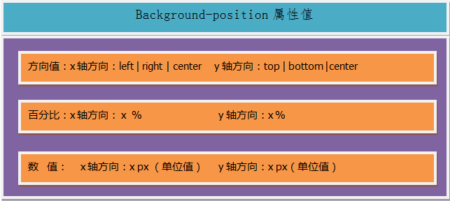
background-position属性值如果是数值,那么指相对于容器自身数值的距离作为起始位置;如果是百分比或者是方向,那么指的是相对于容器自身(容器自身的宽度/高度 - 图片自身的宽度/高度) x 百分比 所得的数值作为起始位置。
如果不设置background-position属性值,那么默认起始位置为background-position:0% 0%。
方向值和百分比的计算方式是一样的,它们可以相互转换,left:0%,right:100%,center:50%。
如果background-position属性值只设置一个,那么另一个默认为center。(引自学习资料)
属性值可混用
数值使用方式与position:absolute;绝对定位的使用一样。
使用百分比则是以除图片外的剩余宽高为父元素。
图标位置计算需加上上一个图标所占位置。(概念了解的不是很清楚)
明天计划的事情:
学会雪碧图的使用。将小图标以背景图片方式放入页面。
之前直接使用的select标签,要学会模拟下拉框。
遇到的问题:
header部分按钮使用outline: none;消除样式,周围却出现阴影。尚需寻找解决办法。
body部分文字内容并排显示使用 display: -webkit-flex; -webkit-flex-flow: column wrap;解决。但flex盒子中子元素盒子不是应该自动占据一行的吗不知道为什么使用p标签也是并排显示。p标签的使用应该也是占据一行的。
收获:
任务5总结:
页面分为三个部分,header,body,footer。
首先布局header,是header紧贴页面顶部,其次布局footer使footer紧贴底部。再后布局body主体部分。
header:
使用position: fixed; left: 0; top: 0;使header定位在页面左上角。设置width:100%.使header占满页面宽度。
使用display: flex;使header成为弹性盒子。justify-content: center; align-items: center;使标题水平垂直居中。
使用position:absolute;使返回图标绝对定位在header左上角。font-weight: 700加粗字体等同于font-weight: bold;
.header {
position: fixed;
display: -webkit-flex;
display: flex;
left: 0;
top: 0;
justify-content: center;
align-items: center;
width: 100%;
height: 5rem;
background-color: #68cdd5;

}
.title {
color: azure;
font-weight: 700;
}

.image1{
position: absolute;
left: 3rem;
top: 1.5rem;
height: 2rem;
width: 2rem;
}
footer:
使用position: fixed;width属性使footer占满页面宽度并紧贴底部。
使用float及height,width,margin,border,padding,border-radius等值显示按钮。
.footer {
position: fixed;
bottom: 0;
left: 0;
right: 0;
width: 100%;
height: 7rem;
}
.footer1 {
float: left;
width: 45%;
height: 5rem;
border: 1px solid #68cdd5;
border-radius: 1em;
margin-top: 1rem;
margin-left: 3%;
background-color: white;

}
.footer2 {
float: right;
width: 45%;
height: 5rem;
border: 1px solid #68cdd5;
border-radius: 10px;
margin-top: 1rem;
margin-right: 3%;
background-color: #68cdd5;
}
body:
(因为header,footer紧贴页面顶部和底部,所以body部分上下均要用margin值留出header,footer的高度,以免内容被header,footer遮挡。
在body中加入margin: 0; border:none;使body内容与页面边无距离。
在html中设置font-size: 62.5%; 使1rem=10px,使rem值的使用换算更简便。)
html {
font-size: 62.5%;
}

body {
margin: 0;
border: none;
font-size: 2rem;

}
使用url引入背景图片。background-repeat: no-repeat;使背景图片不重复。background-size设置为100%使背景图片铺满盒子。
flex中align-items属性使图片和文字垂直居中。
<div class="main">
<img class="image2" src="img/矢量智能对象.png" />
<div class="main-1"><span class="main-1-1">高素雅 51岁</span>
<div><img class="image3" src="img/Shape%204.png"><span class="main-1-2">北京.通州.果园</span></div>
</div>
</div>
.main {
display: flex;
flex-flow: row;
align-items: center;
margin-top: 5rem;
height: 24rem;
background-image: url(img/what.png);
background-repeat: no-repeat;
background-size: 100% 100%;
color: azure;
font-size: 2.5rem;
}
.image2 {
padding-left: 2rem;
padding-right: 2rem;
height: 10rem;
}
.main-1-2 {
font-size: 1.6rem;
}
.image3 {
padding-right: 1rem;}
使用flex布局,align-items:center使内容垂直居中。
.line3 {
    display: flex;
    align-items: center;
    height: 5rem;
    margin-left: 1rem;
    border-bottom: 1px solid #bababa;
}
.line3-1 {
    padding-right: 2.5rem;
    border-right: 1px solid #bababa;
    color: #bababa;
}
.line3-2 {
    padding-left: 2.5rem;
}
min-height设置盒子的最小高度让盒子的高度具有伸缩性恰随中间内容变化高度。white-space: nowrap;设置文字不换行(解决自我介绍四字在缩小页面时文字换行显示问题,不知道还有没有什么好点的解决办法)
.line6 {
    display: flex;
    align-items: center;
    min-height: 5rem;
    border-bottom: 1px solid #bababa;
    margin-bottom: 7rem;
    background-color: white;
}
.line6-1 {
    margin-left: 1rem;
    padding-right: 2.5rem;
    border-right: 1px solid #bababa;
    color: #bababa;
    white-space: nowrap;
}
.line6-1 {
    padding-left: 2rem;
    font-size: 1.6rem;
}
在写总结的过程中去掉了一些无用的代码。规范了命名(我自己认为的,相对于之前。)

 返回列表
返回列表


评论