发表于: 2019-02-26 23:48:39
1 795
Day 27
今天完成的事情
1.学习bootstrap
遇到的问题
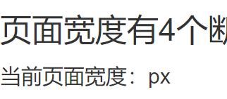
1.跟着视频,码了一遍实时计算当前页面宽度的代码,明明一模一样的代码为什么我的就是不显示呢
2.使用bootstrap,在定义class=col-md的样式的时候
发现样式没有被应用,检查时没有发现这段代码,意识到是没有被识别,也就是哪里出了问题,但菜鸟教程里也是这么写的啊
然后仔细检查自己同视频代码的区别,发现
多出了一个 * 。不懂,这是什么选择器。
收获
1.bootstrap
BS下载
① 下载用于生产环境的bootstrap
解压出来的目录结构大概是这样的
bootstrap3
├── css(map为在压缩环境下方便查看的格式,相当于索引地图)
│ ├── bootstrap-theme.css //主题类型,生产上一般用不到
│ ├── bootstrap-theme.css.map //主题类型,生产上一般用不到
│ ├── bootstrap-theme.min.css //主题类型,生产上一般用不到
│ ├── bootstrap.css//美化过的css样式。默认情况使用这个就足够了
│ ├── bootstrap.css.map //做映射的,可以理解为 shuaige = “luotianshuai” 那么掉shuaige的时候就相当于掉luotianshuai
│ └── bootstrap.min.css
├── fonts //字体图标文件,也是做的对应。下面的文件包含了不同浏览器环境下的字体图标(仅不同格式,内容相同)
│ ├── glyphicons-halflings-regular.eot
│ ├── glyphicons-halflings-regular.svg
│ ├── glyphicons-halflings-regular.ttf
│ ├── glyphicons-halflings-regular.woff
│ └── glyphicons-halflings-regular.woff2
└── js//js组件相关
├── bootstrap.js
├── bootstrap.min.js
② 将文件加入到工作区,即Directory,使用link在自己的页面里把css链接进去
bootstrap引用了部分html元素,所以头部需写成下面所示的样例。
<!DOCTYPE html>   ---包含HTML5文档声明,所有浏览器均开启标准模式
<html>
<head>
<meta charset="utf-8">
<meta http-equiv="X-UA-Compatible" content="IE=edge">
<meta name="viewport" content="width=device-width, initial-scale=1">
    <!-- 上述3个meta标签*必须*放在最前面,任何其他内容都*必须*跟随其后!确保支持响应式布局 -->
<title>Bootstrap</title>
<!-- 新 Bootstrap 核心 CSS 文件 -->
<link rel="stylesheet" href="//cdn.bootcss.com/bootstrap/3.3.5/css/bootstrap.min.css">
<!-- 可选的Bootstrap主题文件(一般不用引入) -->
<link rel="stylesheet" href="//cdn.bootcss.com/bootstrap/3.3.5/css/bootstrap-theme.min.css">
<!-- jQuery文件。务必在bootstrap.min.js 之前引入 -->
<script src="//cdn.bootcss.com/jquery/1.11.3/jquery.min.js"></script>
<!-- 最新的 Bootstrap 核心 JavaScript 文件 -->
<script src="//cdn.bootcss.com/bootstrap/3.3.5/js/bootstrap.min.js"></script>
</head>
<body>
</body>
</html>
BS基本知识
BS是基于响应式(一个网站能够兼容多个终端)设计的一套框架,以栅格系统为基石辅以基础布局组件,再加上很多封装完好的css组件及js组件形成的快速开发的一整套框架
主要规则
① row必须在container中
② 在row中创建column
③ 具体内容放在column中
④ 栅格系统可嵌套
关键点的阈值(可根据阈值来设置不同屏幕下的css样式)
/* 超小屏幕(手机,小于 768px) *//* 没有任何媒体查询相关的代码,Bootstrap 中默认移动设备优先 */
/* 小屏幕(平板,大于等于 768px) */
@media (min-width: @screen-sm-min) { ... }
/* 中等屏幕(桌面显示器,大于等于 992px) */
@media (min-width: @screen-md-min) { ... }
/* 大屏幕(大桌面显示器,大于等于 1200px) */
@media (min-width: @screen-lg-min) { ... }
在不同屏幕上bootstrap的表现
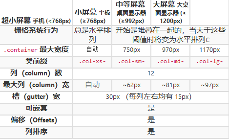
.container:固定宽度的栅格布局。
.container-fluid: 100% 宽度。
同时定义
针对平板设备的 .col-sm -* 类
针对超小屏幕的 .col-xs-* 类
针对中等屏幕设备的 .col-md-* 类
<div class="col-xs-12 col-sm-6 col-md-8">.col-xs-12 .col-sm-6 .col-md-8</div>使用 .col-md-offset-* 类可以将列向右侧偏移。
<div class="col-md-4 col-md-offset-4">.col-md-4 .col-md-offset-4</div>使用 .col-md-push-* 类将列向右推
使用 .col-md-pull-* 类将列向左推
组件的基本构建思想利用了css的特性
① 不同名的样式可叠加
② 同名样式后面的可以覆盖前面的
BS的css组件设计原理(以按钮为例)
基本样式+颜色样式+尺寸样式+状态样式(激活/禁用)+特殊样式(按钮组)+动画样式(例滚动条)
BS基本布局(全局css样式)
排版
代码
表格
表单
按钮
图片
(可定制下载bootstrap)
明天计划学习
尽快进入任务七

 返回列表
返回列表


评论