发表于: 2019-01-03 12:07:06
1 850
今天完成的事情:
一. 最近比较忙,任务也都没做。抽空把CSS的基础又补了一把。下面是整理的笔记:
1. 书写形式 1. 行内样式 2. 内部样式 3. 外部样式
2. 常见的CSS选择器 1. 通用选择器 *{} 2. id选择器 #id {} 3. 类选择器 .class {} 4. 复合选择器 #id .class p{} 5. 群组选择器 6. 后代选择器 7. 伪类和伪元素 .class:hover{}/::first-letter 8. 属性选择器 9. 直接后代选择器 10. 兄弟选择器 11. 否定伪类3. 标签类型 1. 块级标签,独占一行,可设置宽高 1. div 2. p 3. h1 4. ul 5. li 2. 行内标签,多个显示在一行 1. span 2. a 3. label 3. 行内-块级标签,多个显示在一行,有宽高 1. input 2. button
4. display属性 1. none:隐藏标签 2. block:变为块级标签 3. inline:变为行内标签 4. inline-block:变为行内-块级标签
5. 单位 1. px 2. 百分比,相对父类比例 3. em 4. rem 以html定义的大小为基准,设为10容易换算
6. 颜色 1. 直接使用关键字,red等 2. 十六进制表示,#8008DD 3. RGB值,RGB(100%,0,0)/(255,0,0) 4. RGBA值,A表示透明度,0-完全透明,1-不透明
7. 选择器优先级    1. 选择器权值        1. 通配符 0-0-0
        2. 标签 0-0-1
        3. 类/属性/伪类/伪元素 0-1-0
        4. id 1-0-0
        5. important 1-0-0-0
    2. 原则        1. 选择器权值加到一起,大的优先        2. 相同的,后定义的优先    3. 优先级排序
        ```
        important > 内联 > id > 类 > 标签|伪类|属性选择器|伪元素 > 通配符 >    继承
       ```
8. 盒子模型-以content为中心-常用属性    1. 内容content
        1. width
        2. height
        3. min-/max-width/height
    2. 内边距padding,上右下左    3. 边框border,宽度-样式-颜色    4. 外边框margin,上右下左
9. 脱离标准流 1. 浮动float(left/right) 2. position属性(子绝父对)
10. 常见属性
1. 可继承属性-一般文字控制属性
2. 不可继承属性-一般区块控制属性
3. visibility:visible/hidden,空间保留隐藏
4. cursor光标形状,pointer手形,move移动,crosshair十字,wait等待圆圈
5. color:字体颜色
6. font 设置字体 1. font-family 字体,多个优先前面 2. font-size 字号 3. font-weight 粗细 normal/bold 4. font-style 斜体 normal/italic
7. text-decoration 去除下划线 1. none 无下划线 2. underline 下划线 3. overline 上划线 4. line-through 中划线
8. text-indent,设置首行缩进,需指定长度px/%
9. text-align 文本对齐方式 1. left 2. right 3. justify两边对齐 4. center 中间对齐
10. text-transform 大小写控制 1. uppercase 大写 2. lowercase 小写 3. capitalize 首字母大写 4. none
11. list-style:设置无序列表的标记,circle
12. overflow 控制文本溢出情况 1. visible 默认值 2. scroll 增加滚动条 3. auto 根据需求添加滚动条 4. hidden 隐藏溢出
13. line-height 设置行高,越大行间距越大 ``` 行间距=line-height - font-size ```
14. box-sizing 变换盒子边界
1. content-box 默认盒子模型,宽高为内容
2. border-box 宽高为最外边框
11. 定位position 1. absolute ``` 生成绝对定位的元素,相对于 static 定位以外的第一个父元素进行定位。 元素的位置通过 "left", "top", "right" 以及 "bottom" 属性进行规定。 ``` 2. relative ``` 生成相对定位的元素,相对于其正常位置进行定位。 因此,"left:20" 会向元素的 LEFT 位置添加 20 像素。 相对定位元素经常被用来作为绝对定位元素的容器块。 z-index: 表示堆叠顺序,可以为正或负,没有指定时,后面覆盖前面元素 ``` 3. fixed ``` 生成固定定位的元素,相对于浏览器窗口进行定位。 元素的位置通过 "left", "top", "right" 以及 "bottom" 属性进行规定。 ``` 4. static ``` 默认值。没有定位,元素出现在正常的流中 (忽略 top, bottom, left, right 或者 z-index 声明)。 ``` 5. sticky ``` 粘性定位 ``` 6. 定位层级 ``` 1. 定位元素 > 浮动元素 > 文档流 2. 开启定位后通过z-index来设置层级 3. z-index相同,优先下面 4. 父元素不会覆盖子元素 ```
12. 背景background 1. background-color:keywords,#,rgb,rgba 2. background-image:url(<path>) 3. background-repeat:no-repeat,repeat,repeat-x/y 4. background-position: x y;/center center; 5. background-size: 1. width height; 2. cover; 覆盖全屏 3. contain; 一边到边 6. background-attachment 1. scroll: 背景图像会随着页面其余部分的滚动而移动 2. fixed: 当页面的其余部分滚动时,背景图像不会移动
13. 高度塌陷解决方式 1. 开启父BFC,设置overflow:hidden,开启BFC 2. 清除浮动:clear:both; 3. after伪类,放在需要清除的地方 ``` .clearfix::after, .clearfix::before { content:''; display:table; clear:both; } ```
14. 序号选择器 1. 不区分类型 ``` :first-child 选中同级别第一个标签 :last-child 选中同级别最后一个标签 :nth-child(n) 选择同级别第n个标签 :nth-last-child(n) 倒数第n个标签 :only-child 同级别唯一子元素标签 ``` 2. 区分类型 ``` :first-of-type 同级别同类型第一个标签 :last-of-type 同级别同类型最后一个标签 :nth-of-type(n) 同级别同类型第n个标签 :nth-of-last-type(n) 同级别同类型倒数第n个标签 :only-of-type 同级别唯一类型标签 ``` 3. 奇偶选择 ``` :nth-child(odd) 选中所有奇数 :nth-child(even) 选中所有偶数 :nth-child(xn+y) 自定义,n是计数器,从0开始递增 ``` 4. 类匹配 ``` [class ^= "icon-"] 匹配以icon-开头的类 [class *= " icon-"] 匹配所有以icon-开头的类 ```
15. 表格与表单 1. 表格table ``` tr 行,有几行就写几个tr td 列,有几列就写几个td rowspan 纵向合并单元格 rowspan = "3" colsapn 横向合并单元格 colsapn = "4" /*头部,标题行,自动加粗字体*/ <thead> <tr> <th> </th> </tr> </thead> /*内容*/ <tbody> <tr> <td> </td> </tr> </tbody> /*尾部*/ <tfoot> <tr> <td> </td> </tr> </tfoot> /*表单分组*/ fieldset 将表单内的元素分组 legend 为fieldset定义标题 ```
16. flex弹性布局```
1. dispaly:inline-flex;将对象作为弹性伸缩盒展示,用于行内元素,开启伸缩布局
2. dispaly:flex; 用于块级元素,开启伸缩布局
3. 常用属性
1. flex-direction 主轴方向 row x主轴,从左到有 row-reverse 反转 column y主轴,从上到下 column-reverse 相反
2. justify-content 主轴子项对齐方式 start 开端对齐 end 末端对齐 center 中心对齐 space-between 两端对齐 space-around 均匀对齐
3. align-items 侧轴子项对齐方式 stretch 默认值,拉伸,当未设宽高或auto flex-start 与侧轴开始位置对齐 flex-end 与侧轴结束位置对齐 center 与侧轴中心位置对齐 baseline 基线对齐,当行内轴与侧轴在同一线上,效果等同于flex
4. flex-wrap 换行 nowrap 默认值,表示不换行,可能会溢出 wrap 换行,溢出放到下一行 wrap-reverse 反方向换行
5. align-content 多行的对齐方式 stretch 默认,拉伸 flex-start flex-end center space-between space-around
6. align-self 单独指定某个子项对齐方式 auto flex-start flex-end center baseline stretch
4. 复合属性flex,用来指定flex子项如何分配空间 1. flex-grow 默认0,只用此项 flex:2; 2. flex-shrink 默认1 3. flex-basic 默认auto,0%
2. 完成任务四的登录页布局
效果如下:
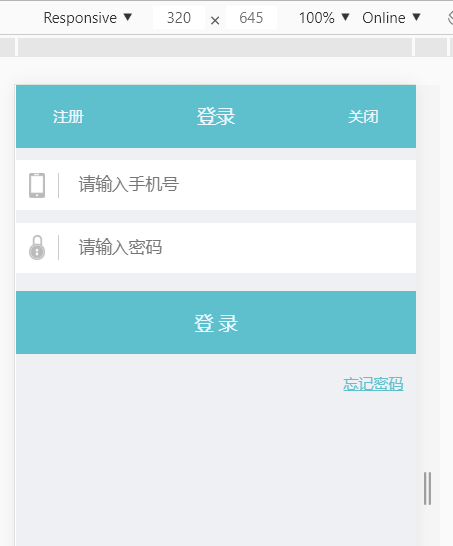
布局如下:
<!DOCTYPE html>
<html>
<head>
    <meta charset="UTF-8">
    <meta name="viewport" content="width=device-width, initial-scale=1.0">
    <title>移动端登录页</title>
    <link rel="icon" type="image/x-icon" href="./images/icon.png"/>
    <link rel="stylesheet" type="text/css" href="./css/login_new.css" >
</head>
<body>
<!--头部-->
<header class="header clearfix">
    <div class="header-center">
        <span>登录</span>
    </div>
    <span class="header-left">注册</span>
    <span class="header-right">关闭</span>
</header>

<!--内容-->
<section class="content">
    <form action="">
        <div class="content-input">
            <input type="text" placeholder="请输入手机号">
            <img src="./images/iphone.png" alt="iphone_logo">
        </div>
        <div class="content-input content-password">
            <input type="password" placeholder="请输入密码">
            <img src="./images/lock.png" alt="lock_logo">
        </div>
        <div class="content-submit">
            <button type="submit">登 录</button>
        </div>
    </form>
    <a href="">忘记密码</a>
</section>


</body>
</html>
样式如下:
*{
    padding: 0;
    margin: 0;
    /*text-decoration: none;*/
    box-sizing: border-box;
    outline: none;
}

html, body {
    width: 100%;
    background-color: #eff0f4;
    color: aliceblue;
    font-size: 10px;
    min-width: 320px;
}

/*防止高度坍塌*/
.clearfix::before,
.clearfix::after {
    content: '';
    display: table;
    clear: both;

}

/**********************头部开始*********************/
.header {
    width: 100%;
    height: 5rem;
    background-color: #5fc0cd;
    text-align: center;
    position: fixed;
    top: 0;
    z-index: 999;
}

.header-left {
    float: left;
    margin-left: 3rem;
    position: relative;
    top: -100%;
    line-height: 5rem;
    font-size: 1.2rem;

}

.header-center {
    width: 100%;
    height: 5rem;
    margin: 0 auto;
    font-size: 1.5rem;
}

.header-center span {
    line-height: 5rem;
}

.header-right {
    float: right;
    margin-right: 3rem;
    position: relative;
    top: -100%;
    line-height: 5rem;
    font-size: 1.2rem;
}

/**********************头部结束*********************/

/**********************内容开始*********************/
.content {
    width: 100%;
    margin: 1rem 0;
    position: relative;
    top: 5rem;
}

.content-input img{
    height: 2rem;
    line-height: 4rem;
    float: left;
    position: relative;
    top: -3rem;
    margin-left: 1rem;
    padding-right: 1rem;
    border-right: 1px solid #CCCCCC;
}

.content-input input {
    width: 100%;
    height: 4rem;
    padding: 0 0 0 5rem;
    border: none;
}

.content-password {
    position: relative;
    top: -1rem;
}

.content-submit button{
    width: 100%;
    height: 5rem;
    background-color: #5fc0cd;
    text-align: center;
    border: none;
    color: aliceblue;
    font-size: 1.5rem;
    position: relative;
    top: -1.5rem;
}

.content a {
    float: right;
    margin-right: 1rem;
    color: #5fc0cd;
    font-size: 1.2rem;
    font-weight: normal;
}

/**********************内容结束*********************/
3. 任务五护工主页大体布局
效果:
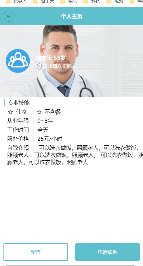
布局:
<!DOCTYPE html>
<html>
<head>
    <meta charset="UTF-8">
    <meta name="viewport" content="width=device-width, initial-scale=1.0">
    <title>护工首页</title>
    <link rel="icon" type="image/x-icon" href="./images/icon.png"/>
    <link rel="stylesheet" type="text/css" href="./css/nurse.css" >
</head>
<body>
<!--头部-->
<header class="header clearfix">
    <div>
        <div>个人主页</div>
        <a href=""><img src="./images/back.png" alt="返回按钮" width="30px"></a>
    </div>
</header>

<!--内容-->
<section class="content">
    <div class="content-top">
        <div class="content-top-left">
            <img src="./images/team.png" alt="头像" height="70">
        </div>
        <div class="content-top-right">
            <p>徐女士 55岁</p>
            <a href=""><img src="./images/gps.png" alt="gps" height="20">京城·四方·报纸林</a>
        </div>
    </div>
    <div class="content-bottom">
        <div>专业技能</div>
        <div>
            <img src="./images/star.png" alt="星星" width="20">
            <span>住家</span>
            <img src="./images/star.png" alt="星星" width="20">
            <span>不含餐</span>
        </div>
        <div>
            <span>从业年限</span><span>|</span><span>0~3年</span>
        </div>
        <div>
            <span>工作时间</span><span>|</span><span>全天</span>
        </div>
        <div>
            <span>服务价格</span><span>|</span><span>25元/小时</span>
        </div>
        <div>
            <span>自我介绍</span><span>|</span>
            <p>可以洗衣做饭,照顾老人,可以洗衣做饭,照顾老人,可以洗衣做饭,照顾老人,
            可以洗衣做饭,照顾老人,可以洗衣做饭,照顾老人</p>
        </div>
    </div>
</section>

<!--尾部-->
<footer class="footer">
    <button>留言</button>
    <button>电话联系</button>
</footer>
</body>
</html>
样式:
*{
    padding: 0;
    margin: 0;
    text-decoration: none;
    box-sizing: border-box;
    outline: none;
}

html, body {
    width: 100%;
    background-color: #fff;
    font-size: 10px;
    min-width: 320px;
}

/*防止高度坍塌*/
.clearfix::before,
.clearfix::after {
    content: '';
    display: table;
    clear: both;

}

/**********************头部开始*********************/
.header {
    background-color: #5fc0cd;
    width: 100%;
    height: 5rem;
    text-align: center;
    line-height: 5rem;
    position: fixed;
    top: 0;
    z-index: 999;
    color: #fff;
    font-size: 1.5rem;
    font-weight: bold;
}

.header img {
    float: left;
    position: relative;
    top: -4rem;
    margin-left: 1rem;
}

/**********************头部结束*********************/


/**********************内容开始*********************/
.content {
    width: 100%;
    height: 100%;
    margin-top: 5rem;
    margin-bottom: 5rem;
}

.content-top {
    background: url("../images/doctor.jpg");
    background-size: cover;
    width: 100%;
    height: 20rem;
    margin: 0 auto;
}

.content-top-left {
    height: 10rem;
    line-height: 10rem;
    width: 20%;
    text-align: center;
    position: relative;
    top: 5rem;
    float: left;
    margin-left: 1rem;
}

.content-top-left img {
    vertical-align: middle;
}

.content-top-right {
    height: 6rem;
    width: 50%;
    position: relative;
    top: 7rem;
    float: left;
    color: #fff;
    margin-left: 1rem;
}

.content-top-right p {
    margin-top: 1rem;
    margin-bottom: .5rem;
    font-size: 1.5rem;
    font-weight: bold;
}
.content-top-right a {
    color: #fff;
    font-size: 1.2rem;
}

.content-top-right a img{
    vertical-align: middle;
}


.content-bottom div:first-child {
    width: 100%;
    height: 2rem;
    line-height: 2rem;
    margin: .5rem 0 .5rem 1rem;
    padding-left: 1rem;
    border-left: 2px solid #5fc0cd;
    font-size: 1.5rem;
}

.content-bottom div:nth-child(2) {
    width: 100%;
    height: 2rem;
    line-height: 2rem;
    margin: .5rem 0 .5rem 1rem;
    padding-left: 1rem;
    font-size: 1.5rem;
}

.content-bottom div:nth-child(2) img{
    vertical-align: middle;
}
.content-bottom div:nth-child(2) span{
    margin-right: 2rem;
}

.content-bottom div:nth-child(3) {
    width: 100%;
    height: 2rem;
    line-height: 2rem;
    margin: .5rem 0 .5rem 1rem;
    padding-left: 1rem;
    font-size: 1.5rem;
}

.content-bottom div:nth-child(3) span{
    margin-right: 1rem;
}

.content-bottom div:nth-child(4) {
    width: 100%;
    height: 2rem;
    line-height: 2rem;
    margin: .5rem 0 .5rem 1rem;
    padding-left: 1rem;
    font-size: 1.5rem;
}

.content-bottom div:nth-child(4) span{
    margin-right: 1rem;
}

.content-bottom div:nth-child(5) {
    width: 100%;
    height: 2rem;
    line-height: 2rem;
    margin: .5rem 0 .5rem 1rem;
    padding-left: 1rem;
    font-size: 1.5rem;
}

.content-bottom div:nth-child(5) span{
    margin-right: 1rem;
}

.content-bottom div:nth-child(6) {
    width: 100%;
    height: 2rem;
    line-height: 2rem;
    margin: .5rem 0 .5rem 1rem;
    padding-left: 1rem;
    font-size: 1.5rem;
}
.content-bottom div:nth-child(6) span{
    margin-right: 1rem;
}

.content-bottom div p {
    display: inline;
}
/**********************内容结束*********************/


/**********************尾部开始*********************/
.footer {
    width: 100%;
    height: 5rem;
    text-align: center;
    line-height: 5rem;
    position: fixed;
    bottom: 1rem;
    display: flex;
    justify-content: space-around;
}

.footer button {
    height: 5rem;
    width: 45%;
    border-radius: .5rem;
    cursor: pointer;
    border: .2rem solid #5fc0cd;
}

.footer button:first-child {
    background-color: #fff;
    color: #5fc0cd;
}

.footer button:last-child {
    background-color: #5fc0cd;
    color: #fff;
}

/**********************尾部结束*********************/
明天计划的事情:
继续任务5
遇到的问题:
1. 头部布局:头部布局一开始是可以的,但是下面一旦输入框为100%,缩放时就会变形,而且删除任一或俩个都会导致布局变形。后来在中间的部分套了一个div占满整行,这样删除里面的文字就不会影响布局了
2. 高度坍塌及定位方面的问题还是有点迷糊
3. 护工主页最后一项自我介绍保持一行还需要再琢磨下
收获:
1. CSS基础知识学习
2. 完成登录页的布局,以期达到验收标准
3. 开始任务五

 返回列表
返回列表


评论