发表于: 2018-12-20 20:35:27
3 835
今天完成的事情:
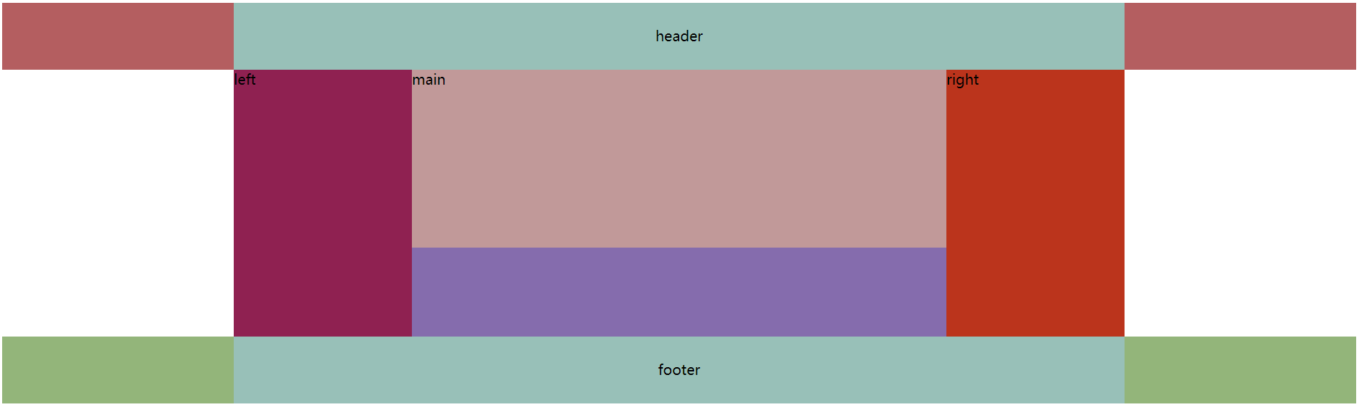
1. 圣杯布局
1.1 效果图如下
1.2 布局如下
<!DOCTYPE html>
<html>
<head>
<meta name="viewport" content="width=device-width, initial-scale=1.0">
<meta charset="UTF-8">
<title>圣杯布局</title>
<link rel="icon" type="image/x-icon" href="./images/icon.png"/>
<link rel="stylesheet" type="text/css" href="./css/header.css" >
<head>
<body>
<div class= "header">
<div class= "content">header</div>
</div>
<div class= "container">
<div class= "main">main</div>
<div class= "left">left</div>
<div class= "right">right</div>
</div>
<div class= "footer">
<div class= "content">footer</div>
</div>
</body>
</html>
1.3 样式如下
.header {
width: 100%;
min-height: 75px;
background-color: #B45E60;
}
.footer {
width: 100%;
height: 75px;
background-color: #93B57A;
}
.content {
width: 1000px;
height: 75px;
margin: auto;
line-height: 75px;
background-color: #98C0B8;
text-align: center;
}
.container {
width: 600px;
height: 300px;
margin: auto;
padding: 0 200px;
background-color: #856CAD;
overflow: hidden;
}
.main {
width: 100%;
min-height: 200px;
background-color: #C19999;
float: left;
}
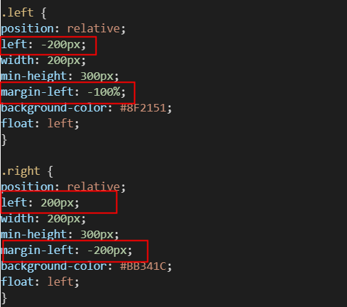
.left {
position: relative;
left: -200px;
width: 200px;
min-height: 300px;
margin-left: -100%;
background-color: #8F2151;
float: left;
}
.right {
position: relative;
left: 200px;
width: 200px;
min-height: 300px;
margin-left: -200px;
background-color: #BB341C;
float: left;
}
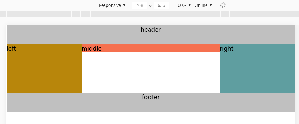
2. 双飞翼布局
2.1 效果如下
2.2 布局如下:
<!DOCTYPE html>
<html>
<head>
<meta name="viewport" content="width=device-width, initial-scale=1.0">
<meta charset="UTF-8">
<title>双飞翼布局</title>
<link rel="icon" type="image/x-icon" href="./images/icon.png"/>
<link rel="stylesheet" type="text/css" href="./css/wings.css" >
<head>
<body>
<div class= "header">
<div class= "content">header</div>
</div>
<div class= "container">
<div class= "main">
<div class= "center">middle</div>
</div>
<div class= "left">left</div>
<div class= "right">right</div>
</div>
<div class= "footer">
<div class= "content">footer</div>
</div>
</body>
</html>
2.3 样式如下:
* {
margin: 0;
padding: 0;
}
.header, .footer {
width: 100%;
height: 50px;
text-align: center;
line-break: 50px;
background-color: #C0C0C0;
}
.container {
overflow: hidden;
}
.main {
width: 100%;
}
.center {
margin-left: 200px;
margin-right: 200px;
background-color: #F5704F;
}
.left, .right, .main {
float: left;
min-height: 130px;
margin-bottom: -2000px;
padding-bottom: 2000px;
}
.left {
width: 200px;
margin-left: -100%;
background-color: darkgoldenrod;
}
.right {
width: 200px;
margin-left: -200px;
background-color: cadetblue;
}
.footer {
clear: both;
}
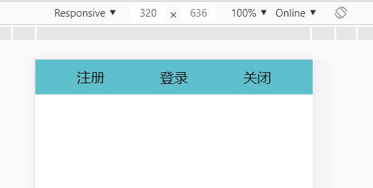
3. 用双飞翼模型布局登录头部
3.1 效果
3.2 布局
<div class = "header">
<div class = "login">
<div class="center">登录</div>
</div>
<div class = "register">
<p>注册</p>
</div>
<div class = "close">关闭</div>
</div>
3.3 样式
* {
margin: 0;
padding: 0;
}
.header {
overflow: hidden;
height: 40px;
background-color: #5fc0cd;
}
.login {
width: 100%;
display: flex;
align-items: center; /*定义垂直居中*/
justify-content: center; /*定义水平居中 */
text-align: center;
}
.center {
margin-left: 80px;
margin-right: 80px;
}
.register, .close, .login {
float: left;
min-height: 40px;
margin-bottom: -2000px;
padding-bottom: 20000px;
}
.register {
width: 80px;
margin-left: -100%;
height: 40px;
display: flex;
padding-left: 48px;
align-items: center; /*定义垂直居中*/
justify-content: left; /*定义水平居中 */
}
.close {
width: 80px;
margin-left: -80px;
height: 40px;
display: flex;
align-items: center; /*定义垂直居中*/
justify-content: left; /*定义水平居中 */
}
明天计划的事情:
继续任务四登录页的下面布局
遇到的问题:
1. 圣杯与双飞翼布局的left与right的有点不理解margin-left =-100%的意思。现在理解了,就是会浮到上一行
收获:
1. 认识圣杯布局
2. 认识双飞翼布局
3. 登录页头部布局

 返回列表
返回列表


评论