发表于: 2018-12-20 16:31:38
1 740
今天完成的事
1 做了任务14的 一部分 头部还有导航 还没做好 好久也没写日报了
明天计划的事情
1 继续完成任务的
遇到的额问题
做个任务主要是 遇到的额问题多
1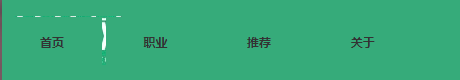
导航栏这里 不能靠右
导航栏的代码 在网上找了好久 最后才用这个
<!--导航-->
<div class="index-nav">
<img src="img/enterprise_10.jpg" id="nav-nav"/>
<div class="index-nav-frame clearfix">
<div class="nav-small" tabindex="-1">
<img src="img/icon.png"/>
</div>
<div class="index-nav-frame-line " tabindex="-1">
<a href="#">首页</a>
</div>
<div class="index-nav-frame-line" tabindex="-1">
<a href="#">职业</a>
</div>
<div class="index-nav-frame-line" tabindex="-1">
<a href="#">推荐</a>
</div>
<div class="index-nav-frame-line" tabindex="-1">
<a href="#">关于</a>
</div>
</div>
/*导航*/
#nav-nav{
margin-left:1rem;
}
.index-nav {
height: 84px;
box-sizing: border-box;
background: #36ab7a;
padding-top: 18px;
}
.index-nav-frame-line {
color: #333333;
background: #36ab7a;
position: relative;
top: 0px;
display: block;
outline: none;
cursor: pointer;
width: 100px;
line-height: 50px;
text-align: center;
font-weight: 700;
}
.index-nav-frame-line-center {
opacity: 0;
height: 0;
position: absolute;
overflow: hidden;
width: 100%;
transition: all 0.5s;
-webkit-transition: all 0.5s;
-moz-transition: all 0.5s;
/* Firefox 4 */
-o-transition: all 0.5s;
/* Opera */
}
.nav-small {
width: 46px;
height: 46px;
position: absolute;
right: 10px;
top: 63px;
cursor: pointer;
display: none;
outline: none;
}
@media only screen and (max-width:800px) {
.index-nav-frame-line-li a {
display: block;
color: white;
}
.nav-small {
display: block;
}
.nav-small:focus~.index-nav-frame-line {
height: auto;
border-bottom: 1px solid #ccc;
}
.index-nav-frame-line {
width: 100%;
height: 0;
overflow: hidden;
}
}
@media only screen and (min-width:800px) {
.index-nav-frame-line{
display: inline-block;
position: relative;
top: -48px;
}
.index-nav {
}
}

 返回列表
返回列表


评论