今天完成的事情:
1. 完成任务三,并提交
2 任务三内容
2.1 任务三切图,布局,并调整样式和设计图一致
2.2 采用外部样式表设计
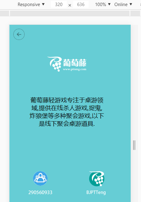
2.2.1 效果图:
2.2.2 代码如下:
<!DOCTYPE html>
<html>
<head>
<meta name="viewport" content="width=device-width, initial-scale=1.0">
<meta charset="UTF-8">
<title>Mobile Web</title>
<link rel="stylesheet" type="text/css" href="./css/mobile.css" >
<head>
<body>
<div class="parent">
<div class = "back">
<img src= "./images/back.png" alt = "返回按钮" height="30" width="30"/>
</div>
<div class = "logo">
<img src= "./images/logo.png" alt = "主Logo" height="40"/>
</div>
<div class = "content">
<p>葡萄藤轻游戏专注于桌游领域,提供在线杀人游戏,捉鬼,炸狼堡等多种聚会游戏,以下是线下聚会桌游道具.</p>
</div>
<div class = "team">
<div>
<img src= "./images/team.png" alt = "team" height="40"/>
</div>
<div>
<img src= "./images/number.png" alt = "team" height="10"/>
</div>
</div>
<div class = "ptt">
<div class="ptt-first">
<img src= "./images/bground.png" alt = "ptt" height="40"/>
<img src= "./images/ptt.png" alt = "ptt" height="40"/>
</div>
<div class="ptt-second">
<img src= "./images/bjptt.png" alt = "ptt" height="12"/>
</div>
</div>
</div>
</body>
</html>
2.2.3 css如下:
html,
body {
width: 100%;
height: 100%;
margin: 0;
padding: 0;
background-color: #66cdd5;
}
.back {
margin-top: 10px;
margin-left: 10px;
}
.logo {
margin-top: 40px;
text-align: center;
}
.content {
margin-top: 60px;
margin-left: 50px;
margin-right: 50px;
text-align: center;
}
.team {
margin-top: 100px;
margin-left: 50px;
float: left;
text-align: center;
}
.ptt {
margin-top: 100px;
margin-right: 50px;
float: right;
text-align: center;
}
.ptt-first img {
position: absolute;
}
.ptt-second {
margin-left: 36px;
margin-top: 46px;
}
3. 任务四的登录页
3.1 熟悉定位position
1. absolute
生成绝对定位的元素,相对于 static 定位以外的第一个父元素进行定位。
元素的位置通过 "left", "top", "right" 以及 "bottom" 属性进行规定。
2. relative
生成相对定位的元素,相对于其正常位置进行定位。
因此,"left:20" 会向元素的 LEFT 位置添加 20 像素。
相对定位元素经常被用来作为绝对定位元素的容器块。
z-index: 表示堆叠顺序,可以为正或负,没有指定时,后面覆盖前面元素
3. fixed
生成固定定位的元素,相对于浏览器窗口进行定位。
元素的位置通过 "left", "top", "right" 以及 "bottom" 属性进行规定。
4. static
默认值。没有定位,元素出现在正常的流中(忽略 top, bottom, left, right 或者 z-index 声明)。
3.2 垂直居中的方式
1. flex布局
display: flex;
align-items: center; /*定义垂直居中*/
justify-content: center; /*定义水平居中 */
3.3 学习input样式
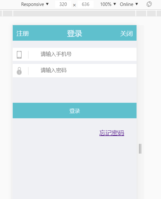
3.4 登录页效果图
3.5 代码如下:
<!DOCTYPE html>
<html>
<head>
<meta name="viewport" content="width=device-width, initial-scale=1.0">
<meta charset="UTF-8">
<title>SIGN IN</title>
<link rel="icon" type="image/x-icon" href="./images/icon.png"/>
<link rel="stylesheet" type="text/css" href="./css/login.css" >
<head>
<body>
<div class="parent">
<div class = "header">
<div class = "login">
<p>登录</p>
</div>
<div class = "register">注册</div>
<div class = "close">关闭</div>
</div>
<form>
<div class = "input-form">
<span class= "icon"><img src = "./images/iphone.png" alt = "登录" height = "20" /> </span>
<input type = "text" placeholder = "请输入手机号" >
</div>
<div class = "input-form">
<span class= "icon"><img src = "./images/lock.png" alt = "密码" height = "20" /> </span>
<input type = "password" placeholder = "请输入密码" >
</div>
</form>
<div class = "commit">
<button>登录</button>
</div>
<div class = "forget">
<p><a href = "http://www.cnblogs.com/xinjiebi/p/5061516.html">忘记密码</a></p>
</div>
</div>
</body>
</html>
3.6 css代码如下
html,
body {
width: 100%;
height: 100%;
margin: 0;
padding: 0;
font-size: 10px;
font-size: 1rem;
color: aliceblue;
font-family: Georgia;
background-color: #eff0f4;
}
.header {
position: absolute;
font-size: 1rem;
width: 100%;
height: 40px;
top: 0px;
background-color: #5fc0cd;
}
.register {
margin-top: -30px;
margin-left: 10px;
float: left;
}
.login {
position: relative;
width: 100%;
height: 40px;
top: 0px;
display: flex;
align-items: center; /*定义垂直居中*/
justify-content: center; /*定义水平居中 */
font-size: 1.2rem;
}
.close {
margin-top: -30px;
margin-right: 10px;
float: right;
}
form {
position: absolute;
top: 50px;
height: 80px;
width: 100%;
}
.input-form {
display: flex;
align-items: center; /*定义垂直居中*/
justify-content: center; /*定义水平居中 */
margin-top: 8px;
width: 80%;
margin-left: auto;
margin-right: auto;
display: inline-block;
background-color: #ffffff;
}
.input-form input {
width: 100%;
height: 32px;
margin-left: 10%;
padding-left: 40px;
border: 0;
}
.input-form input:hover {
border: 0 solid #dcdcdc;
}
.input-form input:after {
border: 0 solid #dcdcdc;
}
.input-form .icon {
width: 30px;
height: 20px;
margin: 8px 10px 5px 10px;
border-right: 1px solid #dcdcdc;
display: inline-block;
position: absolute;
}
.commit button {
width: 100%;
height: 40px;
top: 200px;
border: 0;
position: absolute;
background-color: #5fc0cd;
color: aliceblue;
}
.forget {
top: 250px;
left: 70%;
position: absolute;
}
明天计划的事情:
继续任务四,学习双飞翼布局
遇到的问题:
1. 一开始不知道怎么使两张图片相互覆盖,后来知道可以使用相对定位来覆盖,并可以使用z-index来设置顺序
2. 任务四的头部布局挺难的,无意中看到双飞翼布局,明天好好研究下
收获:
任务三切图,设置布局及样式
任务四切图,设置布局及样式

 返回列表
返回列表


评论