发表于: 2018-12-15 17:19:56
1 842
今天完成的事情:
1. 学习了自适应及viewport
1.1 宽度自适应
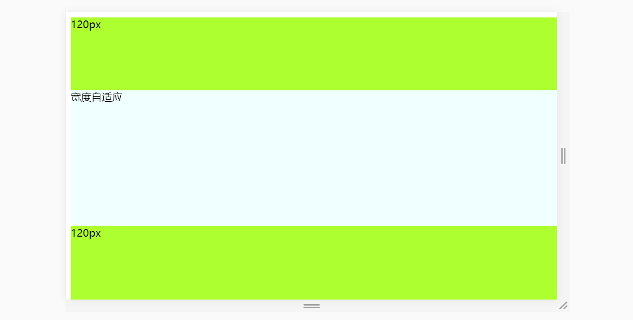
代码如下:
<!DOCTYPE html>
<html>
<head>
<meta name="viewport" content="width=device-width, initial-scale=1.0">
<meta charset="UTF-8">
<title>SELF-ADAPTION</title>
<style type="text/css">
.top {
positon: absolute;
width: 100%;
height: 120px;
background-color: greenyellow;
}
.main {
position: absolute;
width: 100%;
height: auto;
top: 120px;
bottom: 120px;
background-color: azure;
}
.bottom {
position: absolute;
width: 100%;
height: 120px;
bottom: 0;
background-color: greenyellow;
}
</style>
<head>
<body>
<div class="top">
120px
</div>
<div class="main">
宽度自适应
</div>
<div class="bottom">
120px
</div>
</body>
</html>
1.2 高度自适应
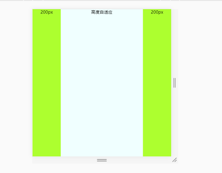
代码如下:
<!DOCTYPE html>
<html>
<head>
<meta charset="UTF-8">
<title>SELF-ADAPTION</title>
<style type="text/css">
html,
body {
height: 100%;
margin: 0;
padding: 0;
font-size: 30px;
font-weight: 500;
text-align: center;
}
.left {
width: 200px;
height: 100%;
background-color: greenyellow;
dispaly: inline;
float: left;
}
.right {
width: 200px;
height: 100%;
background-color: greenyellow;
dispaly: inline;
float: right;
}
.main {
position: absolute;
height: 100%;
left: 200px;
right: 200px;
background-color: azure;
dispaly: inline;
}
</style>
<head>
<body>
<div class="left">
200px
</div>
<div class="main">
高度自适应
</div>
<div class="right">
200px
</div>
</body>
</html>
1.3 九宫格设计成自适应的
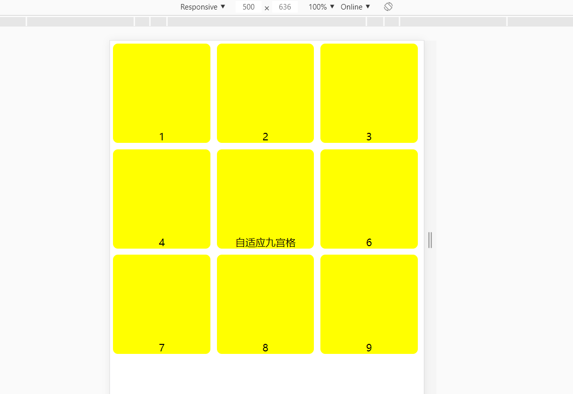
代码如下:
<!DOCTYPE html>
<html>
<head>
<meta name="viewport" content="width=device-width, initial-scale=1.0">
<meta charset="UTF-8">
<title>CSS</title>
<style type="text/css">
html,
body {
width: 100%;
margin: 0;
padding: 0;
text-align: center;
}
#yellow {
position:relative;
width:31%;
border: 0 solid yellow;
padding-top: 27.5%;
margin: 1%;
background-color:yellow;
float:left;
border-radius: 5%;
}
</style>
<head>
<body>
<div class="y">
<div id="yellow">
1
</div>
<div id="yellow">
2
</div>
<div id="yellow">
3
</div>
<div id="yellow">
4
</div>
<div id="yellow">
自适应九宫格
</div>
<div id="yellow">
6
</div>
<div id="yellow">
7
</div>
<div id="yellow">
8
</div>
<div id="yellow">
9
</div>
</div>
</body>
</html>
2. 了解了自适应与响应式的区别
1. 自适应:根据设备自动调整大小,布局不变
2. 响应式:根据设备自动调整布局
3. id与class区别
- id表示唯一性
- class表示复用性
- id优先级大于class
明天计划的事情:
写一个响应式的页面
遇到的问题:
暂无
收获:
1. 认识了自适应和响应式
2. viewport

 返回列表
返回列表


评论