发表于: 2018-11-18 22:44:14
2 602
今日完成的事情
1.重新用flex布局完成任务5。47.104.248.130
收获就是flex布局的基本概念和布局方式
今天遇到的问题:
1.flex布局中头部底部固定在屏幕上方和下方这个不会,还没找到怎么做。是要用position属性的fixed固定定位吗,用了之后脱离文档流以后就成了这样。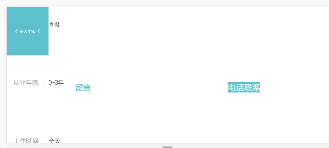
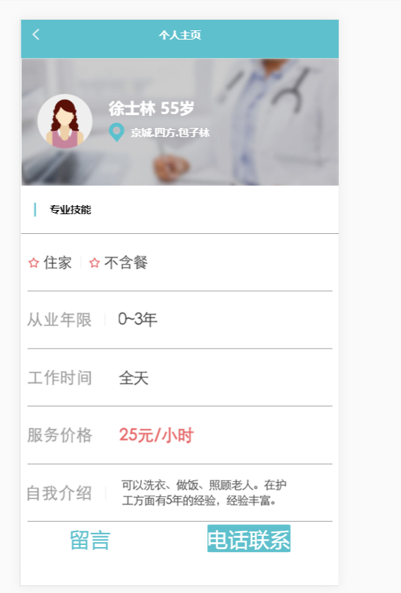
目前代码是下图
<!DOCTYPE html>
<html lang="en">
<head>
    <meta charset="UTF-8">
    <title>ppage</title>
    <style>
 .header{
            padding-left:2%;
 padding-right: 2%;
 margin:0;
 display: flex;
 flex-flow:row nowrap;
 justify-content: space-around;
 align-self: start;
 align-items: center;
 flex:auto;
 height:15vw;
 width:auto;
 background-color:#5fc0cd;
 }
        .headtxt{
            display: flex;
 flex-grow: 1;
 justify-content: center;
 color:white;
 }
        .img{
            z-index: -1;}
        .banner{
            display: flex;
 background: url(/image/banner.jpg) no-repeat;
 width: 100%;
 height: 40vw;
 overflow: hidden;
 background-size:100%;
 flex-flow: row wrap;
 justify-content: start;
 align-items:center;
 flex: auto;
 }
        .bannertxt{
            margin-left:5%;
 display: flex;
 width: auto;
 height: auto;
 flex-flow: column nowrap;
 justify-content: space-around;
 align-items: end;
 font-size: 3rem;
 color:white;
 }
        .adresstxt{
            display: flex;
 flex-flow: row nowrap;
 justify-content: start;
 align-items: center;
 font-size: 2rem;
 }
        .skill{
            display: flex;
 flex-flow: row nowrap;
 justify-content: start;
 align-items: center;
 font-size:2rem;
 border-width: 0 0 1px 0;
 border-style: solid;
 border-color: black;
 height: 15vw;
 width: 100%;
 }
        .skilldetails{
            margin:0 2% 0 2%;
 display: flex;
 flex-flow: row nowrap;
 justify-content: start;
 align-items: center;
 font-size: 2rem;
 border-width: 0 0 1px 0;
 border-style: solid;
 border-color: black;
 height: 18vw;
 width: auto;
 max-width: 100%;
 }
        .footer{
            position: relative;
 display: inline-flex;
 flex-flow: row nowrap;
 justify-content: space-around;
 align-items: center;
 bottom: 0;
 height: 20vw;
 width: 100%;
 }
        .footerdetails1{
            display: flex;
 flex-flow: row nowrap;
 justify-content: space-around;
 align-items: center;
 background-color:white;
 border-radius: 3%;
 border: 1px #5fc0cd;
 color:#5fc0cd;
 padding: auto;
 text-align: center;
 text-decoration: none;
 font-size: 4rem;
 margin: 1% 0 auto 0;
 cursor: pointer;
 width:auto;
 height:auto;
 max-width:100%;
 max-height:100%;
 }
        .footerdetails2{
            display: flex;
 flex-flow: row nowrap;
 justify-content: space-around;
 align-items: center;
 background-color:#5fc0cd;
 border-radius: 3%;
 border: 1px white;
 color:white;
 padding: auto;
 text-align: center;
 text-decoration: none;
 font-size: 4rem;
 margin: 1% 0 auto 0;
 cursor: pointer;
 width:auto;
 height:auto;
 max-width:100%;
 max-height:100%;
 }
        *{
            margin:0px;
 font-family:"Microsoft YaHei",微软雅黑;
 }
    </style>

</head>
<body>
<h1 class="header">
    <img src="/image/returnicon.png">
    <p class="headtxt">个人主页</p>
    <img class="img" src="/image/returnicon.png">
</h1>
<h2 class="banner">
<img style="margin-left: 5%" src="/image/portrait.png">
    <div class="bannertxt">
    <p2 >徐士林 55岁</p2>
    <p3 class="adresstxt" ><img src="/image/addressicon.png">
 京城.四方.包子林</p3>
    </div>
</h2>
<h3 class="skill">
    <img  src="/image/blueicon.png">
    <p4>专业技能</p4>
</h3>
<div class="skilldetails">
    <img src="/image/requirement.png">
</div>
<div class="skilldetails">
    <img src="/image/requirement2.png">
</div>
<div class="skilldetails">
    <img src="/image/requirement3.png">
</div>
<div class="skilldetails">
    <img src="/image/requirement4.png">
</div>
<div class="skilldetails">
    <img src="/image/requirement5.png">
</div>
<div class="footer">
    <div class="footerdetails1">
        <p4>留言</p4>
    </div>
    <div class="footerdetails2">
        <p5>电话联系</p5>
    </div>
</div>

</body>
</html>
明日计划:解决这个问题,完成任务五。

 返回列表
返回列表


评论