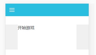
今天完成的事情:今天接着昨天完成了第一张图,触发bfc,来解决margin塌陷问题:
.content-top{
margin: 4rem 0.5rem 1rem 0.5rem;
height: 5rem;
background-color: #fff;
}
<div class="container-fluid fixed-top" style="background-color:#29bde0" ">
<div class="row align-items-center" style="height: 3rem;">
<div class="col">
<div class="three-bars">
</div>
</div>
</div>
</div>
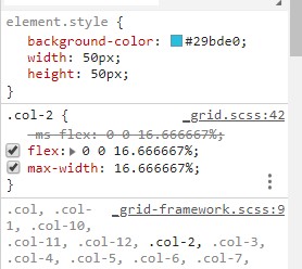
在div引用row和col后,offest-n不会因为主轴垂直排列,而向下移动,已久向右移动:
而且默认col有max-width:
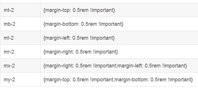
.m-auto用于垂直水平居中,padding是同属性:
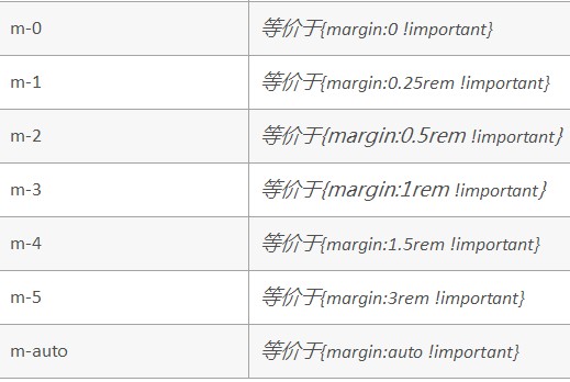
mx-auto用于水平居中:
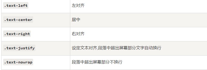
文字排版类名有:
底部四个小圆点,有鼠标移上去变色属性:
.circle{
width: 10px;
height: 10px;
border-radius: 50%;
margin: 3px;
background-color:#f0f0f0;
}
a:hover{
background-color: #29bde0;
}
<div class="row justify-content-center ">
<a href="#" class="circle" ></a>
<a href="#" class="circle" ></a>
<a href="#" class="circle" ></a>
<a href="#" class="circle" ></a>
</div>
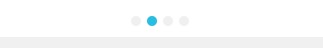
:hover可以用到任何元素上,代表鼠标移上去(移动端是点击)时的效果,a:link :未被访问过的链接属性,a:visited:已被访问过的链接属性,a:active:点击时的效果,这三个属性只能用在链接上。
header左边的三道杠,用css画出:
.three-bars{
background-color:#fff;
width:20px;
height:14px;
border-top: 2px solid #fff;
border-bottom: 2px solid #fff;
padding:4px 0;
background-clip: content-box;
}
bg-cilp代表绘制背景区域;
border-box:从边框开始剪裁;padding-box:从内边距剪裁;content-box:从内容开始剪裁。
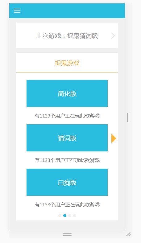
最后完整效果:
<html lang="en">
<head>
<meta charset="UTF-8">
<meta name="viewport" content="width=device-width, initial-scale=1.0">
<meta http-equiv="X-UA-Compatible" content="ie=edge">
<link rel="stylesheet" href="https://stackpath.bootstrapcdn.com/bootstrap/4.1.3/css/bootstrap.min.css">
<script src="https://code.jquery.com/jquery-3.3.1.slim.min.js"></script>
<script src="https://cdnjs.cloudflare.com/ajax/libs/popper.js/1.14.3/umd/popper.min.js"></script>
<script src="https://stackpath.bootstrapcdn.com/bootstrap/4.1.3/js/bootstrap.min.js"></script>
<title>Document</title>
<style>
.three-bars{
background-color:#fff;
width:20px;
height:14px;
border-top: 2px solid #fff;
border-bottom: 2px solid #fff;
padding:4px 0;
background-clip: content-box;
}
.content-top{
margin: 4rem 0.5rem 1rem 0.5rem;
height: 5rem;
background-color: #fff;
}
.content-right{
width : 15px;
height : 15px;
border-top : 3px solid #e7e7e7;
border-left: 3px solid #e7e7e7;
transform : rotate(135deg);
position: absolute;
right: 35px;
}
.content-footer{
margin: 0 0.5rem 1rem 0.5rem;
height: 30rem;
background-color: #fff;
}
.blue-button{
width: 80%;
height: 5.5rem;
line-height: 5.5rem;
color: #fff;
font-size: 20px;
}
body{
background: #f0f0f0;
}
.circle{
width: 10px;
height: 10px;
border-radius: 50%;
margin: 3px;
background-color:#f0f0f0;
}
a:hover{
background-color: #29bde0;
}
.triangle{
position: absolute;
top: 422px;
right: 7.5%;
border: 1rem solid #fbb435;
border-color: #fff #fbb435;
border-right: none;
}
</style>
</head>
<body>
<div class="container-fluid fixed-top" style="background-color:#29bde0" ">
<div class="row align-items-center" style="height: 3rem;">
<div class="col">
<div class="three-bars">
</div>
</div>
</div>
</div>
<div class="container-fluid" style="overflow: hidden;" >
<div class="row content-top align-items-center ">
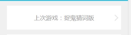
<div class="m-auto " style="color:#9a9a9a;font-size:20px;" >
上次游戏:捉鬼猜词版
</div>
<div class="content-right"></div>
</div>
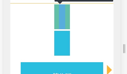
<div class="row justify-content-center" style="margin:0 0.5rem;height:4rem;background-color:#fff;color:#fbb435;font-size: 20px;line-height: 4rem;border-bottom: 1px solid #fbb435;">捉鬼游戏</div>
<div class="row flex-column content-footer justify-content-around align-items-center text-center" style="color: #787878;">
<div class="triangle"></div>
<div class="blue-button" style="background-color:#29bde0;margin-top: 1rem;">简化版</div>
<div>有1133个用户正在玩此款游戏</div>
<div class="blue-button" style="background-color:#29bde0;">猜词版</div>
<div>有1133个用户正在玩此款游戏</div>
<div class="blue-button" style="background-color:#29bde0;">白痴版</div>
<div>有1133个用户正在玩此款游戏</div>
<div class="row justify-content-center ">
<a href="#" class="circle" ></a>
<a href="#" class="circle" ></a>
<a href="#" class="circle" ></a>
<a href="#" class="circle" ></a>
</div>
</div>
</div>
</body>
</html>
明天计划的事情:今天学习html5 audio,配置第二张图。
遇到的问题:用bootstrap4 垂直布局div时 水平方向无法用到.col就无法实现预计效果,最后只用了.row:
<div class="row flex-column content-footer justify-content-around align-items-center text-center" style="color: #787878;">
<div class="triangle"></div>
<div class="blue-button" style="background-color:#29bde0;margin-top: 1rem;">简化版</div>
<div>有1133个用户正在玩此款游戏</div>
<div class="blue-button" style="background-color:#29bde0;">猜词版</div>
<div>有1133个用户正在玩此款游戏</div>
<div class="blue-button" style="background-color:#29bde0;">白痴版</div>
<div>有1133个用户正在玩此款游戏</div>
收获:学会了初步使用bootstrap布局界面。

 返回列表
返回列表


评论