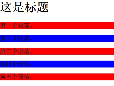
今天完成的事情:昨天官网出现问题,补充昨天任务情况 ,:nth-of-type同类型选择器
p:nth-of-type(odd)
{
background:#ff0000;
}
p:nth-of-type(even)
{
background:#0000ff;
}
</style>
</head>
<body>
<h1>这是标题</h1>
<p>第一个段落。</p>
<p>第二个段落。</p>
<p>第三个段落。</p>
<p>第四个段落。</p>
<p>第五个段落。</p>
:nth-child(n)选择器不分类型
p:nth-child(2)
{
background:#ff0000;
}
</style>
</head>
<body>
<h1>这是标题</h1>
<p>第一个段落。</p>
<p>第二个段落。</p>
<p>第三个段落。</p>
<p>第四个段落。</p>

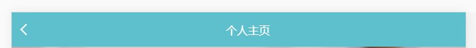
然后用flex布局header,其实header两个子元素用align-items:center垂直居中,然后右边子元素定位到中间就可以,不过我想用flex布局,于是在右边加了一个与背景一样的子元素,然后用justify-content:space-between,水平居中了中间的元素。
header{
position : fixed;
top : 0;background-color: #5fc0cd;
height : 50px;
width : 100%;
color : #fff;
display : flex;
justify-content: space-between;
align-items : center;
}
.header-left{
display : block;
width : 10px;
height : 10px;
margin-left: 15px;
border-top : 2px solid #fff;
border-left: 2px solid #fff;
transform : rotate(-45deg);
}
.header-right{
color: #5fc0cd;
}
学会了如何合并图层,并编辑导出。
然后插入背景图片用background-size,background-repeat,实现背景图自适应且不重复。
.main{
width : 100%;
height : 170px;
margin-top : 50px;
display : flex;
justify-content : flex-start;
align-items : center;
background-image : url(bg2.png);
background-size : 100%;
background-repeat: no-repeat;
<div class="main">
<img class="main-left" src="header.png" height="80px" alt="">

主内容整体用flex布局,
flex-direction: column;
align-items : center;
设置主轴垂直,实现水平居中
主内容最后一行由于字多,宽度变小时,会换行,但是左面标题不能换行就用到了下面
white-space : nowrap;
如果不设置不换行是这样:
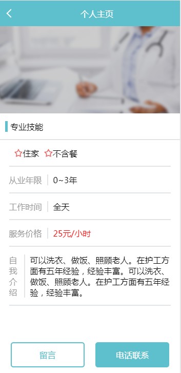
整体任务五效果:
body,div,p{
margin: 0;
}
body{
background-color: #fff;
min-width : 320px;
}
header{
position : fixed;
top : 0;background-color: #5fc0cd;
height : 50px;
width : 100%;
color : #fff;
display : flex;
justify-content: space-between;
align-items : center;
}
.header-left{
display : block;
width : 10px;
height : 10px;
margin-left: 15px;
border-top : 2px solid #fff;
border-left: 2px solid #fff;
transform : rotate(-45deg);
}
.header-right{
color: #5fc0cd;
}
footer{
position : fixed;
bottom : 0;
background-color: #fff;
height : 60px;
width : 100%;
display : flex;
justify-content : space-around;
align-items : center;
}
.footer-left{
display : flex;
width : 40%;
height : 45px;
padding : 0;
border : 2px solid #5fc0cd;
border-radius : 5px;
color : #5fc0cd;
justify-content: center;
align-items : center;
margin-left : 2.9%;
}
.footer-right{
display : flex;
width : 40%;
height : 45px;
padding : 0;
border : 2px solid #5fc0cd;
background-color: #5fc0cd;
color : #fff;
justify-content : center;
align-items : center;
margin-right : 2.9%;
border-radius : 5px;
}
.main{
width : 100%;
height : 170px;
margin-top : 50px;
display : flex;
justify-content : flex-start;
align-items : center;
background-image : url(bg2.png);
background-size : 100%;
background-repeat: no-repeat;
}
.main-left{
margin-left: 20px;
}
.main-right{
display : flex;
flex-direction : column;
justify-content: center;
align-items : flex-start;
margin-left : 20px;
color : #fff;
}
.main-bottom{
font-size: 14px;
margin : 5px;
}
.content-header{
display : flex;
justify-content: flex-start;
align-items : center;
width : 100%;
height : 50px;
border-bottom : 2px solid #e1e5e7;
}
.item-span{
border-left : 5px solid #5fc0cd;
margin-left : 10px;
padding-left: 5px;
}
.content-footer{
display : flex;
flex-direction: column;
align-items : center;
width : 100%;
}
.row{
display : flex;
justify-content: flex-start;
align-items : center;
border-bottom : 2px solid #e1e5e7;
height : 50px;
width : 90%;
}
.row1-item{
display : flex;
align-items: center;
margin-left: 10px;
flex-wrap : nowrap;
}
.row2-item1{
padding-right: 10px;
border-right : 2px solid #e1e5e7;
color : #999999;
}
.row2-item2{
margin-left: 10px;
}
.row4-item{
margin-left: 10px;
color : #ff0000;
}
.row5{
display : flex;
justify-content: flex-start;
align-items : center;
border-bottom : 2px solid #e1e5e7;
width : 90%;
}
.row5-item1{
padding : 14.5px 0;
margin-left: 10px;
}
.row5-item2{
padding-right: 10px;
border-right : 2px solid #e1e5e7;
color : #999999;
white-space : nowrap;
}
.row-footer{
width : 100%;
height: 80px;
}
<!DOCTYPE html>
<html lang="en">
<head>
<meta charset="UTF-8">
<meta name="viewport" content="width=device-width, initial-scale=1.0">
<meta http-equiv="X-UA-Compatible" content="ie=edge">
<link rel="stylesheet" href="task5-flex.css">
<title>Document</title>
</head>
<body>
<header>
<a class="header-left" href="#"></a>
<p>个人主页</p>
<p class="header-right"></p>
</header>
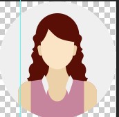
<div class="main">
<img class="main-left" src="header.png" height="80px" alt="">
<div class="main-right">
<p>徐士林 55岁</p>
<p class="main-bottom"><img src="ico.png" height="15px" alt=""> 京城.四方.报纸林</p>
</div>
</div>
<div class="content-header">
<span class="item-span">专业技能</span>
</div>
<div class="content-footer">
<div class="row">
<span class="row1-item"><img src="star.png" height="16px" alt=""><p>住家</p></span>
<span class="row1-item"><img src="star.png" height="16px" alt=""><p>不含餐</p></span>
</div>
<div class="row">
<span class="row2-item1">从业年限</span>
<span class="row2-item2">0~3年</span>
</div>
<div class="row">
<span class="row2-item1">工作时间</span>
<span class="row2-item2">全天</span>
</div>
<div class="row">
<span class="row2-item1">服务价格</span>
<span class="row4-item">25元/小时</span>
</div>
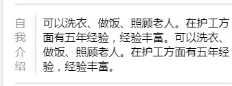
<div class="row5">
<div class="row5-item2">自我介绍</div>
<div class="row5-item1">可以洗衣、做饭、照顾老人。在护工方面有五年经验,经验丰富。可以洗衣、做饭、照顾老人。在护工方面有五年经验,经验丰富。</div>
</div>
</div>
<div class="row-footer"></div>
<footer>
<div class="footer-left">留言</div>
<div class="footer-right">电话联系</div>
</footer>
</body>
</html>
明天计划的事情:总结任务,深度思考,学习雪碧图,配置任务6.
遇到的问题:img用vertical-align垂直居中,无法实现,最后发现因为他的父级不是块级元素,最后用display:block,position:absolute,top和bottom为零,margin:auto 0,来实现。
收获:学会了使用fiex布局,在居中方面很好用。

 返回列表
返回列表


评论