发表于: 2018-10-08 22:57:58
1 789
今天完成的事情:(一定要写非常细致的内容,比如说学会了盒子模型,了解了Margin)
今晚完成了任务八的部分页面
明天计划的事情:(一定要写非常细致的内容)
继续完成任务
遇到的问题:(遇到什么困难,怎么解决的)
遇到了关于栅格系统的问题,是否所有的栅格系统都可以在里面设置样式,并且保证不影响其他代码的情况下
写成自己的样式,还是说有些栅格系统就是固定的,无法进行修改样式呢
收获:(通过今天的学习,学到了什么知识)
今天只是看了一下这样的东西
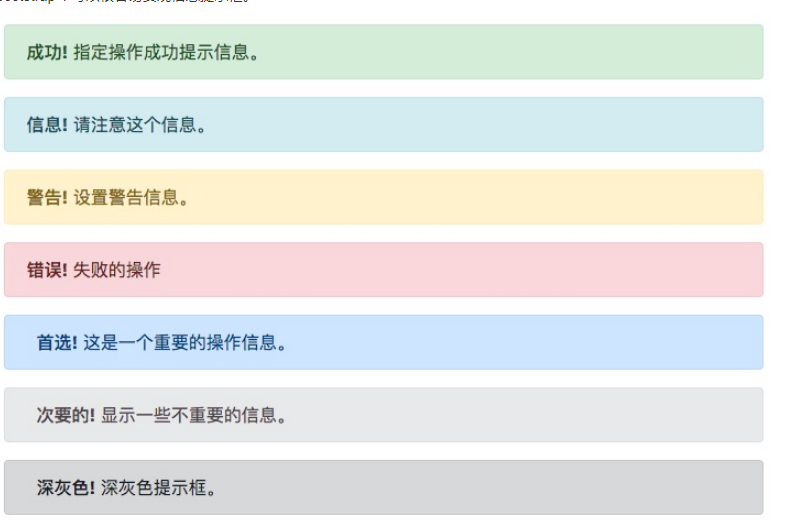
提示框可以使用 .alert 类, 后面加上 .alert-success, .alert-info, .alert-warning, .alert-danger, .alert-primary, .alert-secondary, .alert-light 或 .alert-dark 类来实现:
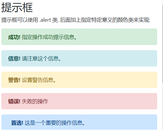
提示框添加链接
提示框中在链接的标签上添加 alert-link 类来设置匹配提示框颜色的链接:
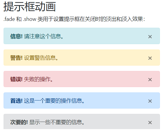
提示框动画
.fade 和 .show 类用于设置提示框在关闭时的淡出和淡入效果:
<!DOCTYPE html>
<html>
<head>
<title>Bootstrap 实例</title>
<meta charset="utf-8">
<meta name="viewport" content="width=device-width, initial-scale=1">
<link rel="stylesheet" href="https://cdn.bootcss.com/bootstrap/4.1.0/css/bootstrap.min.css">
<script src="https://cdn.bootcss.com/jquery/3.2.1/jquery.min.js"></script>
<script src="https://cdn.bootcss.com/popper.js/1.12.5/umd/popper.min.js"></script>
<script src="https://cdn.bootcss.com/bootstrap/4.1.0/js/bootstrap.min.js"></script>
</head>
<body>
<div class="container">
<h2>提示框动画</h2>
<p>.fade 和 .show 类用于设置提示框在关闭时的淡出和淡入效果:</p>
<div class="alert alert-success alert-dismissable fade show">
<button type="button" class="close" data-dismiss="alert">×</button>
<strong>成功!</strong> 指定操作成功提示信息。
</div>
<div class="alert alert-info alert-dismissable fade show">
<button type="button" class="close" data-dismiss="alert">×</button>
<strong>信息!</strong> 请注意这个信息。
</div>
<div class="alert alert-warning alert-dismissable fade show">
<button type="button" class="close" data-dismiss="alert">×</button>
<strong>警告!</strong> 设置警告信息。
</div>
<div class="alert alert-danger alert-dismissable fade show">
<button type="button" class="close" data-dismiss="alert">×</button>
<strong>错误!</strong> 失败的操作。
</div>
<div class="alert alert-primary alert-dismissable fade show">
<button type="button" class="close" data-dismiss="alert">×</button>
<strong>首选!</strong> 这是一个重要的操作信息。
</div>
<div class="alert alert-secondary alert-dismissable fade show">
<button type="button" class="close" data-dismiss="alert">×</button>
<strong>次要的!</strong> 显示一些不重要的信息。
</div>
<div class="alert alert-dark alert-dismissable fade show">
<button type="button" class="close" data-dismiss="alert">×</button>
<strong>深灰色!</strong> 深灰色提示框。
</div>
<div class="alert alert-light alert-dismissable fade show">
<button type="button" class="close" data-dismiss="alert">×</button>
<strong>浅灰色!</strong>浅灰色提示框。
</div>
</div>
</body>
</html>

 返回列表
返回列表


评论