今天完成的事情:
做任务十四、十五,今天自己写栅格布局,边写代码边调整,花了点时间,今天才写完第一个页面,明天应该可以进度快点,做完剩下的。
明天计划的事情:
做完css任务,提交任务,请师兄帮忙看代码,找出不足,进行完善
遇到的问题:
收获
今天主要是有两个部分尝试了一会,一个是折叠的导航栏,一个是css实现的轮播图。
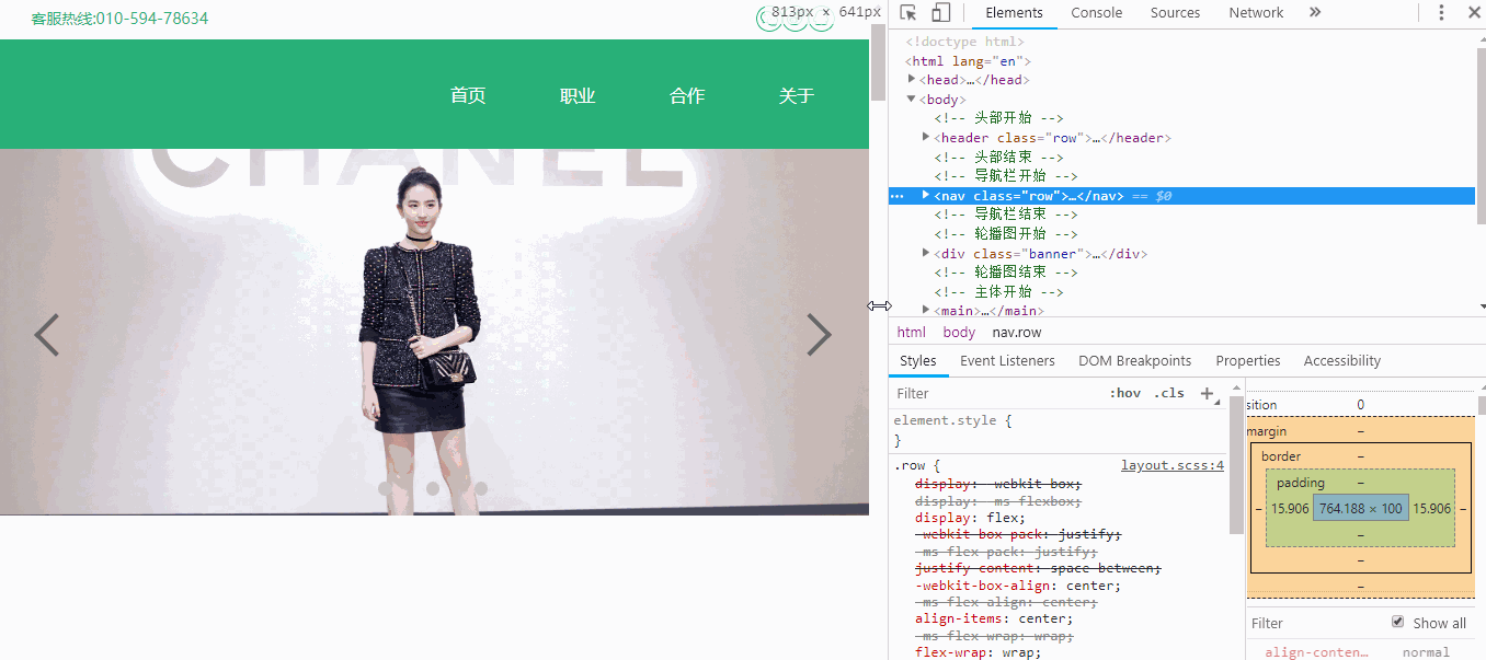
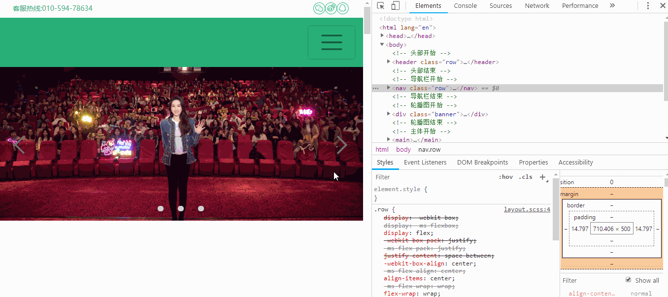
导航栏效果:
代码:
/* 导航栏开始 */
nav {
position: relative;
justify-content: flex-end !important;
min-height: $h100;
background: $bg29;
@media screen and (min-width: 768px) {
.row {
width: 400px;
padding: 0;
a {
@include flex(center, center);
@include box($h100, $h100);
@include font($fz16, $bgff);
// margin: auto;
&:hover {
border-bottom: 4px solid $bgff;
box-sizing: border-box;
}
}
}
}
@media screen and (max-width:767px) {
.row {
flex-direction: column;
align-items: flex-end;
@include box(100px, 70px);
padding: 0;
background: url(../../images/button.png) no-repeat -17px -10px;
&:hover {
margin-top: 15px;
padding-bottom: 415px;
}
&:hover a:nth-child(1) {
position: absolute;
top: 100px;
left: 0;
@include flex(center, center);
width: 100vw;
height: $h100;
}
&:hover a:nth-child(2) {
position: absolute;
top: 200px;
left: 0;
@include flex(center, center);
width: 100vw;
height: $h100;
}
&:hover a:nth-child(3) {
position: absolute;
top: 300px;
left: 0;
@include flex(center, center);
width: 100vw;
height: $h100;
}
&:hover a:nth-child(4) {
position: absolute;
top: 400px;
left: 0;
@include flex(center, center);
width: 100vw;
height: $h100;
}
a {
display: none;
// @include flex(center, center);
@include box(0, 0);
@include font($fz16, $bgff);
&:hover {
background: #0f0;
}
}
}
}
}
思路:(纯粹是用当前学到的知识,实现导航栏的效果,没有其他意义)
在页面宽度大于767px时,导航栏显示的是四个a标签;
在页面宽度小于768px时,导航栏显示为一个图标,a标签隐藏。当鼠标悬停到图标上时,a标签显示为块级元素。我这里用了定位来确定a标签的不同位置,所以导航栏下拉的部分是用鼠标悬停时,利用当前图标盒子的padding值来给出的一个足够的高度。
轮播图:(利用animation属性,从我个人来说,目前只能做到自动轮播,左右箭头及下面的li标签都是没用的)
效果图:
代码:
/* 轮播图开始 */
// body {
// overflow: hidden;
// }
.banner {
position: relative;
// height: 809px;
// width: 100%;
.photo {
// width: 100%;
overflow: hidden;
img {
position: absolute;
width: 100%;
}
img:nth-child(1) {
animation: ban1 8s ease-out infinite;
}
img:nth-child(2) {
animation: ban2 8s ease-out infinite;
}
img:nth-child(3) {
position: relative;
animation: ban3 8s ease-out infinite;
}
}
}
.photo {
span {
position: absolute;
z-index: 5;
@include box(3vw,3vw);
}
span:nth-child(4) {
right: 5%;
top: 50%;
border-top: 4px solid #666;
border-right: 4px solid #666;
transform: translateY(-50%) rotate(45deg);
}
span:nth-child(5) {
left: 5%;
top: 50%;
border-top: 4px solid #666;
border-left: 4px solid #666;
transform: translateY(-50%) rotate(-45deg);
}
ul {
position: absolute;
bottom: 2%;
z-index: 5;
@include flex(center,center);
width: 100%;
li {
float: left;
@include box(1.5vw,1.5vw);
margin: 0 2%;
border-radius: 50%;
// border: 1px solid $bgff;
background: #ccc;
}
}
}
@keyframes ban1 {
0%,
25% {
z-index: 3;
}
35%,
60% {
z-index: 2;
}
70%,
100% {
z-index: 1;
}
}
@keyframes ban2 {
0%,
25% {
z-index: 2;
}
35%,
60% {
z-index: 3;
}
70%,
100% {
z-index: 1;
}
}
@keyframes ban3 {
0%,
25% {
z-index: 1;
}
35%,
60% {
z-index: 2;
}
70%,
100% {
z-index: 3;
}
}
思路:
先做轮播,后添加左右箭头和li标签圆点(目前只能做到这种效果)。
通过绝对定位,让三张图片重合在一起,使用animation属性结合z-index属性,在不同的时间段,使图片的z-index值变化,从而达到随时间变化,图片轮播的效果。

 返回列表
返回列表


评论