发表于: 2018-08-05 18:20:49
1 533
今天完成的事情:
1.切图
2.写魔镜页面的html和css
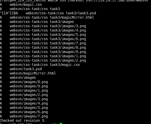
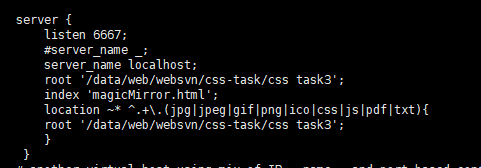
3.svn同步检出,使用nginx发布
切图:
ps生成切图:
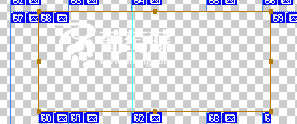
自动划分切片,细调;
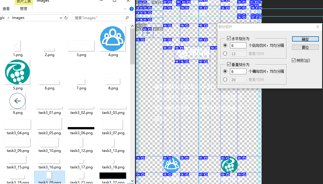
或者直接用切片工具切:
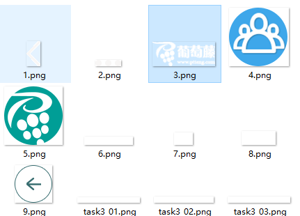
命名切片,导出png-24
也可以下载btn进行一键切图;
但是切出来的图不好,有毛边:

同步git:
svn服务器检出:
配置nginx:
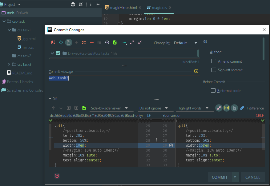
css:
*{ margin: 0; padding: 0;}

body{
    Font-size:62.5%;
    background-color: rgb(51,204,204);
    color:#ffffff;
}

.clean{
    clear: both;
}
.fi{

    font-size:1.5em;
}

.return{
    width: 2rem;
    margin:1em 0 0 1em;
}
.return img{
    width: 100%;
}

.ptt{
    /*position:absolute;*/
    left: 20%;
    bottom: 50%;
    width:15rem;
    /*margin: 10% auto 10em;*/
    margin:10% auto;
    text-align:center;
}
.ptt img{
    width:65%;
}

.body-text{
    position:absolute;
    left: 20%;
    bottom: 50%;
    margin: auto;
    text-align:center;
    width:60%;
    color:#fff;
}
.btm{
    position:absolute;
    left: 20%;
    bottom: 20%;
    width:60%;
    text-align: center;
}
.btm div{
    float: left;
}
.btm div:nth-child(2n+2){
    float:right;
}
.btm div img{
    width: 4rem;
}
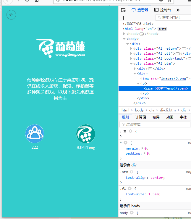
html:
<!DOCTYPE html>
<html lang="en">
<head>
<meta charset="UTF-8">
<title>Title</title>
<link href="magic.css" rel="stylesheet">
</head>
<body>
<div>
<div class="fi return">
<img src="images/9.png">
</div>
<div class="clean"></div>
<div class="fi ptt">
<img src="images/3.png">
</div>
<div class="clean"></div>
<div class="fi body-text">
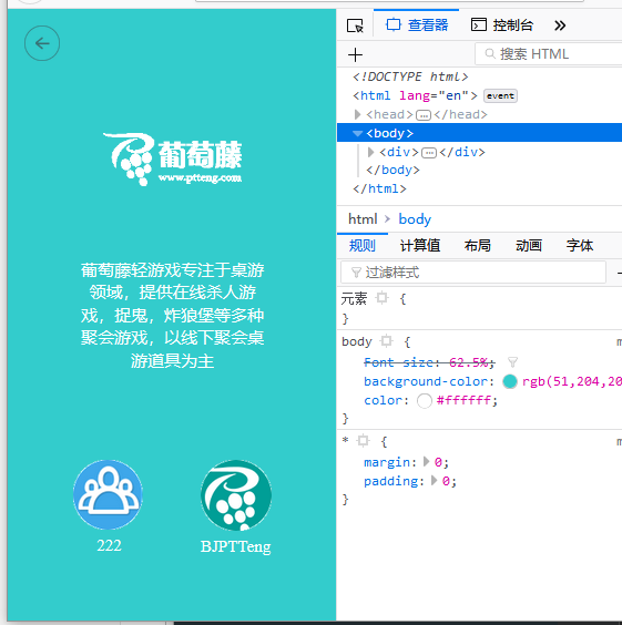
<p><span>葡萄藤轻游戏专注于桌游领域,提供在线杀人游戏,捉鬼,炸狼堡等多种聚会游戏,以线下聚会桌游道具为主</span></p>
</div>
<div class="clean"></div>
<div class="fi btm">
<div >
<img src="images/4.png">
<p><span>222</span></p>
</div>
<div >
<img src="images/5.png">
<p><span>BJPTTeng</span></p>
</div>
</div>
</div>
</body>
</html>
页面地址:葡萄藤
px:固定
响应式,根据font-size:
em:根据父节点
rem:根据根节点
固定端使用px,自适应使用em,移动端使用rem;考虑到兼容性可一起使用
明天计划的事情:
继续学习css,任务
遇到的问题:
浏览器和移动端不兼容
*页面兼容性差,移动端不能看
收获:
position:absolute; 定位,居中
em和rem概念

 返回列表
返回列表


评论