今日完成:
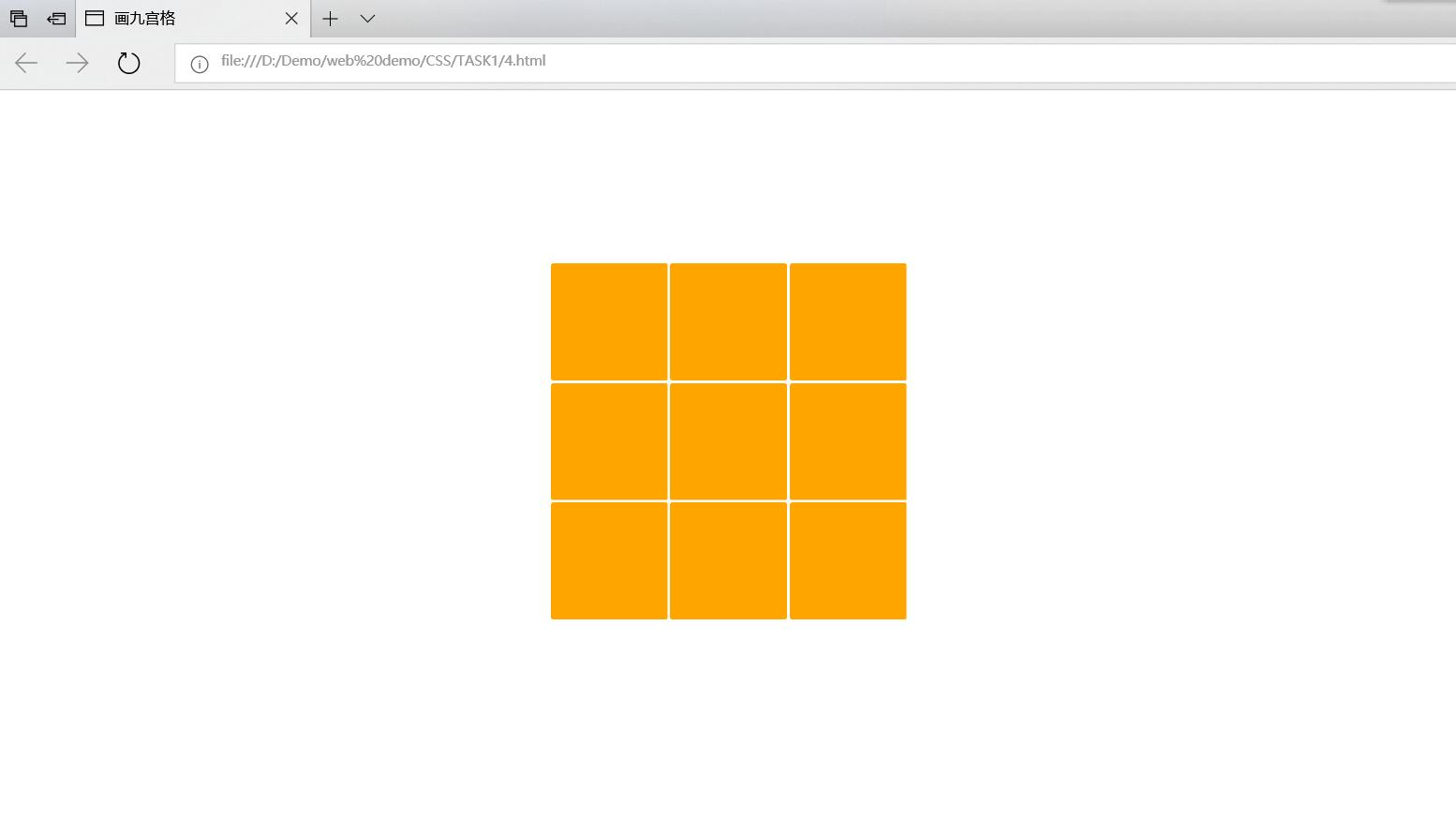
以float浮动方式布局,组合九宫格
查看《chrome开发者工具》,
<!DOCTYPE HTML>
<meta charset="UTF-8">
<head>
<title>
画九宫格
</title>
<style type="text/css">
#box{
padding-left: 460px;
padding-top:140px;
width:400px;
}
#block1{
float:left;
background: orange;
border:2px;
border-radius: 2px;
height:100px;
width:100px;
margin-left: 2px;
}
#block2{
float:left;
background: orange;
border-radius: 2px;
height:100px;
width:100px;
margin-left:2px;
}
#block3{
float:left;
background: orange;
border-radius: 2px;
height:100px;
width:100px;
margin-left:2px;
}
#block4{
float:left;
background: orange;
border-radius: 2px;
height:100px;
width:100px;
margin-left:2px;
margin-top: 2px;
}
#block5{
float:left;
background: orange;
border-radius: 2px;
height:100px;
width:100px;
margin-left:2px;
margin-top: 2px;
}
#block6{
float:left;
background: orange;
border-radius: 2px;
height:100px;
width:100px;
margin-left:2px;
margin-top: 2px;
}
#block7{
float:left;
background: orange;
border-radius: 2px;
height:100px;
width:100px;
margin-left:2px;
margin-top: 2px;
}
#block8{
float:left;
background: orange;
border-radius: 2px;
height:100px;
width:100px;
margin-left:2px;
margin-top: 2px;
}
#block9{
float:left;
background: orange;
border-radius: 2px;
height:100px;
width:100px;
margin-left:2px;
margin-top: 2px;
}
</style>
</head>
<body>
<div id="box">
<div id="block1">
</div>
<div id="block2">
</div>
<div id="block3">
</div>
<div id="block4">
</div>
<div id="block5">
</div>
<div id="block6">
</div>
<div id="block7">
</div>
<div id="block8">
</div>
<div id="block9">
</div>
</div>
</body>
</html>
效果:
明日计划:
代码调试)使用Chrome的开发者工具(F12/Ctrl+shift+I),调试页面(0.5小时)
(编码实战)进一步修改样式,使九宫格大小可以随屏幕宽度改变,初步体验自适应(0.5小时)
遇到的问题:
没有使用chrome浏览器,平时用QQ浏览器较多,里面也有开发者工具,应该也可以调试页面吧。但感觉介绍chrome工具里面的知识也是挺多的,一点点积累吧。
收获:
<div>可定义文档中的分区或节(division/section)
<div>标签可以把文档分割为独立的、不同的部分
<div>是一个块级元素,它的内容会自动开始一个新行
换行是<div>固有的唯一格式表现,可以通过<div>的class或id应用额外的样式

 返回列表
返回列表


评论