发表于: 2018-06-06 18:18:11
1 588
今天做了一点任务五
遇到的问题
1.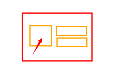
给箭头指向的父元素添加了display:inline-block,vertical-alight:middle,原以为里面的元素会垂直居中,结果没有反应
2.参照720的psd做的html,在320尺寸时,排版过大,怎么样才能完全参照720的psd做出适配所有移动端的页面呢?
为此找到了几种解决方法:1.px2rem
2.flexible
3.媒体查询
html{ font-size: 38px; }@media only screen and (min-width: 320px) { html { font-size: 42.666px !important; } }@media only screen and (min-width: 360px) { html { font-size: 48px !important; } }@media only screen and (min-width: 375px) { html { font-size: 50px !important; } }@media only screen and (min-width: 414px) { html { font-size: 55.2px !important; } }@media only screen and (min-width: 480px) { html { font-size: 64px !important; } }@media only screen and (min-width: 560px) { html { font-size: 74.666px !important; } }@media only screen and (min-width: 640px) { html { font-size: 85.333px !important; } }@media only screen and (min-width: 720px) { html { font-size: 96px !important; } }@media only screen and (min-width: 750px) { html { font-size: 100px !important; } }@media only screen and (min-width: 800px) { html { font-size: 106.666px !important; } }@media only screen and (min-width: 960px) { html { font-size: 128px !important; } }
我个人还是觉得媒体查询比较靠谱。虽然网易和淘宝使用的适配特别高大上,可能是我还不是太会使用用不好。
https://zhuanlan.zhihu.com/p/25216275
明天计划的事:
不想那么草率的结束任务。
明天还是看一下网易和淘宝使用的适配方式,虽然网易之前的效果不是太好,但是有没有可能是我的用法不对。
收获:学习了vertical-alight的使用

 返回列表
返回列表


评论