发表于: 2017-07-07 16:33:07
1 1008
今天着重学习div盒子float浮动排列,盒子的圆角是如何设置的,单位px em rem各自的用途
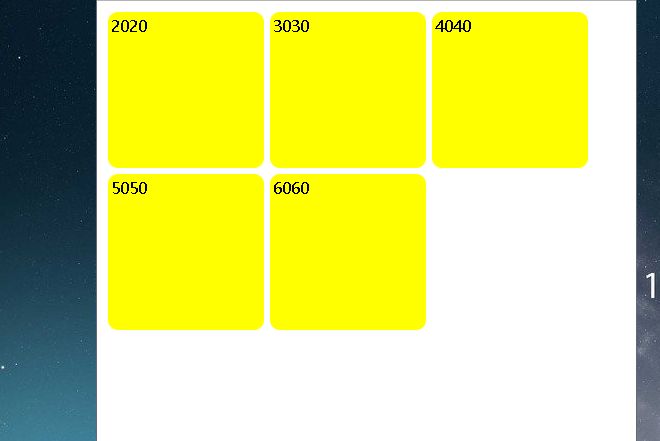
盒子在浮动排列过程中无法自动换行,在浏览器窗口放大的情况下盒子会横向排列,目前仍未解决
clear,清除浮动。
明天要做的事:学会如何设置格子自动换行,不管在窗口多大的情况下都能以九宫格排列,学会自适应,使格子的大小随视口大小变化。
以下为代码:
| <html> | |
| <head> | |
| <style type="text/css"> | |
| .box{ | |
| width:150px;height:150px;margin:3px;padding:3px;background-color:yellow; | |
| border-radius:10px;float:left; | |
| } | |
| .box thri{clear:both;} | |
| </head> | |
| </style> | |
| <body> | |
| <div class="box">2020</div> | |
| <div class="box">3030</div> | |
| <div class="box">4040</div> | |
| <div class="box">5050</div> | |
| <div2 class="box">6060</div2> | |
| </body> | |
| </html> | |
| </html> | |

 返回列表
返回列表


评论