发表于: 2022-09-28 19:40:27
0 475
我们在用bootstrap做前端开发的时候,经常会用到列移动、列排列,特别是在调试大屏幕显示器上显示效果时,经常用到。
首先看这3个英文单词的中文含义解释:
offset 补偿(课本上或相关教程上一般都把这个叫做“偏移”),其实就是在左侧补列(1~11列)
push 推
pull 拉
偏移、推、拉,都有一个参照物,即相对的位置,那就是左侧, 相对于左侧偏移、推、拉
写法比如:
col-md-offset-3(在左侧补充3列 )
col-md-push-8(从左侧往右侧推8列)
col-md-pull-2(往左侧拉2列)
从效果上看offset和push效果一样,其实采取的方法是不同的,offset是直接在左侧补列达到偏移的效果,push是通过位置移动达到移动的效果
offset类似于relative 移动且占据之前位置,push、pull 则像 absolute 脱离文档流
首先说明:
1、col-列;
2、xs-maxsmall,超小;sm-small,小;md-medium,中等;
3、-*表示占列,即占自动每行row分12列栅格系统比;
4、col-xs-*超小屏幕 手机 (<768px),
.col-sm-*小屏幕 平板 (≥768px),
.col-md-*中等屏幕 桌面显示器 (≥992px)(栅格参数).
5、不管在哪种屏幕上,栅格系统都会自动的每行row分12列 col-xs-*和col-sm-* 和col-md-*后面跟的参数表示在当前的屏幕中 每个div所占列数。
例如 <div class="col-xs-6 col-md-3"> 这个div在屏幕中占的位置是: .col-xs-6 在超小屏幕中占6列 也就是屏幕的一半(12/6列=2个div) ,
.col-md-3 在中单屏幕中占3列也就是1/4(12/3列=4个div)。
6、反推,如果我们要在小屏幕上并排显示3个div(12/3个=每个占4 列 ),则col-xs-4;在大屏幕上显示6个div(12/6个=每个占2列 ) ,
则 col-md-2;这样我们就可以控制我们自己想要的什么排版了。
html代码:
<!DOCTYPE html>
<html lang="en">
<head>
<meta charset="UTF-8">
<meta name="viewport" content="width=720,initial-scale=1">
<link rel="stylesheet" href="homepage.css">
<link href="https://cdn.bootcdn.net/ajax/libs/twitter-bootstrap/5.2.0/css/bootstrap.min.css" rel="stylesheet">
<title>Title</title>
</head>
<body>
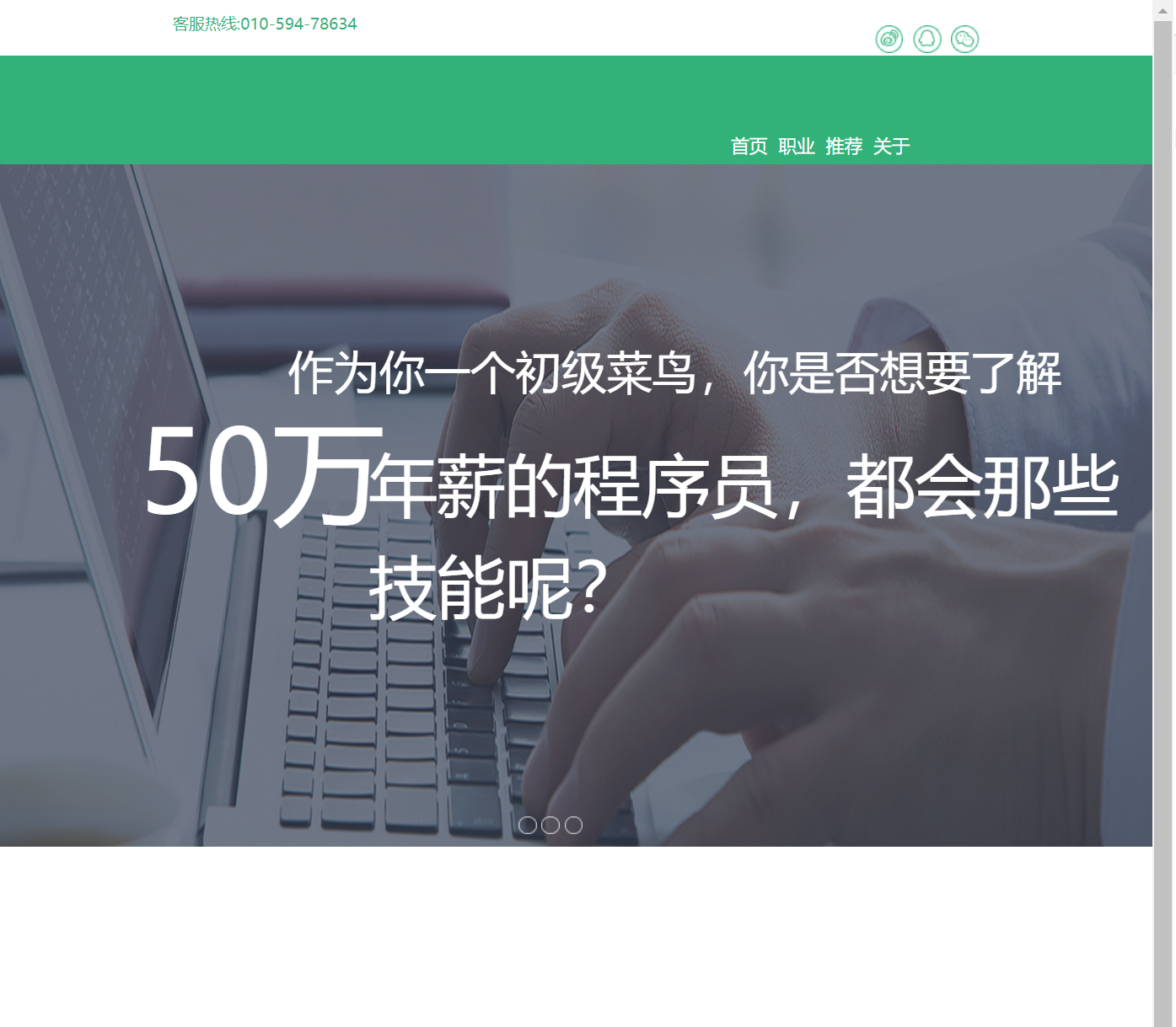
<div class="box">
<div class="head col-md-12">
<p>客服热线:010-594-78634</p>
<div class="chart">
<img class="icon" src="tupian/图层%201.png">
<img class="icon" src="tupian/图层%202.png">
<img class="icon" src="tupian/图层%203.png">
</div>
</div>
<div class="navigation col-md-12">
<ul>
<li class="about">首页</li>
<li class="about">职业</li>
<li class="about">推荐</li>
<li class="about">关于</li>
</ul>
</div>
<div class="content col-md-12">
<img class="image" src="tupian/Image.png">
<p class="word1">作为你一个初级菜鸟,你是否想要了解</p>
<p class="word2">50万</p>
<p class="word3">年薪的程序员,都会那些技能呢?</p>
<img class="ellipse1" src="tupian/椭圆%207%20拷贝.png">
<img class="ellipse2" src="tupian/椭圆%207%20拷贝.png">
<img class="ellipse3" src="tupian/椭圆%207%20拷贝.png">
</div>
<div>
<div></div>
<div></div>
<div></div>
<div></div>
</div>
<div></div>
<div></div>
<div></div>
<div></div>
<div></div>
</div>
</body>
</html>
css代码:
* {
margin: 0;
   padding: 0;
}

.box {
height: 100vh;
   margin: 0 auto;
}

ul {
list-style-type: none;
   width: 200px;
   background-color: #29b078;
   float: right;
   margin-right: 20%;
}

li {
width: auto;
   display: inline-block;
   margin-top: 40%;
   margin-right: 3%;

}

.about {
font-size: 16px;
   color: #ffffff;
}

.head {
height: 39px;
   width: auto;
}

.head p {
font-size: 14px;
   color: #29b078;
   margin: 1% 0 0 15%;
}

.chart {
width: auto;
   margin-right: 15%;
}

.icon {
float: right;
   margin-top: -1%;
   margin-left: 1%;
}

.navigation {
background-color: #29b078;
   height: 100px;
}

.content {
width: 100%;
   height: 100%;
   position: relative;

}

.image {
margin-top: -12px;
   width: 1920px;
   height: 600px;
   max-height: 100%;
   max-width: 100%;
}

.word1 {
font-size: 40px;
   color: #ffffff;
   position: absolute;
   top: 14%;
   left: 25%;
}

.word2 {
font-size: 100px;
   color: #ffffff;
   position: absolute;
   top: 18%;
   left: 12%;
}

.word3 {
font-size: 60px;
   color: #ffffff;
   position: absolute;
   top: 22%;
   left: 32%;
}

.ellipse1 {
position: absolute;
   top: 54%;
   left: 45%;

}

.ellipse2{
position: absolute;
   top: 54%;
   left: 47%;

}

.ellipse3 {
position: absolute;
   top: 54%;
   left: 49%;

}
页面效果:
明天计划:完成接下来的任务。

 返回列表
返回列表


评论