发表于: 2022-02-16 21:08:31
0 2726
今天完成的事情,今天再看js的基础知识,昨天和前天完成任务14和15,今天开始看关于js。在完成任务14和15时主要是在轮播图和响应式导航菜单栏花费时间,在做响应式导航菜单栏因为要利用纯css且不使用bootstrap的css与js的条件下,自己单独实验通过input【type=checkbox 】模拟点击事件来做下拉点击,然后设置点击后下来菜单出现的方式,以及在不同分辨率下导航按钮的显示
//导航
.dh{
width: 100%;
height: auto;
position: relative;
top: 0;
left: 0;
right: 0;
background-color: green;
z-index: 3;
}
.dh > div.bggreen{
float: left;
height: 40px;
margin-bottom: -40px;
width: 100%;
background-color: #008000;
}
.dh > label > div.menu > div.a > a,
.dh > div.menu2 > div.a1 > a{
font-family: monospace;
text-decoration: none;
color: #fff;
}
//div.dh下的元素div.menu2
div.dh > div.menu2{
margin-top: -150px;
//transition: .5s ease-out;
position: absolute;
top: 0;
left: 0;
right: 0;
width: 100%;
height: 120px;
background-color: green;
z-index: 2;
}
//input[type=checkbox]可以对所有带有 type=checkbox 属性的input应用样式
input[type=checkbox] {
display: none;
}
@media (min-width:680px) {
.dh{
min-height: 40px;
}
.menu{
width: 100%;
background-color: green;
.a{
width: 50px;
float: right;
line-height: 40px;
font-size: 16px;
color: #fff;
margin-right: 20px;
position: relative;
text-align: center;
&:hover .border5{
display: block;
}
}
}
.b{
display: none;
}
}
@media (max-width:680px) {
.dh{
min-height: 40px;
}
.menu{
display: none;
}
//相邻兄弟选择器使用了加号(+),即相邻兄弟结合符 用一个结合符只能选择两个相邻兄弟中的第二个元素
#checkbox1:checked + .menu2{
// margin-top: 40px;
.menu2{
display: block;
}
position: relative;
top: 0;
left: 0;
right: 0;
width: 100%;
height: 160px;
Diandian_zy:
padding-top: 40px;
margin-top: 0px;
z-index: -99999999;
}
// div.dh label > div.menu > div{
// display: none;
// }
div.dh label > div.menu {
display: none;
}
.menu{
width: 100%;
height: 40px;
background-color: green;
z-index: 4;
}
.b{
display: block;
float: right;
position: relative;
top: 0;
right: 30px;
margin: 5px 30px -35px 0;
width: 30px;
height: 30px;
background-color: rgba(240, 240, 240, .1);
background-image: url(../img/菜单.png);
background-size: 35px;
background-position: center;
z-index: 4;
border-radius: 2px;
border: 1px solid rgba(240, 240, 240, .1);
}
.b:hover{
border: 1px solid rgba(240, 240, 240, .3);
}
.menu2{
position: absolute;
top: 0;
left: 0;
right: 0;
width: 100%;
height: 120px;
background-color: green;
z-index: -1;
.a1{
width: 100%;
height: 30px;
text-align: center;
font-size: 16px;
line-height: 30px;
color: #fff;
z-index: 1;
}
}
}
来实现下拉,过程中出现很多的问题,比如下拉出的菜单项会覆盖下面的轮播图,然而有同时不能改变菜单的absolute属性 所以只能给导航设置一个小的高度 .dh{
min-height: 40px;
}
使之能挤压下面元素达到不遮挡的条件,然后还要解决小分辨下导航键的独立性,不能点击整个导航就出现下拉菜单 所以要把点击的判断项缩小为相对小的导航按键,然后由于太多的元素块叠加造成布局变型,后面在一点一点的实验中完善。
对于轮播图响本来是需要js来控制轮播但不使用bootstrap后基本无法使用后面经过对网上搜索引擎搜索的结果做参考,
//轮播图
.slide {
position: relative;
top: 0;
left: 0;
right: 0;
width: 100%;
height: auto;
text-align: center;
font-family: Arial;
color: #000;
overflow: hidden;
z-index: -2;
ul {
margin: 0;
padding: 0;
width: 400%;
transition: all 3s;
}
}
//自动播放
.slide .slide-auto {
animation: marginLeft 20s infinite;
}
.slide li {
float: left;
width: 25%;
height: auto;
list-style: none;
font-size: 36px;
}
//动画时间
@keyframes marginLeft {
0% {
margin-left: 0;
}
20% {
margin-left: 0;
}
30% {
margin-left: -100%;
}
50% {
margin-left: -100%;
}
60% {
margin-left: -200%;
}
80% {
margin-left: -200%;
}
90% {
margin-left: -300%;
}
100% {
margin-left: -300%;
}
}
本来轮播老是出现轮播到最后一幅图,会有一个反向轮播跳到第一副图的情况,经过改进在最后一副图后加入第一副图,把轮播时间设置极限小,会看起来是不停的轮播,然后通过调整轮播的图片数改变轮播的宽度 达到轮播图的效果,两个任务大约花费4天半,
明天计划看任务js任务1
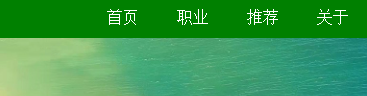
遇到的问题,在导航栏上出现问题,经过很多的测试,也没有找到结果, 在大分辨率上
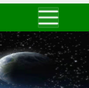
小分辨率下
在小分辨率下显示
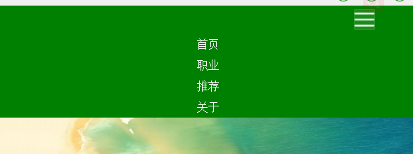
转到大分辨率下下拉菜单消失,但是再切换为小分辨率菜单会自己打开还没解决
收获,独立通过自己尝试完成轮播图,导航,在学习中收获很多。

 返回列表
返回列表


评论