发表于: 2020-03-18 23:01:43
1 1375
编辑日报内容...
一.今日完成的内容和收获:
(一)布局让header紧贴顶部
代码:
1.html部分
<header class="head">
<div class="box">
<div class="box-l">找雇主</div>
<div class="box-r">找护工</div>
</div>
<img src="task6-1.png" alt="地址图标" class="location">
</header>
2.css部分
.head {
width: 100%;
height: 4rem;
background-color: #5fc0cd;
position: fixed;
}
.box {
margin: .5rem auto; /* 让盒子水平居中 */
width: 12rem;
height: 3rem;
background-color: #55a8b3;
line-height: 3rem;
position: relative;
border-radius: 10px;
}
.box-l { /* 找雇主 */
position: absolute;
left: 1rem;
color: white;
font-size: 1.5rem;
}
.box-r { /* 找护工 */
text-align: center;
float: right;
width: 50%;
height: 3rem;
background-color: white;
font-size: 1.5rem;
border-radius: 10px;
color: #5fc0cd;
}
.location { /* 地址图标 */
position: absolute; /* 垂直居中 */
top: 50%;
transform: translateY(-50%); /* 垂直居中 */
right: 1rem;
width: 2rem;
height: 2rem;
}
(二)布局让footer紧贴底部
1.html部分
<footer class="foot">
<div>
<img src="task6-2.png" alt="house" class="foot-l">
<br>
<span>首页</span>
</div>
<img src="task6-3.jpg" alt="write" class="foot-m">
<div>
<img src="task6-4.jpg" alt="me" class="foot-r">
<br>
<span style="color: #bcbdbe;">我的</span>
</div>
</footer>
2.css部分
.foot {
width: 100%;
height: 5rem;
background-color: #f8fafb;
position: fixed;
bottom: 0;
display: flex; /* 采用flex布局 */
align-items: center; /* 在交叉轴的中点对齐 */
justify-content: space-around; /* 每个项目两侧的距离相等 */
border-top: 1px solid #e2eaec;
}
.foot span {
color: #5fc0cd;
}
.foot-l {
width: 2rem;
height: 2rem;
}
.foot-m {
width: 5rem;
height: 5rem;
}
.foot-r {
width: 2rem;
height: 2rem;
}
(三)border边框渐变效果
1.线性渐变(linear-gradient)
(1)语法:必须至少要定义两种颜色,我们也可以设置一个起点或一个方向或者一个角度
background-image: linear-gradient(direction, color-stop1, color-stop2, ...);
(2)默认情况下是从上到下渐变
background-image: linear-gradient(#e66465, #9198e5);
(3)从左到右
background-image: linear-gradient(to right, red , yellow);
(4)从左上角到右下角
background-image: linear-gradient(to bottom right, red, yellow);
(四)html超过部分显示为省略号
overflow: hidden; /* 文字溢出隐藏 */
text-overflow: ellipsis; /* 文字超出容器宽度时,文字被隐藏的文字用省略号代替 */
white-space: nowrap; /* 强制文字不换行 */
text-overflow:ellipsis 属性只能用于块级元素或内块元素,对行内元素是不起作用的。
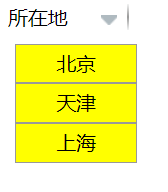
(五)CSS模拟下拉框
1.display:none和display:block切换 将代码部分需要用到的地方摘选出来,用来练习模拟下拉框,能够实现只有鼠标放到小三角形时才可以让菜单显示
<!DOCTYPE html>
<html lang="en">
<head>
<meta charset="UTF-8">
<meta name="viewport" content="width=device-width, initial-scale=1.0">
<title>Document</title>
<style>
.main-h-l {
float: left;
width: 6rem;
border-right: 2px solid;
position: relative;
border-image: linear-gradient(#fafbfb, #999999, #fafbfb)1 1 1;/* 颜色渐变效果 */
}
.select {
list-style-type: none; /* 去掉li的样式 */
position: absolute;
top: -1rem;
right: .5rem;
}
.main-p {
float: right;
position: absolute;
right: 0;
}
li {
width: 6rem;
height: 30px;
background-color: yellow;
border: 1px solid #999;
line-height: 30px;
position: relative;
left: 1rem;
top: 2rem;
display: none; /* 隐藏菜单 */
text-align: center;
}
.select:hover li {
display: block; /* 当鼠标悬浮在select上时,会显示出li菜单 */
}
</style>
</head>
<body>
<div class="main-h-l">所在地
<ul class="select">
<a href="#" class="main-p"><img src="task6-5.png" alt="下拉框" ></a>
<li>北京</li>
<li>天津</li>
<li>上海</li>
</ul>
</div>
</body>
</html>
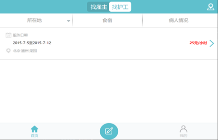
(六)main部分
1.html部分
<main class="main">
<div class="main-h">
<div class="main-h-l">所在地
<a href="#" class="main-p"><img src="task6-5.png" alt="下拉框" ></a>
</div>
<div class="main-h-m">食宿</div>
<div class="main-h-r">病人情况</div>
</div>
<div class="text-1">
<div class="bg-data"></div>
<span>服务日期</span>
<p class="data-2">2015-7-5至2015-7-12</p>
<strong class="price">25元/小时</strong>
<div class="bg-jiantou"></div>
<div class="bg-location"></div>
<span>北京·通州·果园</span>
</div>
</main>
2.css部分
.main-h {
width: 100%;
height: 4rem;
font-size: 1.3rem;
line-height: 4rem;
text-align: center;
color: #999999;
border-bottom: 1px solid #999999;
}
.main-h-l {
float: left;
width: 33%;
border-right: 2px solid;
border-image: linear-gradient(#fafbfb, #999999, #fafbfb)1 1 1;/* 颜色渐变效果 */
}
.main-p {
float: right;
position: relative;
right: .5rem;
}
.main-h-m{
float: left;
width: 32%;
border-right: 2px solid;
border-image: linear-gradient(#fafbfb, #999999, #fafbfb)1 1 1;
}
.main-h-r {
float: left;
width: 33%;
}
.bg-location { /* 雪碧图地址标 */
width: 26px; height: 25px;
background: url(css_sprites.png) -95px -10px;
position: absolute;
top: 6.2rem;
left: 1.5rem;
}
.bg-jiantou { /* 雪碧图剪头标 */
width: 20px; height: 33px;
background: url(css_sprites.png) -10px -10px;
position: absolute;
right: 1rem;
top: 50%;
transform: translateY(-50%);
}
.bg-data { /* 雪碧图日期标 */
width: 26px; height: 25px;
/*background: url('css_sprites.png') -49px -10px;*/
background-image: url(css_sprites.png);
background-position: -49px -10px;
position: relative;
top: 1.5rem;
left: 1.5rem;
}
.text-1 {
width: 100%;
height: 9.5rem;
position: relative;
border-bottom: 1px solid #999999;
}
.text-1 span {
position: relative;
left: 3.5rem;
color: #999;
}
.data-2 {
position: relative;
left: 3.5rem;
overflow: hidden; /* 文字溢出隐藏 */
text-overflow: ellipsis; /* 文字超出容器宽度时,文字被隐藏的文字用省略号代替 */
white-space: nowrap; /* 强制文字不换行 */
width: 41%;
}
.price {
position: absolute;
top: 3.9rem;
right: 3rem;
color: red;
}
目前最终实现的页面
二.遇到的问题
1.遇到的问题,都通过自己查询百度和坑乎解决了
2.拿到页面之后,有时候会不知道如何去着手,一般都是边写边调整,慢慢的先将页面弄成大概的样子,之后在进行细节调整。有的时候实现的布局不一样了就会通过定位来进行调整,主要是绝对定位(脱离文档流)和相对定位(不脱离文档流)来进行调整
3.自己也在进行着比如用float浮动或者flex布局来实现同样的布局,尽可能的让自己对这些定位和布局有深一步的理解和熟练的应用
三.明天的计划
1.最近有事情耽误了每天的日报
2.尽快将任务6完成

 返回列表
返回列表


评论