今天完成的事
1.将任务14的代码复制到15
2.将栅格系统拆解出来单独放入一个文件并引入
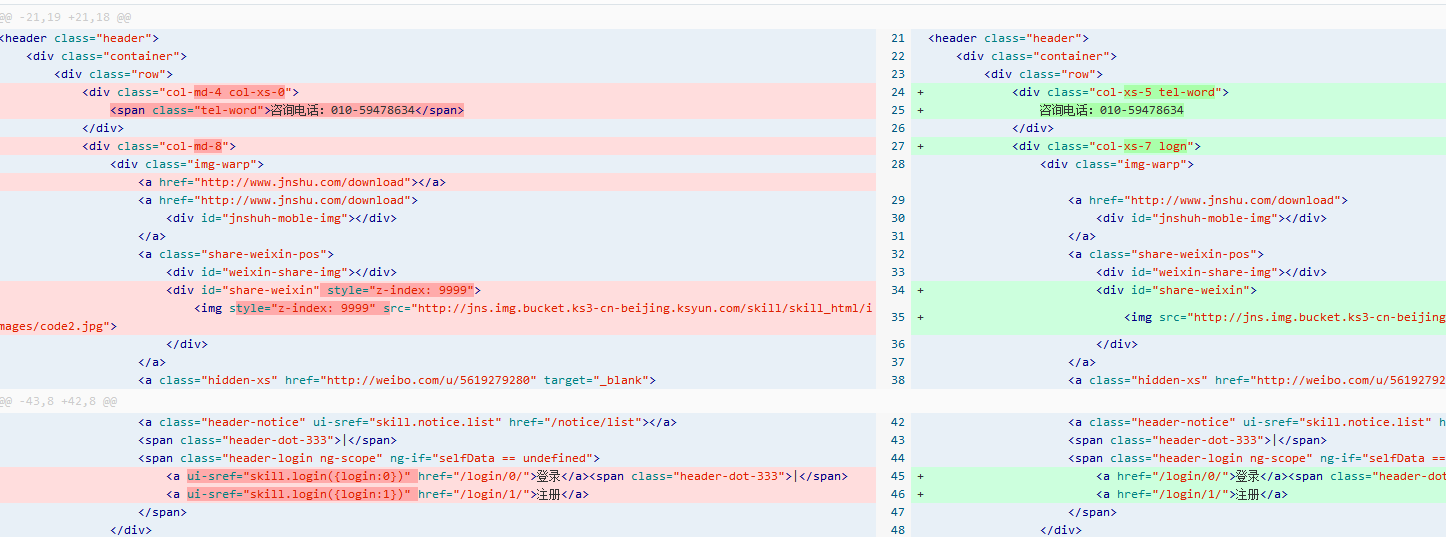
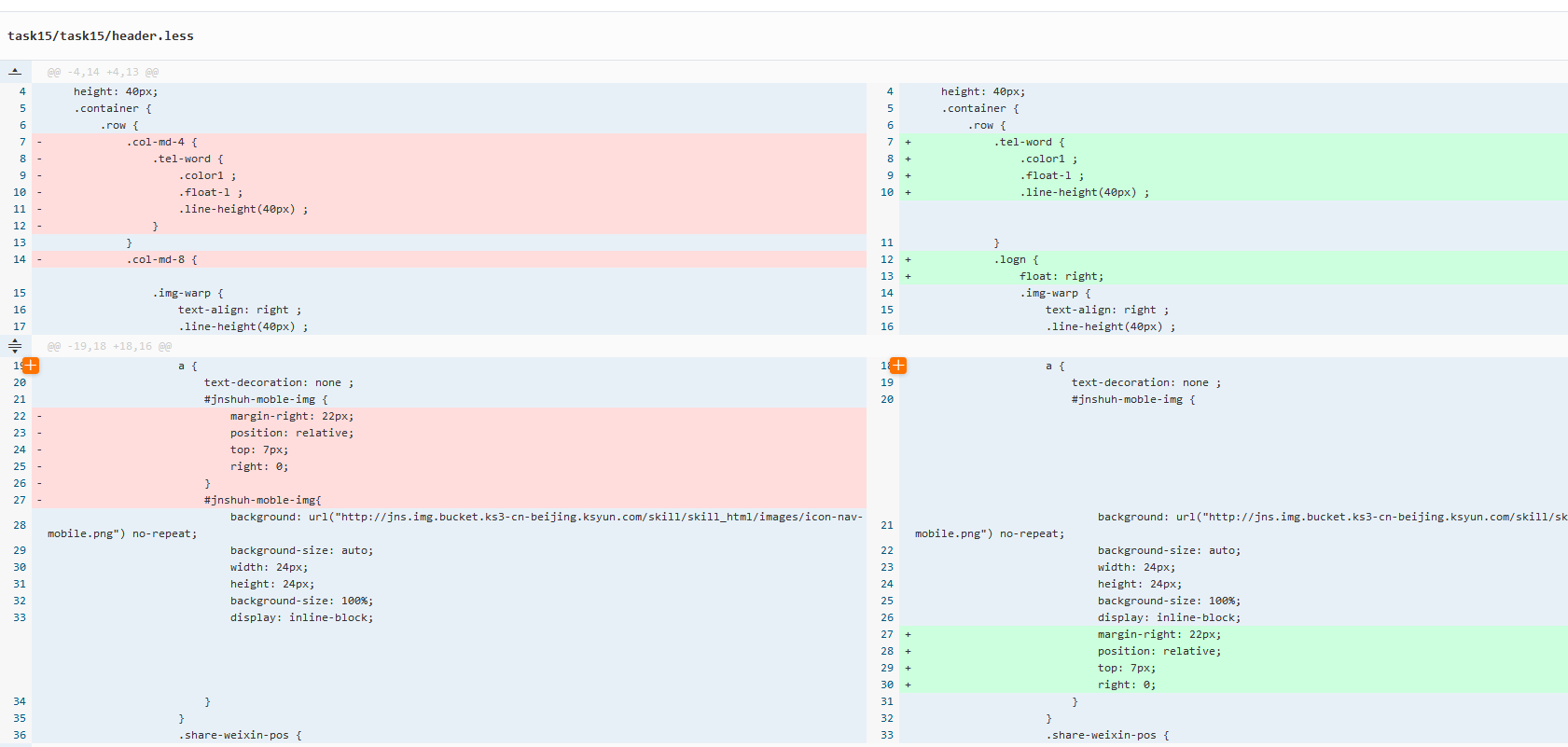
3.将页眉部分关于bootstrap的样式拆解出来
4.根据任务14的效果自己完善nav部分的样式
5.学习input的相关知识 使用type="checked"来触发点击事件 达到移动端屏幕宽度下导航栏点击显示与隐藏的效果
6.将原先nav组件由bootstrap转为自己写的代码来实现导航栏移动端显示与隐藏时input点击事件时就是不生效 卡了几天
不得已将整个nav部分删除重构
<!--导航栏-->
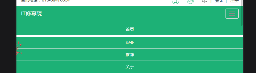
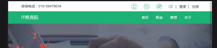
<nav class="nav">
<div class="container">
<div class="row">
<a class="nav-home col-md-4" href="#">IT修真院</a>
<input type="checkbox" id="nav-input" class="nav-input">
<label for="nav-input" class="nav-label">
<span class="nav-span"></span>
<span class="nav-span"></span>
<span class="nav-span"></span>
</label>
<ul class="nav-ul">
<li><a href="" class="">首页</a></li>
<li><a href="" class="">职业</a></li>
<li><a href="" class="">推荐</a></li>
<li><a href="" class="">关于</a></li>
</ul>
</div>
</div>
</nav>
7.重构之后导航栏按钮终于生效 调整样式
.nav {
display: block;
position: fixed;
height: 50px;
background-color: rgb(29, 177, 118);
width: 100%;
.row {
.nav-home {
color: white;
font-size: 24px;
line-height: 50px;
}
.nav-input {
display: none;
}
.nav-label {
position: relative;
float: right;
padding: 14px 10px;
margin: 7px 15px 8px auto;
border: 1px solid white;
border-radius: 4px;
.nav-span {
display: block;
position: relative;
height: 2px;
width: 30px;
background-color: #888;
}
.nav-span:nth-of-type(1) {
top: -7px;
}
.nav-span:nth-of-type(3) {
top: 7px;
}
}
.nav-ul {
display: none;
}
}
}
@media screen and (min-width: 765px) {
.nav-label {
display: block;
}
}
#nav-input:checked~.nav-ul {
display: flex;
width: 100%;
justify-content: space-between;
flex-direction: column;
.nav-li-a {
display: block;
height: 40px;
width: 100%;
text-align: center;
line-height: 40px;
color: white;
}
.nav-li:hover {
border-bottom: 2px solid white;
}
}
8.继续调整nav部分的样式声明
.nav {
display: block;
position: fixed;
height: 50px;
background-color: rgb(29, 177, 118);
width: 100%;
.row {
.nav-home {
color: white;
font-size: 24px;
line-height: 50px;
}
.nav-input {
display: none;
}
.nav-label {
display: none;
}
.nav-ul {
display: flex;
float: right;
flex-direction: row;
justify-content: space-between;
.nav-li-a {
display: block;
color: white;
height: 50px;
text-align: center;
line-height: 50px;
width: 50px;
margin-bottom: -4px;
}
.nav-li:hover {
border-bottom: 4px solid white;
}
}
}
}
@media screen and (max-width: 765px) { /*使导航栏按钮在屏幕宽度小于765px的情况下才显示*/
.nav-label {
display: block !important;
position: relative;
float: right;
padding: 14px 10px;
margin: 7px 15px 8px auto;
border: 1px solid white;
border-radius: 4px;
.nav-span {
display: block;
position: relative;
height: 2px;
width: 30px;
background-color: #888;
}
.nav-span:nth-of-type(1) {
top: -7px;
}
.nav-span:nth-of-type(3) {
top: 7px;
}
}
.nav-li-a {
overflow: hidden;
width:0 !important;
height:0 !important;
}
}
#nav-input:checked~.nav-ul { /*点击按钮之后使隐藏导航栏显示并赋予样式声明*/
display: flex;
width: 100%;
justify-content: space-between;
flex-direction: column;
.nav-li-a {
display: block;
height: 40px !important;
width: 100% !important;
text-align: center;
line-height: 40px;
color: white;
margin: 0 !important;
}
}
9.轻微改动header部分的HTML架构与样式
10.重新简单架构轮播图部分 使用@keyframes来实现轮播效果
<!--轮播图模块 "banner.less"-->
<div class="banner">
<div class="banner-wrap">
<img src="../task15/imag/image1.png">
<img src="../task15/imag/image2.png">
<img src="../task15/imag/image3.png">
</div>
</div>
.banner {
overflow: hidden;
width: 100vw;
.banner-wrap {
display: inline-flex;
position: relative;
width: 300vw;
overflow: hidden;
animation: banner linear 10s infinite 0s alternate;
-webkit-animation: banner linear 10s infinite 0s alternate;
img {
display: block;
width: 100vw;
height: auto;
}
}
}
@keyframes banner {
0% {
left: 0;
}
20% {
left: -0vw;
}
40% {
left: -100vw;
}
60% {
left: -100vw;
}
80% {
left: -200vw;
}
100% {
left: -200vw;
}
}
11.为了使用无缝衔接的效果而不是跳转到第一张图片 多添加一张图片在末尾 使跳转的瞬间不被察觉
<div class="banner">
<div class="banner-wrap">
<img src="../task15/imag/image1.png">
<img src="../task15/imag/image2.png">
<img src="../task15/imag/image3.png">
<img src="../task15/imag/image1.png">
</div>
</div>
@keyframes banner {
0% {
left: 0;
}
10% {
left: -0vw;
}
13.3% {
left: -100vw;
}
33.3% {
left: -100vw;
}
36.6% {
left: -200vw;
}
66.6% {
left: -200vw;
}
69.9% {
left: -300vw
}
100% {
left: -300vw;
}
}
12.轮播图下部添加圆点焦点 添加架构 与轮播图主体使用一样的动画时间设置
在架构上使用五个子元素来完成 设置父容器只显示三个
<div class="banner-wrap2">
<ul class="banner-ul">
<li></li>
<li></li>
<li class="banner-li-1"></li>
<li></li>
<li></li>
</ul>
</div>
.banner-wrap2 {
display: block;
position: relative;
width: 9vw;
top: -2vw;
height: auto;
margin: auto auto;
overflow: hidden;
.banner-ul {
display: flex;
justify-content: space-around;
position: relative;
width: 15vw;
float: right;
animation: li linear 10s infinite 0s normal;
-webkit-animation: li linear 10s infinite 0s normal;
li {
display: block;
border: 3px solid white;
border-radius: 50%;
}
.banner-li-1 {
display: block;
position: relative;
border: 3px solid rgb(29, 177, 118);
}
}
}
@keyframes li {
0% {
right: 0;
}
10% {
right: 0;
}
13.3% {
right: -3vw;
}
33.3% {
right: -3vw;
}
36.6% {
right: -6vw;
}
66.6% {
right: -6vw;
}
69.9% {
right: 0vw;
}
100% {
right: 0vw;
}
}
13.大图标部分外部容器添加overflow:hidden
14.如何学习部分外部容器添加overflow:hidden。
15.重构优秀学员展示部分
16.完善样式 并使用动画效果完成轮播图

17.对其他部分做细微调整 完成页面一
18.提交任务
明天计划的事
1.开始学习JS
2.进行js第一个任务
遇到的问题
1.移动端宽度的情况下由765px以下宽度变为以上宽度时 展开的导航栏的排列不会自动变成横向
不知道实际情况中这种情况会不会产生影响
而使用bootstrap框架在屏幕宽度由765px以下往上变宽的时候展开的上下排布的导航栏会自动会变成横向排列
暂时没想到好的解决方案 尝试使用媒体查询大于765px屏幕宽度的方法不能达到要求。
2.大图标说明部分容器没高度 百度之后添加上了overflow:hidden
使容器强制适配内部元素的高度与宽度。
今天的收获
1.不是自己写的代码 即使暂时复制使用了 日后维护起来不懂底层原理还是会遇到很多困难
2.学习了如何使用纯CSS实现轮播图自动播放的效果
手把手教你用纯css3实现轮播图效果
http://www.imooc.com/article/76377#
如何用纯c4ss3实现轮播图
https://blog.csdn.net/weixin_42276859/article/details/8064894
学会了@keyframes动画的基础使用
百分比可以设置停滞时间与动画播放时间

 返回列表
返回列表


评论