今天完成的事
1.学习了《前端为什么要做组件化》及知乎里哪里有关于css前端组件和模块化的文章的回答
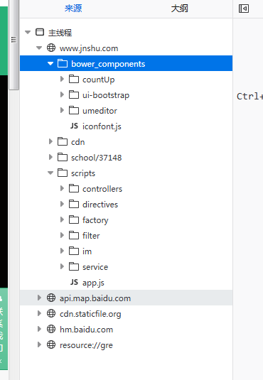
2.根据自己的理解画了css组件模块的简单构图
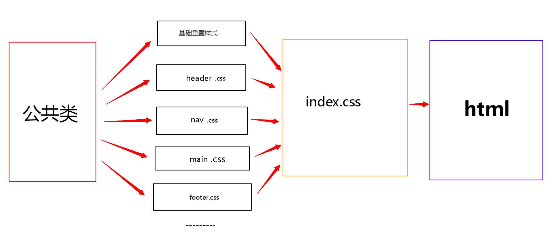
3.根据构图的理解使用模块化的方式去复现修真院官网
4.架构header 并将scolltop和scrollbottom两个按钮包含在其中
<header class="header">
<div id="scrolltop" class="scroll scroll-top"></div>
<div id="scrollbottom" class="scroll scroll-bottom"></div>
</header>
5.给两个按钮引用样式
@import "scroll.css" ;
.scroll-top {
bottom: 100px;
background:
#fff url(http://jns.img.bucket.ks3-cn-beijing.ksyun.com/skill/skill_html/images/toTop.png) no-repeat center center;
background-size: auto;
background-size: 51px;
}
.scroll {
position: fixed;
right: 50px;
width: 51px;
height: 51px;
border-radius: 6px;
box-shadow: 1px 2px 3px
#e0e0e0;
cursor: pointer;
z-index: 9999;
}
.scroll-bottom {
bottom: 40px;
background:
#fff url(http://jns.img.bucket.ks3-cn-beijing.ksyun.com/skill/skill_html/images/toBottom.png) no-repeat center center;
background-size: auto;
background-size: 51px;
}
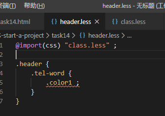
6.架构电话号码部分并调整样式
<div class="col-md-4">
<span class="tel-word">咨询电话:010-59478634</span>
</div>
@import "class.less" ;
.header {
.tel-word {
.color1 ;
.float-l ;
.line-height(40px) ;
}
}
7.架构右上角各种公开平台及登录部分 完成header组件
<header class="header">
<div id="scrolltop" class="scroll scroll-top"></div><!--返回顶部按钮-->
<div id="scrollbottom" class="scroll scroll-bottom"></div><!--下拉底部按钮-->
<div class="container">
<div class="row">
<div class="col-md-4">
<span class="tel-word">咨询电话:010-59478634</span>
</div>
<div class="col-md-8">
<div class="img-warp">
<a href="http://www.jnshu.com/download"></a>
<a href="http://www.jnshu.com/download">
<div id="jnshuh-moble-img"></div>
</a>
<a class="share-weixin-pos">
<div id="weixin-share-img"></div>
<div id="share-weixin" style="z-index: 9999">
<img style="z-index: 9999" src="http://jns.img.bucket.ks3-cn-beijing.ksyun.com/skill/skill_html/images/code2.jpg">
</div>
</a>
<a class="hidden-xs" href="http://weibo.com/u/5619279280" target="_blank">
<!--<img src="images/weibo.png">-->
<div id="weibo-share-img"></div>
</a>
<a class="header-notice" ui-sref="skill.notice.list" href="/notice/list"></a>
<span class="header-dot-333">|</span>
<span class="header-login ng-scope" ng-if="selfData == undefined">
<a ui-sref="skill.login({login:0})" href="/login/0/">登录</a><span class="header-dot-333">|</span>
<a ui-sref="skill.login({login:1})" href="/login/1/">注册</a>
</span>
</div>
</div>
</div>
</div><!--页眉部分-->
</header>
.header {
.container {
.row {
.col-md-4 {
.tel-word {
.color1 ;
.float-l ;
.line-height(40px) ;
}
}
.col-md-8 {
.img-warp {
text-align: right ;
.line-height(40px) ;
.height(40px) ;
a {
text-decoration: none ;
#jnshuh-moble-img {
margin-right: 22px;
position: relative;
top: 7px;
right: 0;
}
#jnshuh-moble-img{
background: url("http://jns.img.bucket.ks3-cn-beijing.ksyun.com/skill/skill_html/images/icon-nav-mobile.png") no-repeat;
background-size: auto;
width: 24px;
height: 24px;
background-size: 100%;
display: inline-block;
}
}
.share-weixin-pos {
.relative ;
#weixin-share-img {
.relative ;
.margin-right(22px) ;
.top(7px) ;
}
#weixin-share-img {
background: url("http://jns.img.bucket.ks3-cn-beijing.ksyun.com/skill/skill_html/images/weixin.png") 0 no-repeat;
background-size: auto;
width: 24px;
height: 24px;
background-size: 100%;
display: inline-block;
}
#share-weixin {
.display-none ;
}
}
.hidden-xs {
#weibo-share-img {
background: url("http://jns.img.bucket.ks3-cn-beijing.ksyun.com/skill/skill_html/images/weibo.png") 0 no-repeat;
width: 24px;
height: 24px;
background-size: 100%;
display: inline-block;
}
#weibo-share-img {
margin-right: 22px;
position: relative;
top: 7px;
}
}
.header-notice {
background: url("http://jns.img.bucket.ks3-cn-beijing.ksyun.com/skill/skill_html/images/header-notice2.png") no-repeat center;
height: 16px;
width: 17px;
display: inline-block;
vertical-align: sub;
}
.header-dot-333 {
margin-right: 8px;
margin-left: 8px;
color: #333;
font-size: 15px;
}
}
}
}
}
}

8.架构nav部分
<div class="header-nav-warp nav">
<nav class="navbar navbar-default container">
<div class="row">
<div class="navbar-header">
<a class="navbar-brand" ui-sref="skill.home" href="https://sunsky92.gitee.io/css-start-a-project/task14/task14.html">
<img class="hidden-xs" src="http://jns.img.bucket.ks3-cn-beijing.ksyun.com/skill/skill_html/images/mh.png" alt="梅花" style="position: absolute;left: -72px;top: -11px;z-index: 1">
<img alt="Brand" src="http://jns.img.bucket.ks3-cn-beijing.ksyun.com/skill/skill_html/images/home-logo-hs.png">
</a>
<button type="button" class="navbar-btn navbar-toggle" data-toggle="collapse" data-target="#navbar-collapse">
<span class="sr-only">切换导航</span>
<img src="http://jns.img.bucket.ks3-cn-beijing.ksyun.com/skill/skill_html/images/menu.png">
</button>
</div>
<div class="collapse navbar-collapse" id="navbar-collapse">
<ul class="navbar-nav">
<li >
<a class="col-md-2" href="http://www.jnshu.com/hall/recommend">职业殿堂</a>
</li>
<li >
<a class="col-md-2" href="http://www.jnshu.com/occupation/1/preface">线上学习</a>
</li>
<li >
<a class="col-md-2" href="http://www.jnshu.com/offline">线下学习</a>
</li>
<li >
<a class="col-md-2" href="http://www.jnshu.com/login/0/">我的学院</a>
</li>
<li >
<a class="col-md-2" href="http://www.jnshu.com/material/document////////">学习资料</a>
</li>
<li >
<a class="col-md-2" href="http://www.jnshu.com/community?mark=1">合作院校</a>
</li>
</ul>
</div>
</div>
<img src="http://jns.img.bucket.ks3-cn-beijing.ksyun.com/skill/skill_html/images/new-year-dl.png" class="hidden-xs hiddex-1130" alt="灯笼" style="position: absolute;top:-40px;right: -80px;z-index: 1">
</nav>
</div>
9.添加样式
.nav {
background:#29b078;
height: 97px;
.navbar {
background:#29b078;
height: 97px;
.row {
.navbar-header {
.navbar-brand {
max-width: 300px;
margin-top: 0;
img {
max-width: 100%;
}
}
.navbar-default .navbar-toggle, .navbar-default .navbar-toggle .icon-bar {
border-color: #26a26f;
}
.navbar-btn {
margin: 10px;
background: #47d197;
}
}
.navbar-default .navbar-collapse, .navbar-default .navbar-form {
border-color: transparent;
.navbar-nav {
float: right;
.navbar-default .navbar-nav > li {
padding: 0 25px;
list-style-image: none;
.navbar-default .navbar-nav > li > a {
display: block;
height: 97px;
padding: 0;
font-size: 16px;
line-height: 93px;
color: #fff;
text-align: center;
border-bottom: 4px solid #29b078;
text-decoration: none;
cursor: pointer;
}
}
}
}
}
}
}
明天的计划
1.继续完善nav部分的样式
2.完成整个页面并且提交
遇到的问题
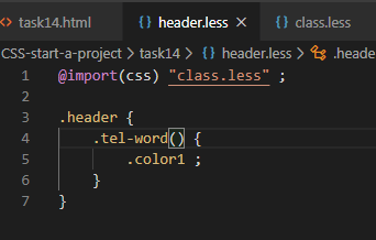
1.纠缠了许久的一个问题解决
less@import 引用其他文件时并引用公用类 总是显示未定义
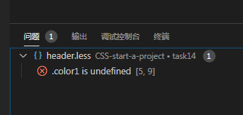
查了才发现应该在类名后面加一个括号 表示调用函数
2.拆出自己的组件库-- 是依据自己所用到的组件 类或者其他来自己创建组件库
还是直接拆解一些文件出来使用
参考了一下师兄的日报 找找思路 发现都是直接重构的
我也参考官网重构算了 这个任务应该可以和任务15合并完成
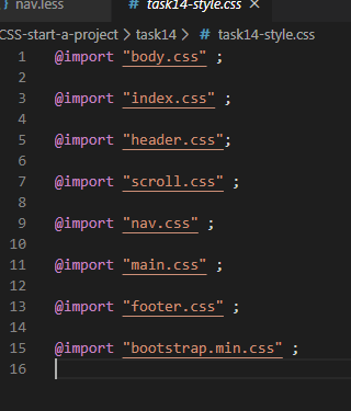
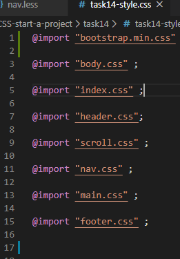
3.设置nav部分时背景颜色总是不生效 后面将bootstrap的引入顺序放到前面就正常了
所以公共类的样式以及这些框架什么的一定要放在最前面引用 后面的针对单独元素做的修改就不会被覆盖
顺序很重要
今天的收获
1.模块化暂时没有想好如何与LESS很好的结合起来 感觉每个都使用less写的化好像文件会有点多
感觉使用less结构化的编辑方式结合公共类就能很好的达成模块化的需求了
2.感觉维护修改拆解比从头架构麻烦多了
也许我应该将修真院官网当做效果图来使用自己的方法重构 感觉没理解js以前 拆起来真的挺乱的

 返回列表
返回列表


评论