发表于: 2019-12-07 22:27:41
1 998
一、今天完后的事情
1、今天学习了复选框的不同样式:
input[type="checkbox"] {
text-indent:0;
margin: 0;
width: 17px;
height: 17px;
text-align:center;
display: inline-block;
vertical-align: middle;
line-height: 15px;
position: relative;
}
input[type="checkbox"]::before {
content: "";
position: absolute;
top: 0;
left: 0;
background: #fff;
width: 100%;
height: 100%;
border: 1px solid #bdbfc2;
}
input[type="checkbox"]:checked::before {
content: "\2713";
background-color: #37b048;
color: #fff;
position: absolute;
top: 0;
left: 0;
width: 100%;
font-size: 12px;
font-weight: bold;
outline: none;
border-color:#ccc;
border: 1px solid #bdbfc2;
}
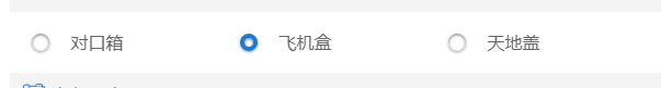
2、
我自己做的单选框
.checkbox{
    width: 1rem;
    height: 1rem;
    border-radius: 100%;
    margin: 20px;
    position: relative;
    -webkit-box-shadow: 0 1px 3px rgba(0,0,0,0.5);
    -moz-box-shadow: 0 1px 3px rgba(0,0,0,0.5);
    box-shadow: 0 1px 3px rgba(0,0,0,0.5);
}
.input{
    display: none;
}
.checkbox label{
    display: block;
    width: 1rem;
    height: 1rem;
    /*border: 15px solid#ffffff;*/
    border-radius: 100%;
    -webkit-transition:all,5s,ease;
    -moz-transition: all,5s,ease;
    -o-transition: all,5s,ease;
    -ms-transition:all,5s,ease;
    transition: all,5s,ease;
    cursor: pointer;
    position: absolute;
    margin: 0;
    padding: 0;
    z-index: 1;
    background: #ffffff;
    -webkit-box-shadow: inset 0 1px 3px rgba(0,0,0,0.5);
    -moz-box-shadow: inset 0 1px 3px rgba(0,0,0,0.5);
    box-shadow:  inset 0 1px 3px rgba(0,0,0,0.5);
}
.checkbox input[type=radio]:checked+label{
    background: #ffffff;
    border: 4px solid#1d7ad9;

}
css代码样式。
二、遇到的困难
用复选框时怎么实现单选?
暂时没有解决,发现网上的教程大多都是js,之后学了js再回头看
三、明天要做的事情
开始任务十
四、收获
学习了解了单选框 复选框

 返回列表
返回列表


评论