发表于: 2019-11-19 18:45:29
1 908
今天完成的事情:(一定要写非常细致的内容,比如说学会了盒子模型,了解了Margin)
明天计划的事情:(一定要写非常细致的内容)
遇到的问题:(遇到什么困难,怎么解决的)
收获:(通过今天的学习,学到了什么知识)
任务八任务九响应式网站设计
一、水平居中
文本/行内元素/行内块元素居中
#parent{ text-align: center; }text-align 只控制行内内容(文字、行内元素、行内块元素)如何相对于他的块父元素对齐
优缺点
- 优点:简单快捷,容易理解,兼容性非常好
- 缺点:只对行内内容有效;属性会继承影响到后代行内内容;如果子元素宽度大于父元素宽度则无效,只有后代行内内容中宽度小于设置text-align属性的元素宽度的时候,才会水平居中
单个块级元素
#son{ width: 100px; /*必须定宽*/ margin: 0 auto; }在margin有节余的同时如果左右margin设置auto,将会根据剩余空间自动计算分配,如果是上下margin设置auto的时候计算值为0
优缺点
- 优点:简单;兼容性好
- 缺点:必须定宽,并且值不能为auto;宽度要小于父元素,否则无效
多个块级元素
#parent{ text-align: center; }.son{ display: inline-block; /*改为行内或者行内块级形式,以达到text-align对其生效*/}原理:text-align只控制行内内容(文字、行内元素、行内块级元素)如何相对他的块父元素对齐
优缺点
- 优点:简单,容易理解,兼容性非常好
- 缺点:只对行内内容有效;属性会继承影响到后代行内内容;块级改为inline-block换行、空格会产生元素间隔
使用绝对定位实现
#parent{ height: 200px; width: 200px; /*定宽*/ position: relative; /*父相*/ background-color: #f00; }#son{ position: absolute; /*子绝*/ left: 50%; /*父元素宽度一半,这里等同于left:100px*/ transform: translateX(-50%); /*自身宽度一半,等同于margin-left: -50px;*/ width: 100px; /*定宽*/ height: 100px; background-color: #00ff00; }原理:子绝父相,top、right、bottom、left的值是相对于父元素尺寸的,然后margin或者transform是相对于自身尺寸的,组合使用达到水平居中的目的
优缺点
- 优点:使用margin-left兼容性好;不管是块级还是行内元素都可以实现
- 缺点:代码较多;脱离文档流;使用margin-left需要知道宽度值;使用transform兼容性不好(ie9+)
任意个元素(flex)
#parent{ display: flex; justify-content: center; }原理:设置当前主轴对齐方式为居中。
优缺点:
- 优点:功能强大
- 缺点:felx的PC兼容性,Android4.0+
小结:
- 水平居中需要优先考虑哪些元素自带居中效果,最先想到的当然是
text-align:center了,但是只对行内有效,使用text-align需要先display:inline-block或者display-inline - 然后考虑可不可以用
margin:0 auto - 然后考虑功能强大flex
二、垂直居中
行内元素/单行文本/行内块元素
#parent{ height: 150px; line-height: 150px; /*与height等值*/}原理: line-height最终表现是通过inline box 实现的,而无论inline box所占据的高度是多少,其占据的空间都是与文字内容公用水平中垂线的
优缺点:
- 优点: 简单,兼容性好
- 缺点: 只能用于单行行内内容,且高度必须已知
图片
#parent{ height: 150px; line-height: 150px; font-size: 0; }img#son{vertical-align: middle;} /*默认是基线对齐,改为middle*/原理: 张鑫旭vertical-align和line-height
缺点
- 优点:简单;兼容性好
- 缺点:需要添加font-size: 0; 才可以完全的垂直居中;不过需要主要,html#parent包裹img之间需要有换行或空格
单个块级元素
<!--html--><div id="parent"> <div id="son"></div></div>使用tabel-cell实现:
#parent{ display: table-cell; vertical-align: middle; }原理:CSS Table,使表格内容对齐方式为middle
优缺点
- 优点:简单;宽高不定;兼容性好(ie8+)
- 缺点:设置tabl-cell的元素,宽度和高度的值设置百分比无效,需要给它的父元素设置display: table; 才生效;table-cell不感知margin,在父元素上设置table-row等属性,也会使其不感知height;设置float或position会对默认布局造成破坏,可以考虑为之增加一个父div定义float等属性;内容溢出时会自动撑开父元素
使用绝对定位实现:
#parent{ height: 150px; position: relative; /*父相*/}#son{ position: absolute; /*子绝*/ top: 50%; /*父元素高度一半,这里等同于top:75px;*/ transform: translateY(-50%); /*自身高度一半,这里等同于margin-top:-25px;*/ height: 50px; }原理:子绝父相
优缺点:
- 优点:使用margin-top兼容性好;不管是块级还是行内元素都可以实现
- 缺点:代码较多;脱离文档流;使用margin-top需要知道高度值;使用transform兼容性不好(ie9+)
#parent{position: relative;}#son{ position: absolute; margin: auto 0; top: 0; bottom: 0; height: 50px; }原理:当top、bottom为0时,margin-top&bottom会无限延伸占满空间并且平分
优缺点
- 优点:简单;兼容性较好(ie8+)
- 缺点:脱离文档流
使用flex实现:
#parent{ display: flex; align-items: center; }或#parent{display: flex;}#son{align-self: center;}或#parent{display: flex;}#son{margin: auto 0;}小结:
- 对于垂直居中,最先想到的应该就是 line-height 了,但是这个只能用于行内内容;
- 其次就是考虑能不能用vertical-align: middle
- 然后便是绝对定位,虽然代码多了点,但是胜在适用于不同情况;
- 移动端兼容性允许的情况下能用flex就用flex
三、水平垂直居中
行内/行内块级/图片
#parent{ height: 150px; line-height: 150px; /*行高的值与height相等*/ text-align: center; font-size: 0; /*消除幽灵空白节点的bug*/}#son{ /*display: inline-block;*/ /*如果是块级元素需改为行内或行内块级才生效*/ vertical-align: middle; }原理:text-align: center; 控制行内内容相对于块父元素水平居中,然后就是line-height和vertical-align的基友关系使其垂直居中,font-size: 0; 是为了消除近似居中的bug
优缺点
- 优点:代码简单;兼容性好(ie8+)
- 缺点:只对行内内容有效;需要添加font-size: 0; 才可以完全的垂直居中;不过需要注意html中#parent包裹#son之间需要有换行或空格;熟悉line-height和vertical-align的基友关系较难
table-cell
#parent{ height: 150px; width: 200px; display: table-cell; vertical-align: middle; /*text-align: center;*/ /*如果是行内元素就添加这个*/}#son{ /*margin: 0 auto;*/ /*如果是块级元素就添加这个*/ width: 100px; height: 50px; }原理:CSS Table,使表格内容垂直对齐方式为middle,然后根据是行内内容还是块级内容采取不同的方式达到水平居中
优缺点
- 优点:简单方便,充分利用默认样式
- 缺点:只适用于行内内容;需要清除部分默认样式;水平垂直居中兼容性很好,但是ie下点击会有凹陷效果!
绝对定位
#parent{ position: relative; }#son{ position: absolute; top: 50%; left: 50%; /*定宽高时等同于margin-left:负自身宽度一半;margin-top:负自身高度一半;*/ transform: translate(-50%,-50%); }原理:子绝父相,top、right、bottom、left的值是相对于父元素尺寸的,然后margin或者transform是相对于自身尺寸的,组合使用达到几何上的水平垂直居中
缺点
- 优点:使用margin兼容性好;不管是块级还是行内元素都可以实现
- 缺点:代码较多;脱离文档流;使用margin需要知道宽高;使用transform兼容性不好(ie9+)
绝对居中
#parent{ position: relative; }#son{ position: absolute; margin: auto; width: 100px; height: 50px; top: 0; bottom: 0; left: 0; right: 0; }原理:当top、bottom为0时,margin-top&bottom设置auto的话会无限延伸占满空间并且平分;当left、right为0时,margin-left&right设置auto的话会无限延伸占满空间并且平分
优缺点
- 优点:无需关注宽高;兼容性较好(ie8+)
- 缺点:代码较多;脱离文档流
flex
#parent{ display: flex; }#son{ margin: auto; }或#parent{ display: flex; justify-content: center; align-items: center; }或#parent{ display: flex; justify-content: center; }#son{ align-self: center; }优缺点
- 优点:简单灵活;功能强大
- 缺点:PC端兼容性不好,移动端(Android4.0+)
视窗居中
#son{ /*0如果去掉,则会多出滚动条并且上下都是50vh的margin。如果去掉就给body加上overflow:hidden;*/ margin: 50vh auto 0; transform: translateY(-50%); }原理:vh为视口单位,视口即文档可视的部分,50vh就是视口高度的50/100,设置50vh上边距再
优缺点
- 优点:简单;容易理解;两句代码达到屏幕水平垂直居中
- 缺点:兼容性不好(ie9+,Android4.4+)
小结
- 一般情况下,水平垂直居中,我们最常用的就是绝对定位加负边距了,缺点就是需要知道宽高,使用transform倒是可以不需要,但是兼容性不好(ie9+);
- 其次就是绝对居中,绝对定位设置top、left、right、bottom为0,然后margin:auto; 让浏览器自动平分边距以达到水平垂直居中的目的;
- 如果是行内/行内块级/图片这些内容,可以优先考虑line-height和vertical-align 结合使用,不要忘了还有text-align ,这个方法代码其实不多,就是理解原理有点困难,想要熟练应对各种情况还需好好研究;
- 移动端兼容性允许的情况下能用flex就用flex。
四、两列布局
左列定宽,右列自适应
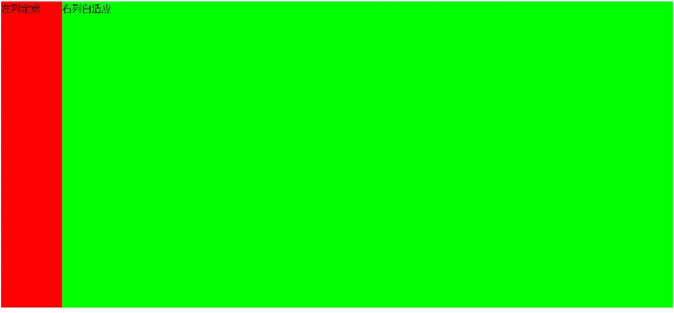
1、利用float+margin实现
<body><div id="left">左列定宽</div><div id="right">右列自适应</div></body>#left { background-color: #f00; float: left; width: 100px; height: 500px; }#right { background-color: #0f0; height: 500px; margin-left: 100px; /*大于等于#left的宽度*/}2、利用float+margin(fix)实现
<body><div id="left">左列定宽</div><div id="right-fix"> <div id="right">右列自适应</div></div></body>#left { background-color: #f00; float: left; width: 100px; height: 500px; }#right-fix { float: right; width: 100%; margin-left: -100px; /*正值大于或等于#left的宽度,才能显示在同一行*/}#right{ margin-left: 100px; /*大于或等于#left的宽度*/ background-color: #0f0; height: 500px; }3、使用float+overflow实现
<body><div id="left">左列定宽</div><div id="right">右列自适应</div></body>#left { background-color: #f00; float: left; width: 100px; height: 500px; }#right { background-color: #0f0; height: 500px; overflow: hidden; /*触发bfc达到自适应*/} <!--优缺点:--> <!--优点:代码简单,容易理解,无需关注定宽的宽度,利用bfc达到自适应效果--> <!--缺点:浮动脱离文档流,需要手动清除浮动,否则会产生高度塌陷;不支持ie6-->4、使用table实现
<div id="parent"> <div id="left">左列定宽</div> <div id="right">右列自适应</div></div>#parent{ width: 100%; display: table; height: 500px; }#left { width: 100px; background-color: #f00; }#right { background-color: #0f0; }#left,#right{ display: table-cell; /*利用单元格自动分配宽度*/} <!--优缺点:--> <!--优点:代码简单,容易理解,无需关注定宽的宽度,利用单元格自动分配达到自适应效果--> <!--缺点:margin失效;设置间隔比较麻烦;不支持ie8--->5、使用绝对定位实现
<body><div id="parent"> <div id="left">左列定宽</div> <div id="right">右列自适应</div></div></body>#parent{ position: relative; /*子绝父相*/}#left { position: absolute; top: 0; left: 0; background-color: #f00; width: 100px; height: 500px; }#right { position: absolute; top: 0; left: 100px; /*值大于等于#left的宽度*/ right: 0; background-color: #0f0; height: 500px; }6、使用flex实现
<body><div id="parent"> <div id="left">左列定宽</div> <div id="right">右列自适应</div></div></body>#parent{ width: 100%; height: 500px; display: flex; }#left { width: 100px; background-color: #f00; }#right { flex: 1; /*均分了父元素剩余空间*/ background-color: #0f0; }7、使用Grid实现
<body><div id="parent"> <div id="left">左列定宽</div> <div id="right">右列自适应</div></div></body>#parent { width: 100%; height: 500px; display: grid; grid-template-columns: 100px auto; /*设定2列就ok了,auto换成1fr也行*/}#left { background-color: #f00; }#right { background-color: #0f0; }左列自适应,右列定宽
和左侧定宽右侧自适应同理,除了不能用上面的float+margin(fix)实现
一列不定,一列自适应
盒子宽度随着内容增加或减少发生变化,另一个盒子自适应
1、使用float+overflow实现
<body><div id="parent"> <div id="left">左列不定宽</div> <div id="right">右列自适应</div></div></body>#left { margin-right: 10px; float: left; /*只设置浮动,不设宽度*/ height: 500px; background-color: #f00; }#right { overflow: hidden; /*触发bfc*/ height: 500px; background-color: #0f0; }优缺点:
- 优点:代码简单,容易理解,无需关注宽度,利用bfc达到自适应效果
- 缺点:浮动脱离文档流,需要手动清除浮动,否则会产生高度塌陷;不支持ie6
2、使用flex实现
<body><div id="parent"> <div id="left">左列不定宽</div> <div id="right">右列自适应</div></div></body>#parent{ display: flex; }#left { /*不设宽度*/ margin-right: 10px; height: 500px; background-color: #f00; }#right { height: 500px; background-color: #0f0; flex: 1; /*均分#parent剩余的部分*/}3、使用Grid实现
<body><div id="parent"> <div id="left">左列不定宽</div> <div id="right">右列自适应</div></div></body>#parent{ display: grid; grid-template-columns: auto 1fr; /*auto和1fr换一下顺序就是左列自适应,右列不定宽了*/}#left { margin-right: 10px; height: 500px; background-color: #f00; }#right { height: 500px; background-color: #0f0; }三列布局
1、 两列定宽,一列自适应
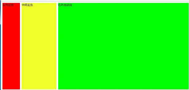
1.1使用float+margin实现
<body><div id="parent"> <div id="left">左列定宽</div> <div id="center">中间定宽</div> <div id="right">右列自适应</div></div></body>#parent{ min-width: 310px; /*100+10+200,防止宽度不够,子元素换行*/}#left { margin-right: 10px; /*#left和#center间隔*/ float: left; width: 100px; height: 500px; background-color: #f00; }#center{ float: left; width: 200px; height: 500px; background-color: #eeff2b; }#right { margin-left: 320px; /*等于#left和#center的宽度之和加上间隔,多出来的就是#right和#center的间隔*/ height: 500px; background-color: #0f0; }1.2使用float+overflow实现
<body><div id="parent"> <div id="left">左列定宽</div> <div id="center">中间定宽</div> <div id="right">右列自适应</div></div></body>#parent{ min-width: 320px; /*100+10+200+20,防止宽度不够,子元素换行*/}#left { margin-right: 10px; /*间隔*/ float: left; width: 100px; height: 500px; background-color: #f00; }#center{ margin-right: 10px; /*在此定义和#right的间隔*/ float: left; width: 200px; height: 500px; background-color: #eeff2b; }#right { overflow: hidden; /*触发bfc*/ height: 500px; background-color: #0f0; } <!--优缺点:--> <!--优点:代码简单,容易理解,无需关注定宽的宽度,利用bfc达到自适应效果--> <!--缺点:浮动脱离文档流,需要手动清除浮动,否则会产生高度塌陷;不支持ie6-->1.3使用table实现
<body><div id="parent"> <div id="left">左列定宽</div> <div id="center">中间定宽</div> <div id="right">右列自适应</div></div></body>#parent { width: 100%; height: 520px; /*抵消上下间距10*2的高度影响*/ margin: -10px 0; /*抵消上下边间距10的位置影响*/ display: table; /*左右两边间距大了一点,子元素改用padding设置盒子间距就没有这个问题*/ border-spacing: 10px; /*关键!!!设置间距*/}#left { display: table-cell; width: 100px; background-color: #f00; }#center { display: table-cell; width: 200px; background-color: #eeff2b; }#right { display: table-cell; background-color: #0f0; } <!--优缺点:--> <!--优点:代码简单,容易理解,无需关注定宽的宽度,利用单元格自动分配达到自适应效果--> <!--缺点:margin失效;设置间隔比较麻烦;不支持ie8--->1.4使用flex实现
<body><div id="parent"> <div id="left">左列定宽</div> <div id="center">中间定宽</div> <div id="right">右列自适应</div></div></body>#parent { height: 500px; display: flex; }#left { margin-right: 10px; /*间距*/ width: 100px; background-color: #f00; }#center { margin-right: 10px; /*间距*/ width: 200px; background-color: #eeff2b; }#right { flex: 1; /*均分#parent剩余的部分达到自适应*/ background-color: #0f0; }1.5、使用Grid实现
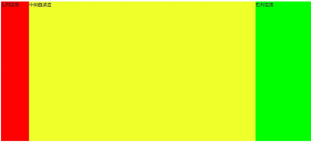
<body><div id="parent"> <div id="left">左列定宽</div> <div id="center">中间定宽</div> <div id="right">右列自适应</div></div></body>#parent { height: 500px; display: grid; grid-template-columns: 100px 200px auto; /*设置3列,固定第一第二列的宽度,第三列auto或者1fr*/}#left { margin-right: 10px; /*间距*/ background-color: #f00; }#center { margin-right: 10px; /*间距*/ background-color: #eeff2b; }#right { background-color: #0f0; }2、两侧定宽,中间自适应
效果:
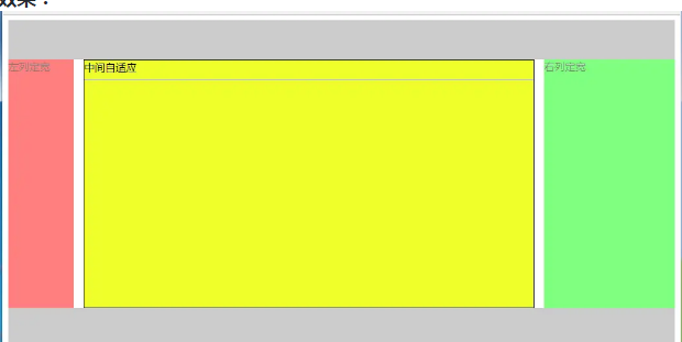
2.1、双飞翼布局方法
<body><div id="header"></div><!--中间栏需要放在前面--><div id="parent"> <div id="center"> <div id="center_inbox">中间自适应</div> <hr> <!--方便观察原理--> </div> <div id="left">左列定宽</div> <div id="right">右列定宽</div></div><div id="footer"></div></body>#header { height: 60px; background-color: #ccc; }#left { float: left; width: 100px; height: 500px; margin-left: -100%; /*调整#left的位置,值等于自身宽度*/ background-color: #f00; opacity: 0.5; }#center { height: 500px; float: left; width: 100%; background-color: #eeff2b; }#center_inbox{ height: 480px; border: 1px solid #000; margin: 0 220px 0 120px; /*关键!!!左右边界等于左右盒子的宽度,多出来的为盒子间隔*/}#right { float: left; width: 200px; height: 500px; margin-left: -200px; /*使right到指定的位置,值等于自身宽度*/ background-color: #0f0; opacity: 0.5; }#footer { clear: both; /*注意清除浮动!!*/ height: 60px; background-color: #ccc; }2.2、圣杯布局方法
<body><div id="header"></div><div id="parent"> <!--#center需要放在前面--> <div id="center">中间自适应 <hr> </div> <div id="left">左列定宽</div> <div id="right">右列定宽</div></div><div id="footer"></div></body>#header{ height: 60px; background-color: #ccc; }#parent { box-sizing: border-box; height: 500px; padding: 0 215px 0 115px; /*为了使#center摆正,左右padding分别等于左右盒子的宽,可以结合左右盒子相对定位的left调整间距*/}#left { margin-left: -100%; /*使#left上去一行*/ position: relative; left: -115px; /*相对定位调整#left的位置,正值大于或等于自身宽度*/ float: left; width: 100px; height: 500px; background-color: #f00; opacity: 0.5; }#center { float: left; width: 100%; /*由于#parent的padding,达到自适应的目的*/ height: 500px; box-sizing: border-box; border: 1px solid #000; background-color: #eeff2b; }#right { position: relative; left: 215px; /*相对定位调整#right的位置,大于或等于自身宽度*/ width: 200px; height: 500px; margin-left: -200px; /*使#right上去一行*/ float: left; background-color: #0f0; opacity: 0.5; }#footer{ height: 60px; background-color: #ccc; }2.3使用Grid实现
<body><div id="parent"> <div id="header"></div> <!--#center需要放在前面--> <div id="center">中间自适应 <hr> </div> <div id="left">左列定宽</div> <div id="right">右列定宽</div> <div id="footer"></div></div></body>#parent { height: 500px; display: grid; grid-template-columns: 100px auto 200px; /*设定3列*/ grid-template-rows: 60px auto 60px; /*设定3行*/ /*设置网格区域分布*/ grid-template-areas: "header header header" "leftside main rightside" "footer footer footer"; }#header { grid-area: header; /*指定在哪个网格区域*/ background-color: #ccc; }#left { grid-area: leftside; background-color: #f00; opacity: 0.5; }#center { grid-area: main; /*指定在哪个网格区域*/ margin: 0 15px; /*设置间隔*/ border: 1px solid #000; background-color: #eeff2b; }#right { grid-area: rightside; /*指定在哪个网格区域*/ background-color: #0f0; opacity: 0.5; }#footer { grid-area: footer; /*指定在哪个网格区域*/ background-color: #ccc; }其他的方法实现如下效果:
2.4使用table实现
<body><div id="parent"> <div id="left">左列定宽</div> <div id="center">中间自适应</div> <div id="right">右列定宽</div></div></body>#parent { width: 100%; height: 500px; display: table; }#left { display: table-cell; width: 100px; background-color: #f00; }#center { display: table-cell; background-color: #eeff2b; }#right { display: table-cell; width: 200px; background-color: #0f0; } <!--优缺点:--> <!--优点:代码简洁,容易理解;--> <!--缺点:margin失效,采用border-spacing表格两边的间隔无法消除;不支持ie8--->2.5使用flex实现
<body><div id="parent"> <div id="left">左列定宽</div> <div id="center">中间自适应</div> <div id="right">右列定宽</div></div></body>#parent { height: 500px; display: flex; }#left { width: 100px; background-color: #f00; }#center { flex: 1; /*均分#parent剩余的部分*/ background-color: #eeff2b; }#right { width: 200px; background-color: #0f0; }2.6使用position实现
<body><div id="parent"> <div id="left">左列定宽</div> <div id="center">中间自适应</div> <div id="right">右列定宽</div></div></body>#parent { position: relative; /*子绝父相*/}#left { position: absolute; top: 0; left: 0; width: 100px; height: 500px; background-color: #f00; }#center { height: 500px; margin-left: 100px; /*大于等于#left的宽度,或者给#parent添加同样大小的padding-left*/ margin-right: 200px; /*大于等于#right的宽度,或者给#parent添加同样大小的padding-right*/ background-color: #eeff2b; }#right { position: absolute; top: 0; right: 0; width: 200px; height: 500px; background-color: #0f0; } <!--优缺点:--> <!--优点:容易理解,兼容性比较好--> <!--缺点:需手动计算宽度确定边距;脱离文档流;代码繁多-->多列布局
1、多列等宽
1.1使用float实现
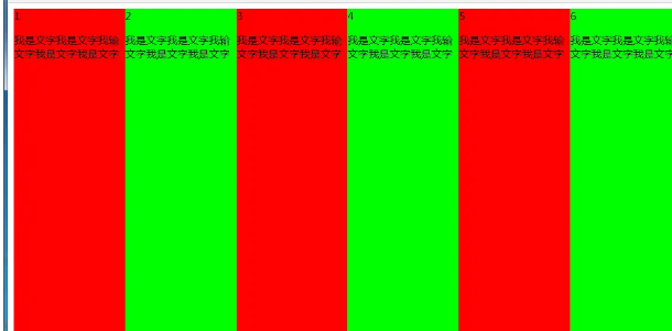
<body><div id="parent"> <div class="column">1 <p>我是文字我是文字我输文字我是文字我是文字</p></div> <div class="column">2 <p>我是文字我是文字我输文字我是文字我是文字</p></div> <div class="column">3 <p>我是文字我是文字我输文字我是文字我是文字</p></div> <div class="column">4 <p>我是文字我是文字我输文字我是文字我是文字</p></div> <div class="column">5 <p>我是文字我是文字我输文字我是文字我是文字</p></div> <div class="column">6 <p>我是文字我是文字我输文字我是文字我是文字</p></div></div></body>#parent { height: 500px; }.column{ float: left; /*添加浮动*/ width: 16.66666666666667%; /*100÷列数,得出百分比*/ height: 500px; }.column:nth-child(odd){ background-color: #f00; }.column:nth-child(even){ background-color: #0f0; } <!--优缺点:--> <!--优点:代码简单,容易理解;兼容性较好--> <!--缺点:需要手动清除浮动,否则会产生高度塌陷-->1.2、使用table实现
<body><div id="parent"> <div class="column">1 <p>我是文字我是文字我输文字我是文字我是文字</p></div> <div class="column">2 <p>我是文字我是文字我输文字我是文字我是文字</p></div> <div class="column">3 <p>我是文字我是文字我输文字我是文字我是文字</p></div> <div class="column">4 <p>我是文字我是文字我输文字我是文字我是文字</p></div> <div class="column">5 <p>我是文字我是文字我输文字我是文字我是文字</p></div> <div class="column">6 <p>我是文字我是文字我输文字我是文字我是文字</p></div></div></body>#parent { width: 100%; height: 500px; display: table; }.column{ display: table-cell; /*无需关注列数,单元格自动平分*/}.column:nth-child(odd){ background-color: #f00; }.column:nth-child(even){ background-color: #0f0; } <!--优缺点:--> <!--优点:代码简单,容易理解;无需关注宽度。单元格自动等分--> <!--缺点:margin失效;设置间隔比较麻烦;不兼容ie8--->1.3、使用flex实现
<body><div id="parent"> <div class="column">1 <p>我是文字我是文字我输文字我是文字我是文字</p></div> <div class="column">2 <p>我是文字我是文字我输文字我是文字我是文字</p></div> <div class="column">3 <p>我是文字我是文字我输文字我是文字我是文字</p></div> <div class="column">4 <p>我是文字我是文字我输文字我是文字我是文字</p></div> <div class="column">5 <p>我是文字我是文字我输文字我是文字我是文字</p></div> <div class="column">6 <p>我是文字我是文字我输文字我是文字我是文字</p></div></div></body>#parent { height: 500px; display: flex; }.column{ flex: 1; /*无需关注列数,一起平分#parent*/}.column:nth-child(odd){ background-color: #f00; }.column:nth-child(even){ background-color: #0f0; }1.4、使用Grid实现
<body><div id="parent"> <div class="column">1 <p>我是文字我是文字我输文字我是文字我是文字</p></div> <div class="column">2 <p>我是文字我是文字我输文字我是文字我是文字</p></div> <div class="column">3 <p>我是文字我是文字我输文字我是文字我是文字</p></div> <div class="column">4 <p>我是文字我是文字我输文字我是文字我是文字</p></div> <div class="column">5 <p>我是文字我是文字我输文字我是文字我是文字</p></div> <div class="column">6 <p>我是文字我是文字我输文字我是文字我是文字</p></div></div></body>#parent { height: 500px; display: grid; grid-template-columns: repeat(6,1fr); /*6就是列数*/}.column{}.column:nth-child(odd){ background-color: #f00; }.column:nth-child(even){ background-color: #0f0; }2、九宫格布局
(1)使用table实现
<body><div id="parent"> <div class="row"> <div class="item">1</div> <div class="item">2</div> <div class="item">3</div> </div> <div class="row"> <div class="item">4</div> <div class="item">5</div> <div class="item">6</div> </div> <div class="row"> <div class="item">7</div> <div class="item">8</div> <div class="item">9</div> </div></div></body>#parent { width: 1200px; height: 500px; margin: 0 auto; display: table; }.row { display: table-row; }.item { border: 1px solid #000; display: table-cell; }(2)使用flex实现
<body><div id="parent"> <div class="row"> <div class="item">1</div> <div class="item">2</div> <div class="item">3</div> </div> <div class="row"> <div class="item">4</div> <div class="item">5</div> <div class="item">6</div> </div> <div class="row"> <div class="item">7</div> <div class="item">8</div> <div class="item">9</div> </div></div></body>#parent { width: 1200px; height: 500px; margin: 0 auto; display: flex; flex-direction: column; }.row { display: flex; flex: 1; }.item { flex: 1; border: 1px solid #000; }(3)使用Grid实现
<body><div id="parent"> <div class="item">1</div> <div class="item">2</div> <div class="item">3</div> <div class="item">4</div> <div class="item">5</div> <div class="item">6</div> <div class="item">7</div> <div class="item">8</div> <div class="item">9</div></div></body>#parent { width: 1200px; height: 500px; margin: 0 auto; display: grid; grid-template-columns: repeat(3, 1fr); /*等同于1fr 1fr 1fr,此为重复的合并写法*/ grid-template-rows: repeat(3, 1fr); /*等同于1fr 1fr 1fr,此为重复的合并写法*/}.item { border: 1px solid #000; }栅格系统
优缺点:
优点:代码简洁,容易理解;提高页面内容的流动性,能适应多种设备;
(1)用Less生成
/*生成栅格系统*/@media screen and (max-width: 768px){ .generate-columns(12); /*此处设置生成列数*/ .generate-columns(@n, @i: 1) when (@i <= @n) { .column-xs-@{i} { width: (@i * 100% / @n); } .generate-columns(@n, (@i+1)); } } @media screen and (min-width: 768px){ .generate-columns(12); /*此处设置生成列数*/ .generate-columns(@n, @i: 1) when (@i <= @n) { .column-sm-@{i} { width: (@i * 100% / @n); } .generate-columns(@n, (@i+1)); } }div[class^="column-xs-"]{ float: left; }div[class^="column-sm-"]{ float: left; }编译后的CSS代码:
@media screen and (max-width: 768px) { .column-xs-1 { width: 8.33333333%; } .column-xs-2 { width: 16.66666667%; } .column-xs-3 { width: 25%; } .column-xs-4 { width: 33.33333333%; } .column-xs-5 { width: 41.66666667%; } .column-xs-6 { width: 50%; } .column-xs-7 { width: 58.33333333%; } .column-xs-8 { width: 66.66666667%; } .column-xs-9 { width: 75%; } .column-xs-10 { width: 83.33333333%; } .column-xs-11 { width: 91.66666667%; } .column-xs-12 { width: 100%; } } @media screen and (min-width: 768px) { .column-sm-1 { width: 8.33333333%; } .column-sm-2 { width: 16.66666667%; } .column-sm-3 { width: 25%; } .column-sm-4 { width: 33.33333333%; } .column-sm-5 { width: 41.66666667%; } .column-sm-6 { width: 50%; } .column-sm-7 { width: 58.33333333%; } .column-sm-8 { width: 66.66666667%; } .column-sm-9 { width: 75%; } .column-sm-10 { width: 83.33333333%; } .column-sm-11 { width: 91.66666667%; } .column-sm-12 { width: 100%; } }div[class^="column-xs-"]{ float: left; }div[class^="column-sm-"]{ float: left; }全屏布局
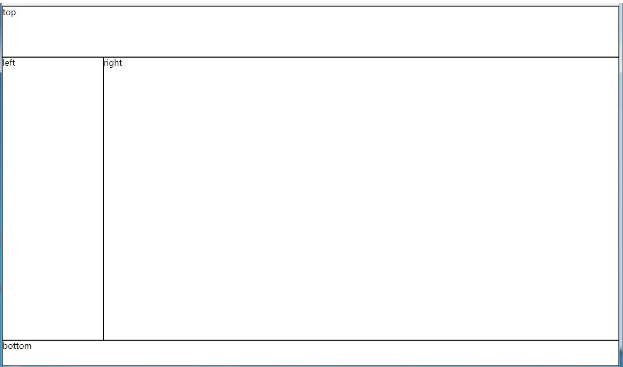
(1)使用绝对定位实现
<body><div id="parent"> <div id="top">top</div> <div id="left">left</div> <div id="right">right</div> <div id="bottom">bottom</div></div></body>html, body, #parent {height: 100%;overflow: hidden;}#parent > div { border: 1px solid #000; }#top { position: absolute; top: 0; left: 0; right: 0; height: 100px; }#left { position: absolute; top: 100px; /*值大于等于#top的高度*/ left: 0; bottom: 50px; /*值大于等于#bottom的高度*/ width: 200px; }#right { position: absolute; overflow: auto; left: 200px; /*值大于等于#left的宽度*/ right: 0; top: 100px; /*值大于等于#top的高度*/ bottom: 50px; /*值大于等于#bottom的高度*/}#bottom { position: absolute; left: 0; right: 0; bottom: 0; height: 50px; }优缺点:
- 优点:容易理解
- 缺点:代码繁多;需要计算好各个盒子的宽高;
(2)使用flex实现
<body><div id="parent"> <div id="top">top</div> <div id="middle"> <div id="left">left</div> <div id="right">right</div> </div> <div id="bottom">bottom</div></div></body>*{ margin: 0; padding: 0; }html,body,#parent{ height:100%; }#parent { display: flex; flex-direction: column; }#top { height: 100px; }#bottom { height: 50px; }#middle { flex: 1; display: flex; }#left { width: 200px; }#right { flex: 1; overflow: auto; }(3)使用Grid实现
<body><div id="parent"> <div id="top">top</div> <div id="left">left</div> <div id="right">right</div> <div id="bottom">bottom</div></div></body>*{ margin: 0; padding: 0; }html, body, #parent { height: 100%; }#parent { width: 100%; height: 100%; display: grid; /*分成2列,第一列宽度200px,第二列1fr平分剩余的部分,此处换成auto也行*/ grid-template-columns: 200px 1fr; /*分成3行,第一行高度100px,第二行auto为自适应,此处换成1fr也行,第3行高度为50px*/ grid-template-rows: 100px auto 50px; /*定义网格区域分布*/ grid-template-areas: "header header" "aside main" "footer footer"; }#parent>div{ border: 1px solid #000; }#top{ grid-area: header; /*指定在哪个网格区域*/}#left{ grid-area: aside; /*指定在哪个网格区域*/}#right{ grid-area: main; /*指定在哪个网格区域*/}#bottom{ grid-area: footer; /*指定在哪个网格区域*/}媒体查询
[I]. 定义和规范
1.1 CSS2中的媒体查询
在CSS2中,媒体查询只使用于<style>和 <link>标签中,以media属性存在;media属性用于为不同的媒介类型规定不同的样式,而真正广泛使用的媒介类型是'screen'、'print'和'all'
all 适合所有设备screen 计算机屏幕(默认值) print 打印预览模式 / 打印页 tty 电传打字机以及使用等宽字符网格的类似媒介tv 电视类型设备(低分辨率、有限的屏幕翻滚能力)projection 放映机handheld 手持设备(小屏幕、有限的带宽)braille 盲人用点字法反馈设备aural 语音合成器<style media="screen,tv">.box{ height: 100px; width: 100px; background-color: lightblue; } </style><div class="box"></div>1.2 CSS3中的媒体查询
在Media Queries Level 3规范中,媒体查询的能力被扩展,除了设备的类型,我们可以还获取到诸如窗口宽度、屏幕方向或分辨率等媒体特性(media features):
width – 输出设备渲染区域(如可视区域的宽度或打印机纸盒的宽度)的宽度height – 输出设备渲染区域(如可视区域的高度或打印机纸盒的高度)的高度device-width – 输出设备的宽度(整个屏幕或页的高度,而不是仅是渲染区域)device-height – 输出设备的高度(整个屏幕或页的高度,而不是仅是渲染区域)orientation – 设备处于横屏(宽度大于高度)模式还是竖屏(高度大于宽度)模式aspect-ratio – 输出设备目标显示区域的宽高比device-aspect-ratio – 输出设备的宽高比resolution – 输出设备的分辨率(像素密度)color – 检查设备支持多少种颜色等color-index – 输出设备中颜色查询表中的条目数量monochrome – 指定了一个黑白(灰度)设备每个像素的比特数scan – 检查电视输出设备是顺序扫描还是隔行扫描grid – 判断输出设备是网格设备还是位图设备1.3Media Queries Level 4规范中新的媒体特性
几个有代表性的如:
update – 根据设备的更新频度区分其类型 (none 如打印机, slow 如电子墨水, fast 正常设备) scripting – none 不支持脚本或未启用 | initial-only 仅支持页面初始化脚本 | enabled 支持脚本并且已启用pointer – 设备交互的精度 (coarse不精确如手指, fine 精确如鼠标, none 无指点) hover – 设备是否支持悬停状态[II]. 使用形式
2.1 基本语法
媒体查询最基本的形式,就是单独或组合使用媒体类型和媒体特性(后者要置于括号中),如:
@media screen { body { font-size: 20px; } } @media screen, print { body { font-size: 20px; } } @media (width: 30em) { nav li { display: block; } } @media screen and (width: 30em) { nav li { display: block; } }2.2 嵌套
/*例子1:媒体类型套媒体特性*/@media screen { @media (min-width: 20em) { img { display: block; width: 100%; height: auto; } } @media (min-width: 40em) { img { display: inline-block; max-width: 300px; } } }/*例子2:媒体特性多层嵌套*/@media (hover: on-demand) { @media (pointer: coarse) { input[type=checkbox] ~ label { padding: .5em; } } @media (pointer: fine) { input[type=checkbox] ~ label { padding: .1em; } } }2.3 否定式查询
可以用关键字not表示一个否定查询; not必须置于查询的一开头并会对整条查询串生效,除非逗号分割的多条
@media not print { body { background: url('paisley.png'); } }/*否定`print and (min-resolution: 1.5dppx)`这一整个条件*/@media not print and (min-resolution: 1.5dppx) { .external { background: url('arrow-lowres.png'); } }/* not A 或 not B */@media not (hover: hover), not (pointer: coarse) { font-size: 20px; }/*非法:not不在最前面*/@media not print and not (min-resolution: 2dppx) { }/*非法:not不在最前面*/@media screen and not (min-resolution: 2dppx) { }[III]. 媒体特性
3.1 根据媒体特性的范围查询
指定一个固定的宽度通常是没有意义的,更多的情况下,我们需要限定的是类似“小于等于”或“大于等于”这样的范围,而大多数媒体特性可以通过添加“max-”和“min-”前缀达到上述目的
/*0 至 30em*/@media (max-width: 30em) { nav li { display: block; } }/*30em 至 100em*/@media (min-width: 30em) and (max-width: 100em) { nav li { display: block; } }| 支持范围选择的特性 | 取值类型 |
|---|---|
| aspect-ratio | 诸如 1024/768 或 16:9 |
| device-aspect-ratio | 诸如 1024/768 或 16:9 |
| color | 整数 |
| color-index | 整数 |
| width | 合法宽度 |
| height | 合法高度 |
| device-width | 合法宽度 |
| device-height | 合法高度 |
| monochrome | 整数 |
| resolution | 分辨率单位(dpi, dpcm, dppx) |
3.2 选项式的媒体特性查询
不同于取值连续的范围式查询,很多媒体特性只有几个固定的取值可供选择
@media screen and (orientation: portrait) { #logo { height: 10vh; width: auto; } }| 选项式的媒体特性 | 取值选项 | 备注 |
|---|---|---|
| grid | 布尔值(使用时直接写成 (grid) 来判断) | 是网格设备还是位图设备 |
| hover | none, on-demand, hover | 是否支持悬停状态 |
| orientation | portrait, landscape | 设备方向 |
| light-level | dim, normal, washed | 环境光 |
| pointer | none, coarse, fine | 设备交互的精度 |
| scripting | none, initial-only, enabled | 是否支持脚本 |
| update | none, slow, normal | 根据设备的更新频度区分其类型 |
| scan | interlace, progressive | 电视输出设备是顺序扫描还是隔行扫描 |
| any-hover | none, on-demand, hover | can be used to check whether any available input mechanism allows the user to hover over elements |
| any-pointer | none, coarse, fine | Presence and accuracy of any pointing device available to the user |
| inverted-colors | none, inverted | useragent或OS是否倒置了颜色 |
| overflow-block | none, scroll, optional-paged, paged | 在block轴方向,当内容超出初始包含块或视口时,设备或浏览器的行为 |
| overflow-inline | none, scroll | 在inline轴方向,当内容超出初始包含块或视口时,设备或浏览器的行为 |
@media screen and (hover: on-demand) { input[type=checkbox] + label { padding: .5em; } } @media screen and (hover: none) and (pointer: coarse) { input[type=checkbox] + label { padding: .5em; } }[IV]. 其他
4.1 针对高分屏的媒体查询
@media (-webkit-min-device-pixel-ratio: 2), (min-resolution: 192dpi) { /* Retina屏幕下的样式 */}4.2 引入外部文件时的媒体查询
@import url(typography.css) screen, print; @import url(hi-res-icons.css) (min-resolution: 1.5dppx), (min-resolution: 96dpi); <!--即使媒体查询不符,样式文件总会被下载--> <link rel="stylesheet" href="styles.css" type="text/css" media="screen and (max-width: 480px)">4.3 在style标签上的媒体查询
<style type="text/css" media="screen and (max-width: 480px)"> body { font-size: 20px; }</style>4.4 利用媒体查询实现图片自适应
<picture> <source srcset="large.jpg" media="(min-width: 1024px)"> <source srcset="medium.jpg" media="(min-width: 680px)"> <!-- fallback --> <img src="small.jpg" alt=""></picture>看上去很简单,但在实际应用中,考虑到各种情况,可能会是这样:
<picture> <source src="large.jpg" media="( (min-device-pixel-ratio: 1.5) and (min-width: 20.001em) and (max-width: 35.999em) ) or ( (max-device-pixel-ratio: 1.5) and (min-width: 120.001em) ) or ( (min-device-pixel-ratio: 1.5) and (min-width: 60.001em) )" /> <source src="medium.jpg" media="( (max-device-pixel-ratio: 1.5) and (min-width: 20.001em) and (max-width: 35.999em) ) or ( (max-device-pixel-ratio: 1.5) and (min-width: 60.001em) ) or ( (min-device-pixel-ratio: 1.5) and (min-width: 10.001em) )" /> <source src="small.jpg" /> <!-- fallback --> <img src="small.jpg" alt="" /></picture>4.5 扩展阅读:用srcset和sizes实现更好的图片自适应
- 对于固定宽度(不同设备的设计稿上尺寸相同)的图像:
srcset属性列出了浏览器可以选择加载的源图像池,是一个由逗号分隔的列表。
x描述符表示图像的设备像素比
浏览器根据运行环境,利用这些信息来选择适当的图像
不理解srcset的浏览器会直接加载src属性中声明的图像
<img src="pic-255.jpg" alt="pic" srcset="pic-383.jpg 1.5x, pic-510.jpg 2x" />- 可变宽度(根据设备有不同显示策略)的图像:基于viewport选择
w描述符告诉浏览器列表中的每个图象的宽度
如果srcset中任何图像使用了w描述符,那么必须要设置sizes属性
sizes属性有两个值:第一个是媒体条件;第二个是源图尺寸值
源图尺寸值不能使用百分比
浏览器利用srcset和sizes信息来自动选择最符合规定条件的图像
无法确定究竟显示哪张图像,因为每个浏览器挑选适当图像的算法有差异
4.6 扩展阅读:用 image-set() 设置响应式的背景图片
body { /* 为普通屏幕使用 pic-1.jpg, 为高分屏使用 pic-2.jpg, 如果更高的分辨率则使用 pic-3.jpg,比如印刷 */ background-image: image-set( url(../images/pic-1.jpg) 1x, url(../images/pic-2.jpg) 2x, url(../images/pic-3.jpg) 600dpi ); }4.7 在Javascript中使用媒体查询
var isWideScreen = matchMedia("(min-width: 960px)"); console.log(isWideScreen.matches); //是否匹配 true | falseconsole.log(isWideScreen.media); //"(min-width: 960px)"以下情况下 matches 属性会返回 false:
function toggleClass(mq) { if (mq.matches) { document.body.classList.add('widescreen'); } else { document.body.classList.remove('widescreen'); } }//添加监听isWideScreen.addListener( toggleClass );//撤销监听isWideScreen.removeListener( toggleCl
 返回列表
返回列表


评论