发表于: 2019-11-12 22:49:36
1 906
今天完成的事情:任务八的第一个页面的响应式写了个大致
明天计划的事情:继续任务八
遇到的问题:把轮播框调整为自适应花费较长时间,最后还是还是靠bootstrap的js组件解决的
收获:代码部分的调整很麻烦,后来专门写了css文件直接引入进去感觉方便点
<link media="(max-width: 768px)" rel="stylesheet" href="gx.css">
屏幕小于768px就会引用这一个
下面是代码部分
html新添加部分
<p align="right" class="x1" style="margin: 0;">登录 ︱ 注册</p>
css部分
.d1{
display: none;
}
.x1{
display: block;
}
效果图
顶部消失,取而代之的时登录注册的右上角部分,下面的部分代码
html部分
<div class="m1"><label id="menu1" for="menu"></label></div>
<input id="menu" type="checkbox">
css部分
.d2{
display: none;
}
.d2 a{
width: 100%;
display: block;
margin: 0 auto;
}
#menu1{
height: 50px;
width: 50px;
background: url(./8/2.png);
display: block;
}
#menu:checked ~ .d2{
display: block;
}
.m1{
display: flex;
flex-direction: row-reverse;
}
效果图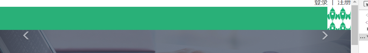
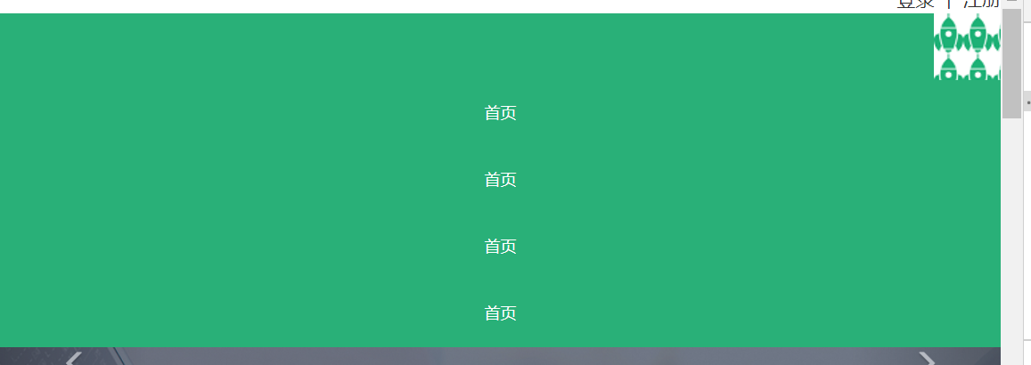
使用纯css的方法实现点击下拉导航,点击图片暂时用其他的部分代替以后再完善。再下面部分的代码
.d6{
height: 800px;
flex-direction: column;
align-items: center;
}
.dd6{
flex-direction: column;
align-items: center;
height: 500px;
border: none;
}
.d8{
flex-direction: column;
align-items: center;
height: 350px;
justify-content: space-around;
}
.d11{
flex-direction: column;
align-items: center;
}
.d12{
display: none;
}
.d14{
flex-direction: column;
align-items: center;
}
.db{
flex-direction: column;
}
.zb{
padding-left: 0px;
}
.db .yb p{
text-align: left!important;
}
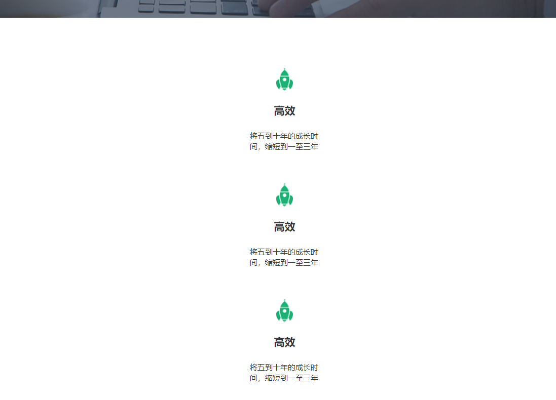
基本拍成了一列,明天再调整宽度,效果图
明天继续写下面的部分

 返回列表
返回列表


评论