发表于: 2019-11-09 21:33:43
1 1020
今天完成的事情:实际写了一部分响应式布局
明天计划的事情:继续任务
遇到的问题:响应式布局的写法有很多种,尝试不同的写法花了较多实际,bootsrap的轮播组件改样式非常麻烦
收获:了解了较多的响应式布局方法,如
1.原生代码实现。
在国内目前设计网页的时候,一般会分成PC端和移动端两套页面,但在一定的情况下,必须满足只设计一个页面的情况下,满足不同端口都能正常使用,
因此会用用到自适应的方法。
用原生代码实现的根本在于媒体查询@media的设置。
@media screen 可以查询当前浏览器的尺寸,因此可采用该方法对同一个页面设置不同的CSS样式,来满足不同分辨率要求。
举例如下:
@media screen and (min-width:1000px){...} 对应PC端页面
@media screen and (max-width:1000px) and (min-width:768px) {...} 对应平板端页面
@media screen and (max-width:768px){...} 对应手机端页面
也可以直接创建一个css文件直接引入也行
2.采用bootstrap框架布局
bootstrap框架布局完成的页面,是自动对应的自适应效果。
但是在书写的时候,应该严格按照bootstrap的书写规范,才不会出现怪异性问题。
写法举例:
<div class="col-md-6 col-sm-6 col-xs-12">
说明:最后的数字对应该div所占栅栏的列数。
col-md-6 代表在PC端上显示在一行的6个栅栏,也就是一半。
col-sm-6 代表在平板上也显示div占当前行的一半。
col-xs-12 代表在手机端显示为当前行的百分之百填充。
另外字体也可以响应式设计,例如、
html{font-size:100%;}
完成后,你可以定义响应式字体:
@media (min-width:640px){body{font-size:1rem;}}
@media (min-width:960px){body{font-size:1.2rem;}}
@media (min-width:1200px){body{font-size:1.5rem;}}
另外bootsrap的轮播组件很难用,测试代码
<!-- 指示器 -->
<ol class="carousel-indicators">
<li data-target="#carousel-example-generic" data-slide-to="0" class="active"></li>
<li data-target="#carousel-example-generic" data-slide-to="1"></li>
<li data-target="#carousel-example-generic" data-slide-to="2"></li>
</ol>
<!-- 轮播图片及说明文字 -->
<div class="carousel-inner" role="listbox">
<div class="item active">
<img src="..." alt="图片1">
<div class="carousel-caption">
...
</div>
</div>
<div class="item">
<img src="..." alt="图片2">
<div class="carousel-caption">
...
</div>
</div>
</div>
<!-- 控制按钮:左右切换 -->
<a class="left carousel-control" href="#carousel-example-generic" role="button" data-slide="prev">
<span class="glyphicon glyphicon-chevron-left" aria-hidden="true"></span>
<span class="sr-only">Previous</span>
</a>
<a class="right carousel-control" href="#carousel-example-generic" role="button" data-slide="next">
<span class="glyphicon glyphicon-chevron-right" aria-hidden="true"></span>
<span class="sr-only">Next</span>
</a>
</div>
效果图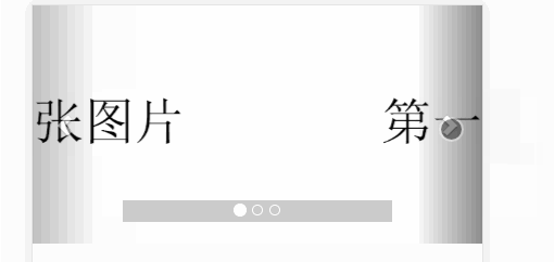
挺难用的改起样式很麻烦,明天再继续弄

 返回列表
返回列表


评论