发表于: 2019-11-02 19:20:05
1 929
今天完成的事情: 开始写任务八第一个页面
明天计划的事情: 继续任务
遇到的问题: 屏幕的分辨率和设计图的分辨率不一样,导致写出来的页面看起来非常奇怪,反复核查尺寸之后结论测量无误,明天继续想办法 处理一下
收获:任务依然在进行中,完成了页面上面的一部分,代码
<div class="d1">
<span>客服电话:010-594-34567</span>
<img src="./8/1.png" alt="">
</div>
.d1{
display: flex;
justify-content: space-between;
padding: 0 180px;
height: 20px;
align-items: center;
顶部的部分,实际效果图
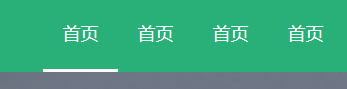
导航部分代码
<div class="box2">
<div class="d2">
<a href="" class="a1">
首页
<div class="y1"></div>
</a>
css部分
.d2{
height: 50px;
padding: 0 168px;
background-color: #29b078;
display: flex;
flex-direction: row-reverse;
}
a{
display: inline-block;
line-height: 50px;
width: 50px;
text-align: center;
position: relative;
}
这是直接显示的部分
.y1{
height: 2px;
width: 50px;
position: absolute;
background-color: white;
bottom: 0;
visibility:hidden;
}
这是按钮下面的白条
用hover来关联移上去浮现出来,代码
.a1:hover .y1{
visibility: visible;
实际效果图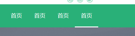
移到那个下面显示白条,用绝对定位来定位,然后复制四个调整位置
<div class="zsj"></div>
<div class="d3v">
<p align="right" class="n1">作为你一个初级菜鸟,你是否想要了解</p>
<div class="lu1">
<span class="n2">50万</span>
<span class="n3">年薪的程序员,都会那些技能呢?</span>
</div>
</div>
<div class="ysj"></div>
中间图片的部分
css代码
.d3{
height: 300px;
background: url(./8/Image.png) no-repeat 0px;
background-size:cover;
}
.d3{
display: flex;
justify-content:center;
align-items: center;
}
.zsj{
width: 12px;
height: 12px;
border-top: 2px solid gainsboro;
border-right: 2px solid gainsboro;
transform: rotate(225deg);
}
.ysj{
width: 12px;
height: 12px;
border-top: 2px solid gainsboro;
border-right: 2px solid gainsboro;
transform: rotate(45deg);
}
.d3v{
width: 600px;
color: #fff;
padding: 0 55px;
实际效果图
这个设计图上面的字字体到底是哪一种换了各种都不像,暂时先放着
后面被分辨率尺寸困扰明天再继续,考虑用尺寸百分比尝试解决

 返回列表
返回列表


评论