任务进展——任务十
一、 任务进度:95%;
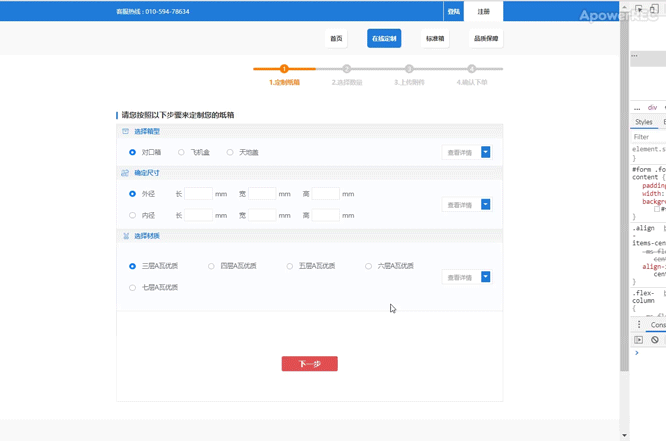
① 效果呈现
页面操作

页面切换
二、 近期情况
1. 完成bootstrap的表单的应用
HTML
① 每个form-group都包含一个基本表单组件,多个表单组件通过栅格系统排列,并实现在不同分辨率屏幕下的自适应变化;
② 单选框和多选框的name要一样才生效,且都要包含在form标签里面;
<div class="form-group m-0 d-flex flex-column">
<div class="form-row no-gutters m-0">
<div
class="custom-control custom-radio custom-control-inline p-0 col-sm col-12"
>
<input
type="radio"
id="box-outside"
name="box-size"
class="custom-control-input d-none"
checked
/>
<label class="custom-control-label" for="box-outside">
外径
</label>
</div>
<div
class="form-inline d-flex align-items-center specific-size"
>
<div class="form-group flex-nowrap col-sm-4 col-12">
<label for="box-length1">
长
</label>
<input
type="search"
id="box-length1"
name="box-outside-length1"
class="form-control"
maxlength="4"
oninput="value=value.replace(/[^\d]/g,'')"
required
/>
<span>mm</span>
</div>
<div class="form-group flex-nowrap col-sm-4 col-12">
<label for="box-width1">
宽
</label>
<input
type="search"
id="box-width1"
name="box-outside-width1"
class="form-control"
maxlength="4"
oninput="value=value.replace(/[^\d]/g,'')"
required
/>
<span>mm</span>
</div>
<div class="form-group flex-nowrap col-sm-4 col-12">
<label for="box-height1">
高
</label>
<input
type="search"
id="box-height1"
name="box-outside-height1"
class="form-control"
maxlength="4"
oninput="value=value.replace(/[^\d]/g,'')"
required
/>
<span>mm</span>
</div>
</div>
</div>
CSS
① 对于单选框和多选框前面的按钮样式定义,都是::before为勾选前状态,::after为勾选后状态,且通过position:absolute,定位在相同位置上,且custom-control的类在min-height设置为1.5rem,需修改才能变小;
② 对于input的单行文本框,form-control的类默认宽度为100%,且是块状元素,所以要定义为内联块状元素,如想定义输入文本的字体大小,直接定义字体大小即可,再定义文本框的宽高尺寸;
#form .form-content {
padding: 0.25em 0.8em;
width: 100%;
background-color: #fbfcff;
}
#form .form-content .custom-control {
margin: 1em 2.4em;
min-height: 0;
font-size: 0.5em;
color: #666;
}
#form .form-content .custom-control-label {
cursor: pointer;
}
#form .form-content .custom-control-label::before,
#form .form-content .custom-control-label::after {
display: inline-block;
top: 0.25em;
left: -2em;
width: 1em;
height: 1em;
} /* 定义表单内容区的单选按钮组的样式 */
.specific-size label,
.specific-size span,
.amount-size label,
.amount-size span {
margin: 0 0.4em;
font-size: 0.5em;
color: #666;
}
.specific-size .form-control,
.amount-size .form-control {
display: inline-block;
padding: 0.4em;
width: 4.5em;
height: 2em;
font-size: 0.5em;
color: #666;
border: 0.04em solid #e8e8e8;
border-radius: 0;
}
.specific-size .form-control:focus,
.amount-size .form-control:focus {
box-shadow: 0 0 0.4em #1d7ad9;
} /* 定义表单内容区的确定尺寸的具体数字区的样式 */
2. 完成bootstrap的下拉菜单的应用
HTML
<div class="dropdown ml-auto d-flex align-items-center">
<button
type="button"
class="btn p-0 text-nowrap"
data-toggle="dropdown"
aria-haspopup="true"
aria-expanded="false"
>
查看详情
<span class="dropdown-toggle"></span>
</button>
<div class="dropdown-menu p-0">
<a class="dropdown-item" href="#">Action</a>
<a class="dropdown-item" href="#">Another action</a>
<a class="dropdown-item" href="#">Something else here</a>
</div>
</div>
CSS
#form .form-content .dropdown {
padding: 0.3em 0.4em;
padding-right: 0.1em;
height: 1.2em;
font-size: 0.625rem;
border: 0.05em solid #e8e8e8;
background-color: #fff;
}
#form .form-content .dropdown .btn {
font-size: 0.4em;
color: #999;
}
#form .form-content .dropdown .btn:focus {
box-shadow: none;
}
#form .form-content .dropdown .dropdown-toggle {
display: inline-block;
margin-left: 1em;
width: 1.2em;
height: 1.5em;
font-size: 1.5em;
color: #fff;
border: none;
border-radius: 0.1em;
background-color: #1d7ad9;
}
#form .form-content .dropdown .dropdown-menu {
min-width: 100%;
font-size: 0.625rem;
}
#form .form-content .dropdown .dropdown-item {
padding: 1em;
font-size: 0.4em;
color: #666;
} /* 定义表单内容区的下拉菜单的样式 */
3. 完成导航栏的自动添加active的Jquery应用
HTML
<nav class="navbar navbar-expand navbar-dark" id="navbar-top">
<ul class="navbar-nav ml-auto">
<li class="nav-item w-100 ml-0 ml-3">
<a class="nav-link p-0 text-nowrap text-center" href="#">
首页
<span class="sr-only">(current)</span>
</a>
</li>
<li class="nav-item w-100 ml-0 ml-3 active">
<a class="nav-link p-0 text-nowrap text-center" href="#">
在线定制
</a>
</li>
<li class="nav-item w-100 ml-0 ml-3">
<a class="nav-link p-0 text-nowrap text-center" href="#">
标准箱
</a>
</li>
<li class="nav-item w-100 ml-0 ml-3">
<a class="nav-link p-0 text-nowrap text-center" href="#">
品质保障
</a>
</li>
</ul>
</nav>
JS
$("nav .nav-item").click(function() {
$("nav .nav-item").removeClass("active");
$(this).addClass("active");
}); // 自动添加active
4. 完成bootstrap的进度条的应用
HTML
① 通过多个进度条的内联排列在一起,来形成整条带序号的进度条,并可以作为轮播图的轮播指示使用;
② 作为carousel-indicators的轮播指示,子元素可以不用为li标签,可以是其他标签,通过data-target和data-slide-to来绑定内容对象和页面位置即可,如不想点击轮播指示来切换页面,则不用添加data-target,只需data-silde-to来实现根据页面切换情况来自动添加active;
<article
class="d-flex justify-content-center carousel-indicators position-static m-0"
id="steps"
>
<section
class="d-flex flex-column justify-content-center active"
data-slide-to="0"
>
<div class="d-flex justify-content-center align-items-center">
<div class="progress">
<div
class="progress-bar active"
role="progressbar"
aria-valuenow="0"
aria-valuemin="0"
aria-valuemax="100"
></div>
</div>
<span class="step text-center align-middle">1</span>
</div>
<p class="step-text text-center">1.定制纸箱</p>
</section>
<section
class="d-flex flex-column justify-content-center"
data-slide-to="1"
>
<div class="d-flex justify-content-center align-items-center">
<div class="progress">
<div
class="progress-bar"
role="progressbar"
aria-valuenow="0"
aria-valuemin="0"
aria-valuemax="100"
></div>
</div>
<span class="step text-center align-middle">2</span>
</div>
<p class="step-text text-center">2.选择数量</p>
</section>
<section
class="d-flex flex-column justify-content-center"
data-slide-to="2"
>
<div class="d-flex justify-content-center align-items-center">
<div class="progress">
<div
class="progress-bar"
role="progressbar"
aria-valuenow="0"
aria-valuemin="0"
aria-valuemax="100"
></div>
</div>
<span class="step text-center align-middle">3</span>
</div>
<p class="step-text text-center">3.上传附件</p>
</section>
<section
class="d-flex flex-column justify-content-center"
data-slide-to="3"
>
<div class="d-flex justify-content-center align-items-center">
<div class="progress">
<div
class="progress-bar"
role="progressbar"
aria-valuenow="0"
aria-valuemin="0"
aria-valuemax="100"
></div>
</div>
<span class="step text-center align-middle">4</span>
</div>
<p class="step-text text-center">4.确认下单</p>
</section>
</article>
CSS
① 为实现页面切换时的动画效果,通过定义active的类的样式,即处于该页面时的进度条的选中状态,并定义进度条的动画过渡效果即transition;
② 再给所有进度条声明为该active的状态,通过~符号来声明active后的进度条应用未选中状态,从而实现进度条向前运动的效果;
#steps {
float: right;
position: relative;
padding: 1em 0;
}
#steps .progress {
width: 5em;
height: 0.2em;
font-size: 0.625rem;
font-weight: 600;
border-radius: 0;
background-color: #ccc;
}
#steps .progress-bar {
width: 100%;
background-color: #ff7f02;
border-radius: 0;
}
#steps section:first-child .progress,
#steps section:first-child .progress-bar {
border-radius: 0.1em 0 0 0.1em;
}
#steps section:last-child .progress,
#steps section:last-child .progress-bar {
border-radius: 0 0.1em 0.1em 0;
} /* 定义进度条的左右两端的圆角 */
#steps .step {
position: absolute;
width: 1.5em;
height: 1.5em;
font-size: 0.4em;
color: #fff;
border-radius: 50%;
background-color: #ff7f02;
} /* 定义进度条和序号的样式*/
#steps .step-text {
margin-top: 1.2em;
margin-bottom: 1em;
font-size: 0.5em;
font-weight: 600;
color: #ff7f02;
} /* 定义进度条的序号文字的样式 */
section .progress-bar,
section .step,
section .step-text {
-webkit-transition: width 1s ease, background-color 1s ease, color 1s ease;
transition: width 1s ease, background-color 1s ease, color 1s ease;
}
/* 定义进度条变化过渡动画的效果 */
#steps .active .progress-bar {
width: 100%;
}
#steps .active ~ section .progress-bar {
width: 0%;
}
#steps .active .step {
background-color: #ff7f02;
}
#steps .active ~ section .step {
background-color: #ccc;
}
#steps .active .step-text {
color: #ff7f02;
}
#steps .active ~ section .step-text {
color: #ccc;
}
/* 给轮播图的轮播指示定义动画变化,
通过默认状态为选中状态,~符号指定后面都为初始状态,由此实现点击下一步,保留已选中状态 */
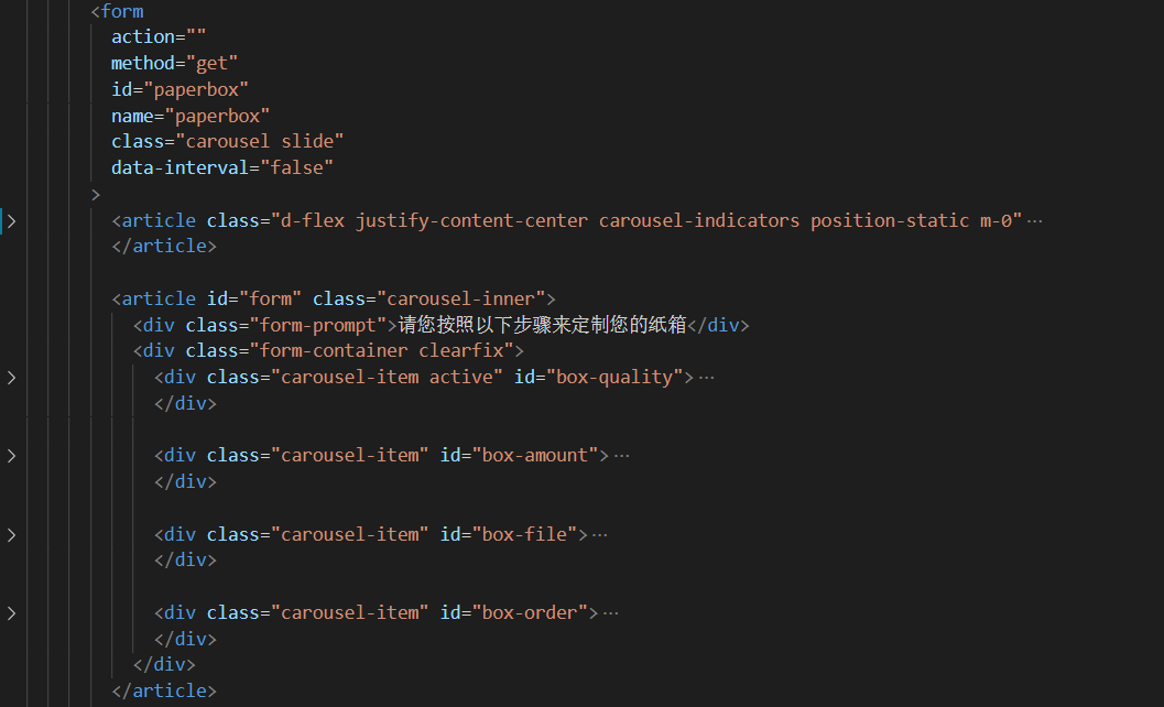
5. 完成bootstrap的轮播图组件改造为ppt组件
HTML
① form标签为carousel,进度条为carousel-indicators,表单内容为carousel-inner,其里面的具体内容通过carousel-item来实现自动添加active,下一步按钮为轮播的控制项;
② 通过在form标签即carousel类,去除data-ride属性,添加data-interval="false"(轮播切换延迟时间为无限长),实现不会自动轮播且禁止滑动切换,并且也不会出现点击控制项后又会出现自动轮播的现象;
③ 通过在carousel-indicators去除data-target,实现不会点击序号来切换页面,只需添加data-slide-to属性,即可实现页面切换时自动添加active;
④ carousel-inner作为轮播图的父元素即框架,而carousel-item作为轮播图中的页面,框架大小可由页面撑开,而页面则由表单内容撑开,从而实现自适应时不会出现滚动条;
⑤ 轮播图的控制项,不用carousel-control-prev或carousel-control-next的类来默认样式,只需添加href和data-silde属性,即可实现对轮播图页面的控制;
<article class="form-group row m-0 d-flex justify-content-center w-100"
id="carousel-control"
>
<button
type="button"
class="back btn btn-outline-danger p-0"
name="back"
id="back"
href="#paperbox"
role="button"
data-slide="prev"
>
上一步
</button>
<button
type="submit"
class="next btn p-0 border-0"
name="next"
id="next"
href="#paperbox"
role="button"
data-slide="next"
>
下一步
</button>
</article>
JS
① 由于轮播图的控制项会出现第一页和最后一页的轮回,即在第一页点击上一步按钮会回到最后一页的情况;
② 为避免此情况的出现,需要保证第一页没有上一步按钮,最后一页没有下一步按钮,点击下一步会出现上一步的按钮,点击上一步会出现下一步的按钮,由此通过jquery来获取进度条的active位置,来定义上一步按钮和下一步按钮的显隐情况;
$("#back").click(function() {
if ($("#steps section:eq(1)").hasClass("active")) {
$("#back").hide();
} else {
$("#back").show();
}
}); // 当点击上一页的按钮时,如果第二页是有active的类,则返回第一页时上一页按钮消失
$("#next").click(function() {
$("#back").show();
}); // 点击下一页按钮时,上一页按钮显示,由此实现第一页没有上一页按钮
$("#next").click(function() {
if ($("#steps section:eq(2)").hasClass("active")) {
$("#next").hide();
} else {
$("#next").show();
}
}); // 当点击下一页的按钮时,如果第三页即倒数第二页是有active的类,则到最后一页时下一页按钮消失
$("#back").click(function() {
$("#next").show();
}); // 点击上一页按钮时,下一页按钮显示,由此实现最后一页没有下一页按钮
三、 明天任务
1. 完成less或sass的学习;
2. 学习http的相关概念

 返回列表
返回列表


评论