任务进展
一、 任务进度:80%;
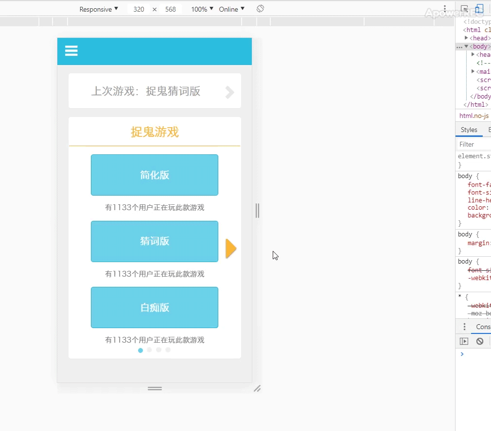
① 效果呈现:
二、 今日情况:
1. 实现页面内部跳转,通过声明href为同根目录的html文件,即实现同域跳转;
① 也曾用过iframe标签(https://www.cnblogs.com/hq233/p/9849939.html),进行嵌入html文件,但以纯CSS难以实现打开和关闭的流畅,适合用于广告弹窗嵌入等,而不用共用css文件来比较方便;
HTML
<article class="text-right">
<button type="button" class="btn">
<a class="glyphicon glyphicon-remove" href="index.html"></a>
</button>
</article>
</header>
<!--标题栏或导航栏-->
2. 实现bootstrap的popover弹出窗插件的应用,并与audio音频结合,来实现点击即打开背景音乐的事件;
HTML
<section class="container">
<span
title=" "
data-container="main"
data-toggle="popover"
data-placement="top"
data-content="发言讨论结束,大家请投票"
onclick="playPause()"
>
点击得票数最多人的头像
</span>
<!--提示弹出框的打开和音频播放暂停的控制-->
<audio
id="votebgm"
src="../WebApp/audio/财富自由.mp3"
loop="loop"
>
亲 您的浏览器不支持html5的audio标签
</audio>
</section>
CSS
#vote .container:first-child {
position: relative;
padding-left: 11.25%;
height: 5.4em;
font-size: 1.2em;
}
.container:first-child span {
position: absolute;
bottom: 0;
} /* 定义提示区的样式 */
body .popover-content {
padding-left: 1.5em;
width: 100%;
font-size: 1.4em;
color: #464646;
}
body .popover {
width: 100%;
max-width: none;
top: 5.4em!important;
z-index: 500;
border: none;
border-radius: 0;
background-color: rgba(255, 255, 255, 0.67);
box-shadow: none;
}
body .popover .arrow {
left: 13%!important;
transform: scaleX(0.5);
opacity: 0.67;
} /* 定义提示弹出框的样式,因在其html文件隐藏,需要在chrome调试并通过提高权值或最高权值来覆盖 */
body .popover-title {
position: absolute;
right: .9em;
margin: 0;
padding: 0;
border: none;
width: 4em;
height: 100%;
background: url(../WebApp/img/play@2x.png) no-repeat center;
background-size: 2.6em 2.6em;
-webkit-animation: rotate 3s linear infinite;
animation: rotate 5s linear infinite;
} /* 定义提示弹出框中的音频播放键按钮 */
@keyframes rotate {
0% {
transform: rotate(0);
}
100% {
transform: rotate(360deg);
}
} /* 定义音频播放时,按钮旋转动画 */
JS
<script>
$(function() {
$('[data-toggle="popover"]').popover();
}); //弹出提示框的触发条件
var votebgm = document.getElementById("votebgm");
function playPause() {
if (votebgm.paused) {
votebgm.play();
} else {
votebgm.pause();
}
} //背景音乐的播放与暂停
</script>
3. 实现bootstrap的栅格系统的应用,可以实现如任务1—九宫格的自适应变化(随宽度变大变小),以及按钮组的应用;
① 但对于以em为单位,如是头像跟宽度相关等比例缩放,而字体不变,会导致整体布局受到破坏,所以还是以固定的em单位来确定尺寸;
② 由于尺寸固定,而-col-xs的值随宽度变大,导致头像的布局越来越偏,所以还是需要声明为flex布局后,通过align-items:center来实现垂直居中,才可以使得仅仅间隔变大,而位置按比例不变;
③ 所以栅格系统,不怎么适合移动端的自适应布局应用;
HTML
以一行为例,即一个类为row的div结构;
<section class="container">
<div class="row">
<div class="col-xs-4">
<div class="sculpture">
<p class="name text-center">水民</p>
<p class="numb text-center">1号</p>
</div>
<div class="btn-group">
<button type="button" class="btn"></button>
<button type="button" class="btn"></button>
<button type="button" class="btn"></button>
<button type="button" class="btn"></button>
</div>
</div>
<div class="col-xs-4">
<div class="sculpture">
<p class="name text-center">水民</p>
<p class="numb text-center">2号</p>
</div>
<div class="btn-group">
<button type="button" class="btn"></button>
<button type="button" class="btn"></button>
<button type="button" class="btn"></button>
<button type="button" class="btn"></button>
</div>
</div>
<div class="col-xs-4">
<div class="sculpture">
<p class="name text-center">警察</p>
<p class="numb text-center">3号</p>
</div>
<div class="btn-group">
<button type="button" class="btn"></button>
<button type="button" class="btn"></button>
<button type="button" class="btn"></button>
<button type="button" class="btn"></button>
</div>
</div>
</div>
CSS
/栅格系统
.container:nth-child(2) .row {
margin-top: 1.2em;
padding: 0 0.5em;
display: flex;
justify-content: space-between;
} /* 定义网格系统的行的样式 */
#vote .col-xs-4 {
padding: 0 5%!important;
display: flex;
flex-direction: column;
align-items: center;
} /* 定义水槽的宽度,以及垂直居中对齐布局 */
.sculpture {
display: flex;
flex-direction: column;
width: 7.1em;
height: 7.1em;
background-color: #FFF;
border: .3em solid #FFF;
} /* 定义头像的背景图 */
.sculpture .name {
margin: 0;
width: 100%;
height: 70%;
background-color: #f5c97b;
font-size: 1.6em;
color: #565656;
line-height: 3em;
} /* 定义头像名字的样式 */
.sculpture .numb {
margin: 0;
width: 100%;
height: 30%;
background-color:rgba(26, 153, 183, 0.52);
font-size: 1.2em;
line-height: 1.8em;
} /* 定义头像编号的样式 */
/按钮组
.col-xs-4 .btn-group {
display: flex;
justify-content: space-between;
margin-top: 1.2em;
width: 7.1em;
visibility: hidden;
} /* 定义按钮组的位置和布局 */
.col-xs-4 .btn-group .btn {
margin: 0;
padding: 0;
width: 1.5em;
height: 1.5em;
} /* 定义按钮的样式 */
.col-xs-4 .btn-group .btn:first-child {
background: url(../WebApp/img/kill.png) no-repeat center;
background-size: cover;
}
.col-xs-4 .btn-group .btn:nth-child(2) {
background: url(../WebApp/img/check.png) no-repeat center;
background-size: cover;
}
.col-xs-4 .btn-group .btn:nth-child(3) {
background: url(../WebApp/img/sign.png) no-repeat center;
background-size: cover;
}
.col-xs-4 .btn-group .btn:last-child {
background: url(../WebApp/img/save.png) no-repeat center;
background-size: cover;
} /* 定义各个按钮的图像 */
.sculpture:hover + .btn-group {
visibility: visible;
} /* 定义头像在悬浮状态时,显示按钮组 */
三、 任务问题:
① 应用bootstrap后,主要在于html文件的类声明更加规范,思路会变为先对照bootstrap的组件来声明类,再通过应用默认组件或自定义组件样式,再修改样式更符合UI要求,但bootstrap的CSS文件声明的权值较高,有时候需要通过id声明来提高权值,甚至实在没办法,只能用!important来覆盖,所以组件规范化,即多个页面应用同一个组件样式,显得十分重要;
② 应用bootstrap的默认样式时,发现如是自定义字体大小为em单位后,就已经相当于px单位的效果,rem如何改变都无法使得字体随之变大变小,单位可能要用rem吧,且自定义样式的网站没有保存功能而无法修改,所以现在用户调节字体大小的功能没有实现;
③ 文字类的居中问题常常比较难处理,只有line-height可以调节其垂直轴位置,但正常来说,line-height等于定宽块状元素的高度就可以实现垂直居中,然而对于内联元素暂时没有想到什么好方法,vertical-align往往都失效,还是用起来不够理解,习惯用chrome浏览器调试来一个一个数据尝试,导致效率不高;
四、明天任务:
① 完成剩余一个页面,并继续使用bootstrap文件,及练习组件结合;
② 尝试解决完一些自适应问题,以及交互效果问题,完成深度思考;

 返回列表
返回列表


评论