发表于: 2019-09-15 14:39:04
1 550
今天完成的事情:
1、学习了CSS绘制简单图形
矩形
.rectangle {
width: 100px;
height: 100px;
background-color: #f6d1d8;
}
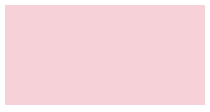
width和height值相同时则为正方形
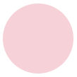
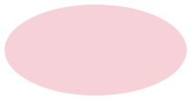
圆形和椭圆形
在正方形中添加圆角50%,即可得到圆形;同理,椭圆形通过长方形的圆角设置得到
.circle {
width: 100px;
height: 100px;
border-radius: 50%;
background-color: #f6d1d8;
}
.oval {
width: 200px;
height: 100px;
border-radius: 50%;
background-color: #f6d1d8;
}
梯形
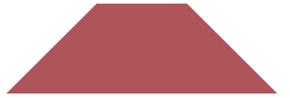
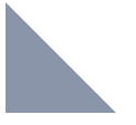
正方形div元素的边框是由4个等腰梯形组成的。
为正方形的css样式,添加不同的颜色的边框表示来证明这一句话。如下图
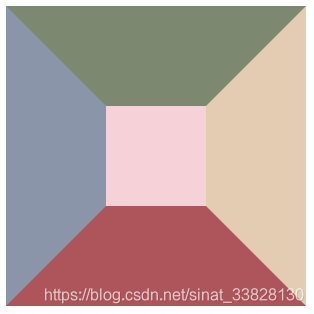
代码如下
.colorsquare {
width: 100px;
height: 100px;
background-color: #f6d1d8;;
border-top: 100px solid #7c8870;
border-right: 100px solid #e4ccb2;
border-bottom: 100px solid #ae555b;
border-left: 100px solid #8a95a9;
}
可观察到在边框中,可以得到4个不同方向的等腰梯形
因此,等腰梯形的绘制相当于拿出边框的其中一边,为长边方向设置背景颜色,相邻两边设置为透明色。
下列代码取出底部边框,得到等腰梯形:
.trapezium{
width: 100px;
border-right: 100px solid transparent;
border-bottom: 100px solid #ae555b;
border-left: 100px solid transparent;
}
下图为梯形边框长度定义的图示
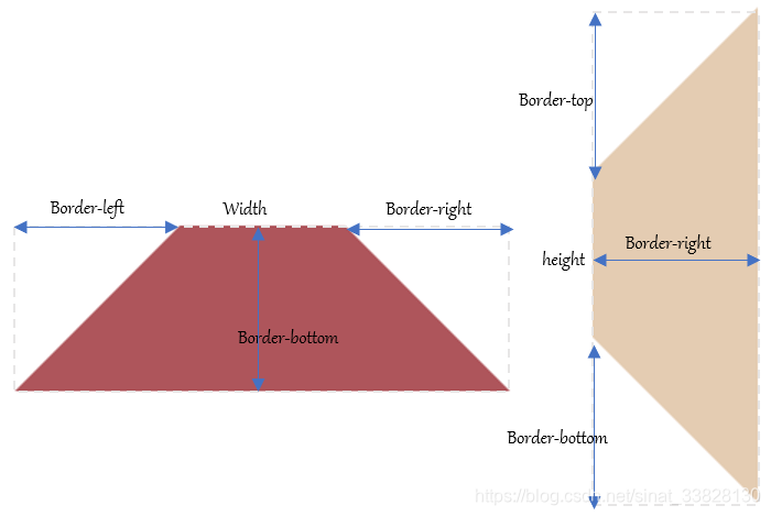
等腰梯形保留了一条边框作为梯形长边,同时保留相邻两边并设为透明,非等腰梯形的实现,通过改变相应边框宽度即可。
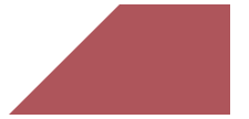
其中直角梯形,只保留一条邻边并设为透明。
.right-trapezium{
width: 100px;
border-bottom: 100px solid #ae555b;
border-left: 100px solid transparent;
}
三角形
在上一节的梯形中,梯形取自正方形边框,那么正方形长宽均为0时,边框则由四个三角形组成。
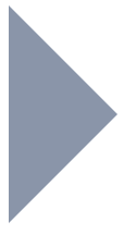
因此,三角形与梯形同理,区别只是三角形的width和height值均为0;
.triangle {
width: 0;
height: 0;
border-left: 100px solid #8a95a9;
border-top: 100px solid transparent;
border-bottom: 100px solid transparent;
}

与直角梯形类似,去掉一条邻边,同样可得到直角三角形
.triangle {
width: 0;
height: 0;
border-left: 100px solid #8a95a9;
border-top: 100px solid transparent;
}
2、任务6完成了页眉和页脚
页眉和页脚的布局,综合使用之前任务中的浮动、定位、和弹性盒子,就可以顺利完成。
3、学会了雪碧图的制作和应用
雪碧图的制作:从UI中切图得到需要的png图片,将所有png图片制作成雪碧图
此处有安利,https://www.toptal.com/developers/css/sprite-generator
有很多快速生成雪碧图的网站,右侧上传所有图片文件,左侧生成雪碧图,可以选自不同的布局方式,此时右侧显示的代码是不同图片的在雪碧图中的background-position
这里建议上传前为图片重命名,这样可以自动生成,以图片文件名为名的类选择器
雪碧图的应用:
首先,为元素i添加背景,并设置尺寸,这里设置了尺寸有利于之后的缩放。除非制作雪碧图前已经准备好了合适的尺寸
i {
background-image: url(css_sprites.png);
background-repeat: no-repeat;
background-size: 17.2rem 12.5rem;
}
雪碧图的原理是,控制一个层可显示的区域范围大小,通过一个窗口,进行背景图的滑动。
相当于是两张纸上下叠放,上层纸抠一个洞,下层纸画很多图形,从洞中看下层的图形,滑动下层可以从洞中看到不同的图形
如下,每一个洞是一个选择器
.bg-6_house {
width: 1.6rem;
height: 1.5rem;
background-position: -2.4rem -0.3rem;
background-size: 5.7rem 4.2rem;
}
其中width和height是洞的大小
background-position表示下层纸偏移的位置,以左上角为基准,背景图的左上角为0,0 .负数表示的是向左,向上偏移下层背景图
background-size表示背景图大小
等比例修改这四个值,可以实现缩放。
<i
明天计划的事情:
1、学习bootstrap
2、学习下拉菜单
3、将中间的服务信息实现
遇到的问题:
CSS形状绘制中,还有很多的图形,百度到了实现方式,但我还不能看懂。希望在以后的学习中可以学会多角星,多边形等的绘制。
相对定位和绝对定位还不是很熟练,需要多理解。
收获:
掌握了flex弹性盒子的使用,掌握了雪碧图的制作和应用。

 返回列表
返回列表


评论